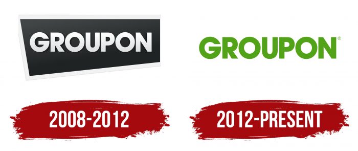
The Groupon logo conveys the idea of teamwork for the prosperity and development of the group. The logo has a theme of unity, growth, and profitable acquisitions. The color scheme enhances the hint of money and financial gain.
Groupon: Brand overview
| Founded: | November 2008 |
| Founder: | Andrew Mason Eric Lefkofsky Brad Keywell |
| Headquarters: | Chicago, Illinois, U.S. |
| Website: | groupon.com |
Meaning and History
Its former CEO, Andrew Mason, conceived the online group shopping platform of Pittsburgh. The idea liked Eric Lefkofsky, his past employer, who decided to provide a million dollars in start-up capital. The start-up quickly brought income and paid off in a short time because two years later (in the spring of 2010), the commercial site was already valued at more than a billion dollars.
Groupon intended to continue working in this spirit. Therefore, he publicly announced that he will be even more active in selling and will pick up a billion dollars faster than anyone else. But the miracle did not happen, and in the reports for 2011, the public company recorded a decline – losses for the fourth quarter. This disappointed investors and served as a new start for the Internet site. As a result, 2012 became a turning point for her – a serious reason for revising long-range and short-range plans.
Subsequently, the international web trading platform began to activate the process, for which it significantly expanded its spheres of influence. She acquired many small structures and shops of various directions, which allowed her to stay afloat. Naturally, the most serious stages in work were reflected in the corporate identity because it is any company’s face. Over the years, Groupon has had two official emblems.
What is Groupon?
Groupon is a marketplace where discount coupons are sold for purchasing various goods and services. The discount often ranges from 50% to 90%, which has attracted millions of customers. The online service directly negotiates deals with restaurants, spas, hotels, and other establishments, promoting their offers. The company operates in more than ten countries, but its headquarters are located in the USA.
2008 – 2012
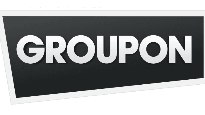
The online shopping and selling platform’s debut logo contains a single element – the title in an oblique frame. It consists of two pillars – “group” and “coupon,” which reflect a trading company’s basic occupation. The inscription is made in light letters with a slight gradient. This is an unobtrusive transition from gray (bottom) to white (top).
All characters are uppercase and are located in one line with a minimum distance from each other. The signs are smooth, even, chopped. The background is an elongated black rectangle of irregular shape. On the left, the geometric shape resembles a trapezoid, and on the right, a rectangle. A wide edging strip runs along the perimeter of the emblem.
2012 – today
2012 was a decisive year for the web trading platform, as it needed funds to survive and continue to be successful. Therefore, after the losses experienced, the team rallied and strengthened commercial activities. Of course, this turning point was reflected in the company’s identity.
The designers suggested a different style of logo design – brighter, more catchy, and in some ways even uncompromising. And it’s all about a new color: green is, in fact, a magnet for money, as its various shades are traditionally used on banknotes. The authors also paid attention to the inscriptions, making the letters larger and elongated, and removed the background, leaving a simple white space.
Groupon: Interesting Facts
- Beginnings: Created by Andrew Mason, Eric Lefkofsky, and Brad Keywell as a part of a social activism project, it quickly shifted to focus on group buying, offering big discounts once a certain number of people bought the deal.
- Explosive Growth: In just two years, Groupon grew massively, reaching 250 markets worldwide by the end of 2010.
- Historic IPO: In 2011, Groupon’s IPO raised $700 million, marking the biggest internet company IPO since Google.
- Unique Business Model: It introduced a novel approach by offering one “Groupon” daily in each market, benefiting local businesses and consumers.
- Expanded Offerings: Groupon grew to include various deals, from travel to goods, through Groupon Goods and Groupon Getaways.
- Consumer Behavior Shift: While Groupon has encouraged deal-seeking behavior among consumers, it has also faced criticism for potentially devaluing products and services.
- Community Involvement: The company has supported local community projects and nonprofits through Groupon Grassroots.
- Global Footprint: Despite achieving international reach, Groupon faced challenges abroad, leading to downsizing or exiting certain markets.
- Tech and Innovation: Groupon has focused on enhancing user experience with mobile apps and new deal formats, like immediate-use Groupon Now! deals.
Groupon’s story, from a small startup to a significant online platform, demonstrates the impact and hurdles of internet-based businesses and showcases the power of innovation in transforming market and consumer practices.
Font and Colors
The company did not make significant changes to its logo, so the style remained the same. Only the details have changed, but they are so insignificant that they are not striking the first time. The exception is color – it has become sharper and brighter.
For the debut logo, the developers chose the ITC Avant Garde Bold from the grotesque typeface category. It is a sleek font with bold characters. Its author is Herb Lubalin. When creating the second version, the designers chose the same version, slightly adjusting the symbols’ height. But they changed the color radically: instead of white and gray, they used a rich green acrid palette.
Groupon color codes
| Kelly Green | Hex color: | #53a318 |
|---|---|---|
| RGB: | 83 163 24 | |
| CMYK: | 49 0 85 36 | |
| Pantone: | PMS 369 C |
