The Grumman Corporation logo is as fast and reckless as the military fighters it produced. The emblem reads the strength of metal, the perfection of aircraft, and the desire to get ahead of its time to use future technologies.
Grumman Corporation: Brand overview
| Founded: | December 6, 1929 |
| Founder: | Leroy Grumman, Edmund Ward Poor, William T. Schwendler, Jake Swirbul |
| Headquarters: | Bethpage, New York, U.S. |
Meaning and History
The company’s logos are filled with speed, motion, and images that hide information about Grumman’s activities. The sign animates the aircraft, endowing them with features of a living creature, to convey how the company puts its heart into its products. The change in the identity in the mid-seventies is associated with a change in the corporation’s name. If initially, Northrop Grumman produced airplanes that soared to the clouds; now its goal is to produce devices that will rise higher into space. The wish came true when the firm merged with a larger aerospace company. In the first and last signs of the firm before the merger, an important image of the bird, associated with flight, is preserved.
What is Grumman Corporation?
It’s an American aircraft construction company credited with popular Gulfstream planes for companies and private individuals. The firm’s fighters distinguished themselves during World War II. In peacetime, the company produced Apollo program modules for lunar landings. Another significant contribution to the transport sector is the Grumman LLV mail truck, which has been used by the US Post since the 1990s.
1929 – 1976
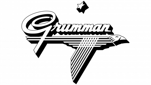
The company’s emblem consists of the corporation’s abbreviated name. The full name is Grumman Aircraft Engineering Corporation. The logo uses only the first word, corresponding to the surname of the main founder, engineer Leroy Grumman.
The name is written in lowercase letters with a large stylized letter G, which looks like an expert aerobatic maneuver of an aircraft. The choice is dictated by the fact that throughout its history, the company actively produced aircraft for the Navy.
Under the name, there is a stylized image of an eagle. Thanks to the intertwining of smooth parallel lines of wings and body, the bird looks more like a techno-genic work of art created by engineering thought. Therefore, the eagle perfectly personifies man-made airplanes and rockets.
At the same time, the eagle received a head reminiscent of a living bird. This technique breathed life into artificial steel structures to demonstrate the improvement of the industry, the development of artificial intelligence, and the use of the latest technologies in creating aircraft.
The smooth and straight lines of the bird’s frame resemble pipes. Initially, the company, founded by Leroy Grumman and his three companions, was welding aluminum pipes for truck frames. Therefore, the technique is a tribute to the founders of the business.
Subsequent contracts with the Navy led to producing parts for aviation (retractable aircraft). Hence the image of a flying bird. After switching to producing airplanes, the company often referred to the animal theme in their names. The most famous series is a cat: Wildcat, Hellcat, Tigercat, Bearcat. Therefore, using a living creature as an identity fully conveys the spirit of the company’s products.
The eagle is a symbol of America and is depicted on the US Navy’s coat of arms. Since all the company’s products were for military use, the bird connects the logo with the main customer and buyer of the company.
At the top of the emblem is a star corresponding to the American flag. The design conveys patriotism and service to the country.
All elements are very voluminous. Their side parts are painted in a dense black, which seems to lift the elements above the surface and place them on a pedestal. The elevation speaks of the quality of the company’s products and its aspiration towards the sky.
1976 – 1994
The company’s name was changed to Grumman Aerospace Corporation. The new emblem communicated the process of modernization and the review of the company’s direction.
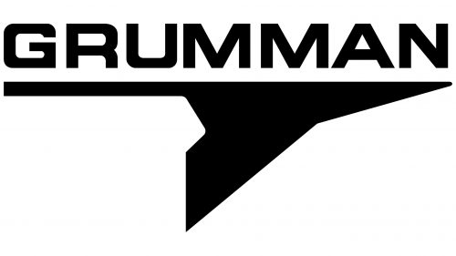
The title, executed in black light and square letters, is full of engineering precision and, at the same time, airiness. The distance between glyphs in letters increases, conveying the idea of flight.
Below the title, like an arrow, a black metallic bird rushes, which is closer in the image to fighter planes than to a living organism. The division that produced light leisure gliders has been sold. The firm focused on producing new jet planes for the Navy and individuals, which the image embodies.
Popular Gulfstream 1 and 2, A-6 Intruder, E-2 Hawkeye, and Grumman EA-6B repeat in their features the emblem’s spread wings and long tail. The last model of the 70s, the F-14 Tomcat, had a completely streamlined metal body, similar to the front part of the logo image.
The sign reads speed and haste. Modern aircraft models carry the company into the future, keeping its name in aviation history.
Font and Colors
The black-and-white elements of the logo embody the synthesis of laws of physics and man-made mechanisms. At Grumman, they have well-studied mechanics and dynamics, which allows their heavy machines to rise into the air and fly. White is a prototype of sky and air, and black is of metal and grease. The colors convey power, strength, and extraordinary gracefulness for steel devices.
The font is similar to Unison Pro Bold. The streamlined elements correspond to the theme of flight and friction reduction.


