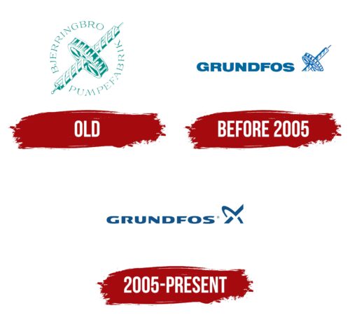
The pump manufacturer uses an abstract logo that alludes to its core business. The Grundfos logo attracts attention with its unusual appearance because the designers combined visual lightness and massiveness, softened lines, and sharp angles.
Grundfos: Brand overview
| Founded: | 1945 |
| Founder: | Poul Due Jensen |
| Headquarters: | Bjerringbro, Denmark |
| Website: | grundfos.com |
Meaning and History
Not so many logos were presented for all the time of the company’s work on the market of the target audience. Moreover, the first was immediately associated with pumping systems, thanks to the bright emblem. The redesign of the logo made it minimalistic. It is his company that is actively used today. In general, the brand’s visual identity is at a high level among the organization’s customers.
What is Grundfos?
This is one of the largest companies in terms of the production of pumping equipment. Every year, millions of people purchase pumping units that are created under this brand.
Old
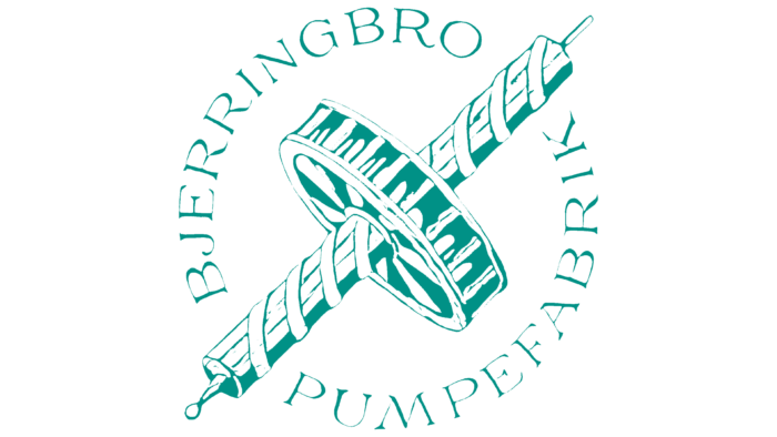
The original version of the logo was introduced in 1953. Interestingly, its basis was the abbreviation “B.P.” It was used for the first two years, but in 1955, one of the employees presented his version to Paul Due Jensen. This logo consisted of a word inscription and an image of the water screw of Archimedes, which was located in the center. Interestingly, this screw was very similar to the inside of the CP centrifugal pump. Diagonally (top left and bottom right) were the words Bjerringbro and Pumpefabrik.
As a rule, all the main elements were made in green on a white background.
before 2005
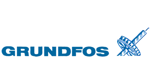
The old Grundfos logo, used until 2005, consisted of two elements: the name of the company and the graphic symbol in the form of an Archimedes water screw. The word was typed in straight letters in upper case. The bold sans-serif resembled Foundation Sans Black Extended by FontSite Inc., Annonce Regular by Canada Type, or their free counterpart ReservoirGrunge Regular by Zetafonts. The typeface was modern and simple, making the lettering legible.
The presence of the Archimedes water screw on the emblem was because Grundfos specializes in the production of pumping systems that are designed to pump liquids. The artists depicted this engineering device in a simplified way, using only two colors: white and dark blue.
2005 – today
The only redesign of the logo resulted in a significant simplification. Archimedes’ water screw has been removed. The basis included a verbal inscription and an emblem, which is located on the right.
The brand name used a classic bold sans-serif font with rounded corners. There is free space between all letters, which makes the inscription more strict and confident.
The company logo visually resembles two orbits intersecting with each other. In sum, this logo element looks like a stylized letter “X.” It looks interesting. Still, it does not associate the logo with Grundfos activities as in the original version.
Font and Colors
The original version of the logo used an elegant serif font with thin lines in the letters. However, the verbal inscription was somewhat lost against the emblem’s background, which was the main element of the logo. After the redesign, the font was replaced with a more businesslike one. Bold sans-serif letters look confident, demonstrating the strength and ambition of the company. Also, they are in harmony with the emblem.
If we talk about the color palette, then in both versions, the company preferred conciseness. Initially, it was green on a white background, but after a redesign, it was changed to blue. Thus, the laconic color scheme does not distract potential buyers of Grundfos products, allowing them to concentrate on the product.
Grundfos color codes
| Medium Electric Blue | Hex color: | #12538a |
|---|---|---|
| RGB: | 18 83 138 | |
| CMYK: | 87 40 0 46 | |
| Pantone: | PMS 7462 C |
