


 GTR Logo PNG
The GT-R logo is a bold, luxurious response to customers’ desire for a dream car with superior performance. It conveys the car’s rapid start, unrestrained speed, and, of course, high status. Like the emblem, the sports car is characterized by luxury, comfort, and impeccable functionality.
The Skyline GT-R heritage influenced the modern Nissan GT-R. Still, the modern GT-R’s history began in 2001, when development of a separate sports car began. The project stayed secret for six years, while engineers worked on a model that could combine high speed, advanced electronics, all-wheel-drive control, and daily usability. The goal was to create a Japanese performance car capable of competing with established European supercars.
The GT-R officially debuted at the 2007 Tokyo Motor Show. Production began at a specialized plant in Kaminokawa, Tochigi Prefecture, where each engine was assembled by hand by trained specialists. From 2008 to 2010, the car received regular updates, with changes focused on acceleration, handling, cooling, stability, and track performance. During this period, the GT-R also drew attention through Nürburgring lap records.
A major revision arrived in 2011, bringing improved aerodynamics and a stronger engine. From 2012 to 2016, the model continued to develop through yearly updates, keeping its core layout while refining electronics, performance settings, and driving behavior. In 2017, the car received a broader refresh with a redesigned front end, a revised cabin, and updated equipment, while preserving the basic formula that had defined the model since launch.
Between 2018 and 2022, limited editions and special versions kept the GT-R active in the market, including NISMO variants aimed at sharper performance. By 2023, the car still followed the concept set during development: supercar-level speed at a lower price than many European rivals. Its body was constructed from steel, aluminum, and carbon fiber. At the same time, careful assembly remained part of its identity as a high-performance sports car.
Meaning and History
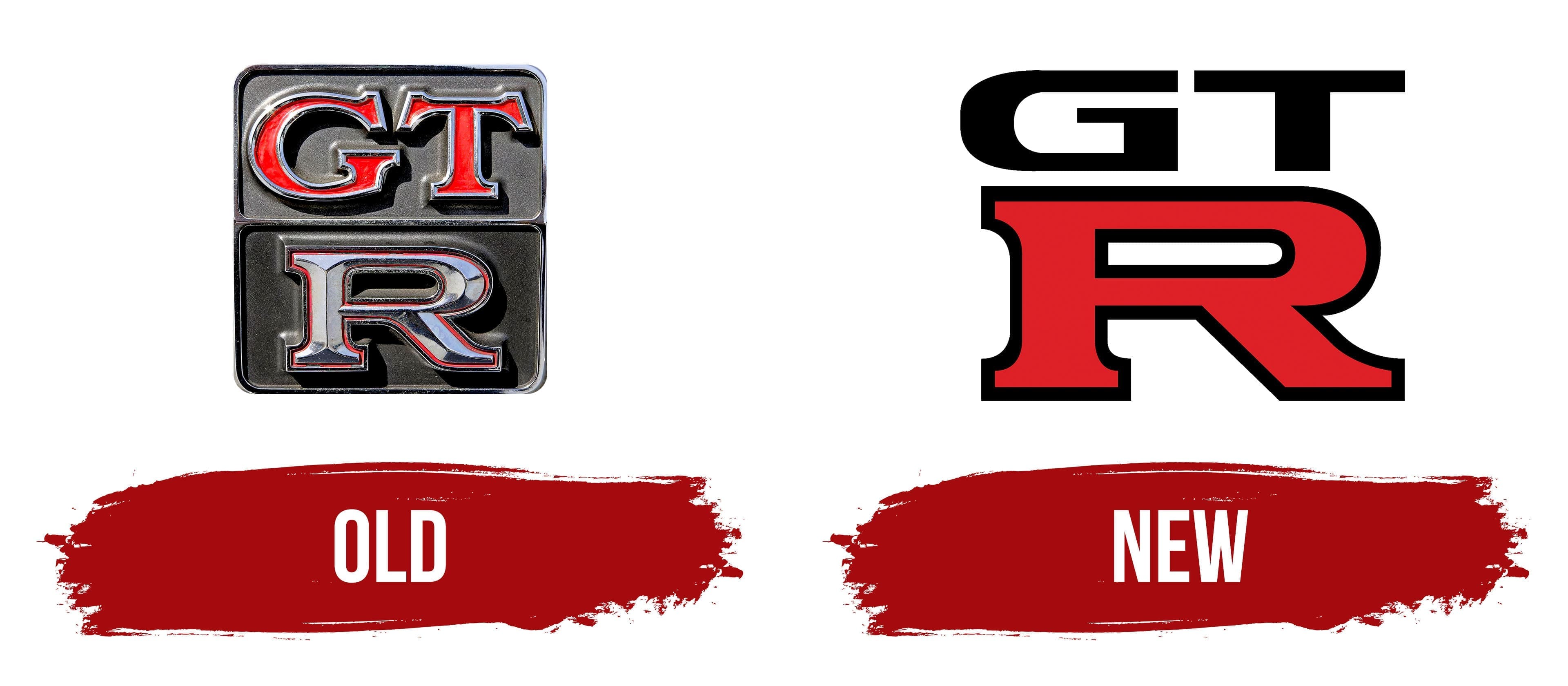
Although the line of new sports cars was introduced in 2007, their large-scale production started two years later. Despite its near-identical appearance to its predecessor, the car is distinguished by its innovation. The same applies to the GT-R logo. According to the in-house designers’ idea, it, like the car, reflects current trends and conveys Japanese culture and historical heritage.
- The logo is made in a strict sports style.
- It emphasizes the car’s aerodynamic characteristics.
- The emblem embodies the sports car’s optimal downforce.
Moreover, the previous logo has been slightly simplified to make it more universal. This symbol is equally well perceived on the car’s body, on different screens, and on banners, regardless of their size.
What is GT-R?
GT-R is a Japanese car brand launched by Nissan in 2007. It includes high-tech sports cars manufactured based on the Nissan Skyline GT-R coupe. The novelty is slightly different from its predecessor, delivering excellent performance on both roads and race tracks. But it is not included in the Skyline series. Unlike old models, the car is sold worldwide.
Old
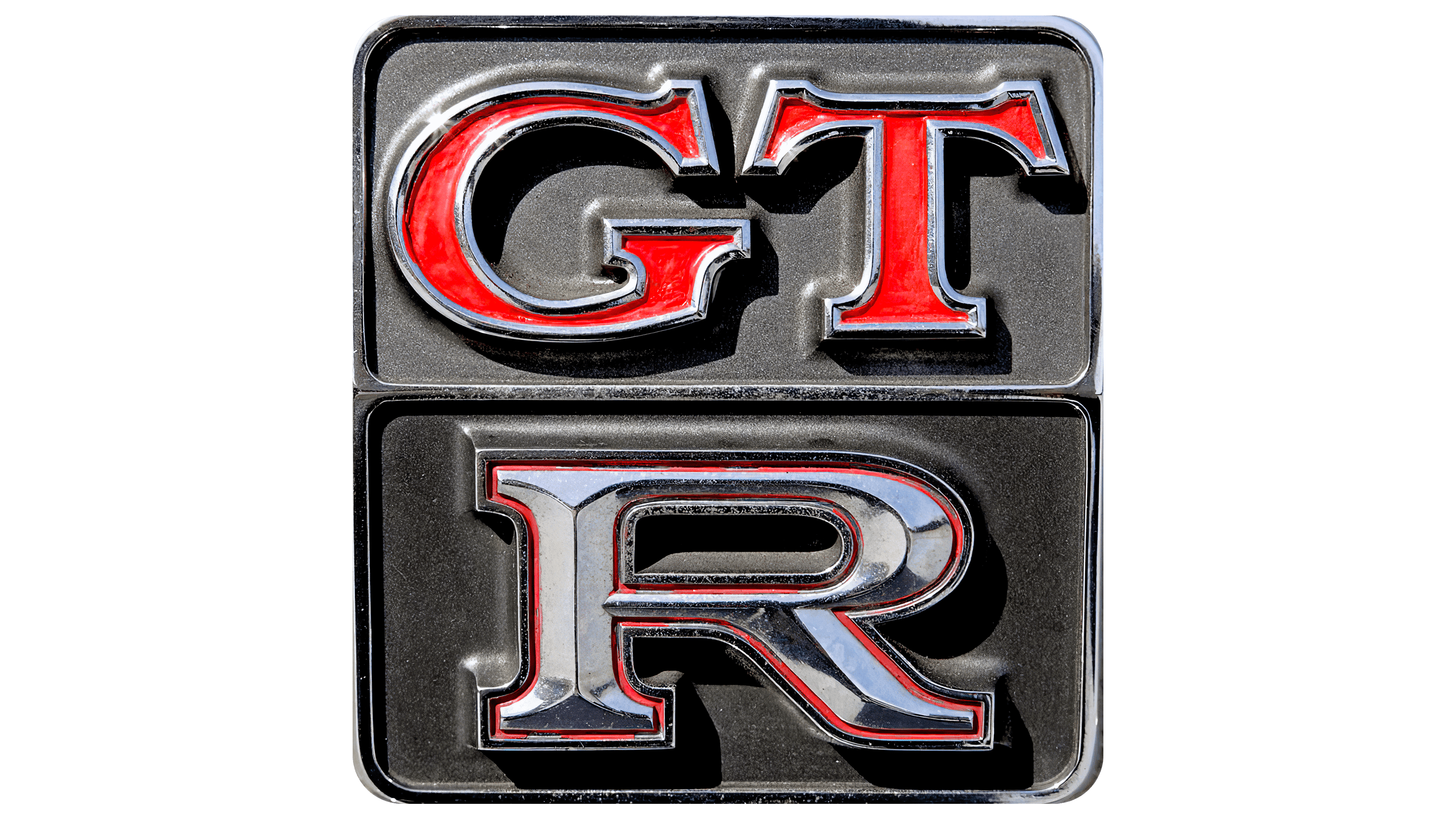
The GT-R emblem is double: it consists of two identical halves, with one common edge in the middle.
- At the top is the abbreviation “GT,” painted red and outlined in silver. Each letter has a clear boundary, so it is visible. They have figurative serifs with raised edges. This makes the signs resemble a gear’s teeth and adds a technical dimension to the logo.
- At the bottom is a single “R.” It is large, uppercase, and wide, matching the size of the two upper symbols. The strip running through the center of the letter visually makes it three-dimensional. The edges are slightly lower, framed with a double frame: silver (outer) and red (inner). The sign itself is painted in gray.
New
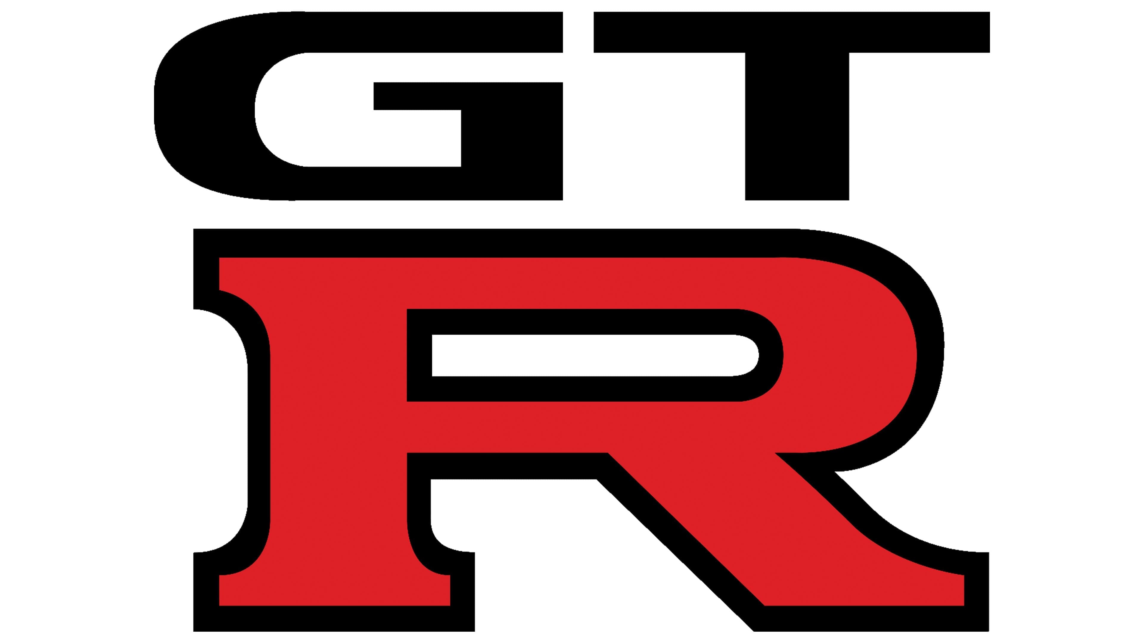
The updated GT-R logo is simple and practical, as it is equally well perceived on all information carriers, including printed flyers and drawn banners. Moreover, simplifying the emblem style is not a tribute to fashion. Two-dimensionality is a technological requirement so potential customers can examine the sign from any distance and on any screen.
The logo is two-tiered but without borders. Nothing confines each line, so the letters are arranged freely yet still structured. The abbreviation at the top is black, and the single symbol at the bottom is red. The “G” and “T” are severely flattened; they have no serifs, which makes them look like geometric shapes. On the other hand, the stretched-out “R” has clearly defined serifs, making it a sophisticated element. It is the largest element in the logo, matching the size of the two top letters.
Font and Colors
Although the GT-R logo is text-based, it does not use typical letters; they are drawn rather than printed. Graphic symbols are made according to an individual project and have an original design that promotes the concept of the automobile company:
- All symbols are grounded (flattened at the top and bottom), which conveys the downforce of sports cars.
- They have a good streamline, demonstrating the cars’ excellent aerodynamic characteristics.
- The perfectly smooth lines of the symbols show how precise the car’s body design is.
The emblem’s corporate palette includes red, silver (for a chrome-plated surface), and black. Together, they form a harmonious combination that reflects the strength, stability, and assertive character of high-speed technology.