


![]() Guinness Logo PNG
Guinness Logo PNG
Like a divine harp playing, the drink’s taste creates an indescribable, vivid sensation. The Guinness logo suggests that the secret to the beer’s success lies in an ancient recipe passed down from generation to generation.
Meaning and History
![]()
In the middle of the 18th century in Dublin, a young brewer, Arthur Guinness, began brewing ale. In December 1759, he rented an abandoned enterprise for 9,000 years and, ten years later, already exported his alcoholic drink to the UK. In 1778, the entrepreneur expanded the range by mastering new technologies and producing dark beer. It has become the main product that Tuinness has dealt with for many years. It produced three varieties: single, double, and export stout.
Gradually, sales increased, and the company became the main supplier of strong dark beer in the Irish and British markets. It went public in 1886, selling an average of 1,138 barrels of beer a year. Moreover, the brewery did not promote its drink in any way (did not engage in advertising), did not offer discounts, and did not run promotions. He was extremely popular in his own right. Then the company survived the difficult wartime period without going bankrupt.
In 1986, Guinness bought Distillers, and in 1997 it merged with Grand Metropolitan to form Diageo. However, due to disagreements, the company remained an independent entity, retaining exclusive rights to the original beer, brand, and trademarks. Now it is a huge beer empire known worldwide. It not only has production sites but also patented technologies that enable it to produce a range of beer styles.
Bottles with the harp logo are highly recognizable and in great demand. The image of a musical instrument appeared on labels in 1862. It is modeled after the Trinity College Harp, the legendary symbol of Ireland since the time of King Henry VIII. The brewery officially registered its emblem in 1875, following the Trade Marks Registration Act. Moreover, her harp is turned not to the left but to the right, which differs from the Irish national coat of arms drawing. There are six versions of the original emblem in total.
What is Guinness?
This brand, owned by Diageo, is regarded as the pinnacle of Irish stout. It produces its unique dark beer at the famous St. James’s Gate Brewery in Dublin. Its distinguishing feature is the renowned stout, known for its rich flavor with hints of roasted barley, coffee, and chocolate, a creamy head, and a deep ruby color. The brand uses a special nitrogen-based dispensing system that creates a velvety texture and a cascading effect. The lineup includes Guinness Extra Cold and Guinness Foreign Extra Stout.
1759 – 1862
During this period, the Guinness brewery did little self-promotion and did not advertise its product, as it was already very popular. The company focused mainly on the assortment and on developing basic and innovative technologies for producing various types of beer. Her logo was later registered under the Trade Marks Registration Act.
1862 – 1995
![]()
The Irish brewery has long used a monochrome stamp-like sign. It was a vertically elongated oval containing a wealth of information, resembling an advertising tool. The graphic elements on it were a harp, a twisted rope with a repeating ornament, and a double frame.
1955 – 1968
![]()
Guinness then approved a minimalistic logo, simplified to a harp on a white background. The musical instrument was detailed to the smallest detail: it repeated the number of strings, shape, curves, and the pattern of the original.
1968 – 1997
![]()
In 1968, the emblem’s designers added the beer brand’s name to the harp but simplified the instrument itself. They made it sketchy, keeping the basic structure rather than the detail. The inscription was bold, large, and made in stencil type with capital letters.
1997 – 2005
![]()
The designers have refined the elegance of the Guinness logo by thinning the inscription while retaining the old serif font. They also restyled the harp, transforming it into a miniature golden badge. To the right and left of the musical instrument appeared the year of the foundation of the brewing company, divided into two parts: “17” and “59”.
2005 – 2016
![]()
This period is characterized by the use of the semi-grotesque instead of Antiqua, although the letters remained uppercase and had the same size as before. Moreover, the designers redrew the harp: they changed the number and thickness of the strings, separated them from the sides, removed the white gap on the upper part of the instrument, and swapped the thin and thick lines on the left side. In addition, they linked the numbers to the brewery’s founding date.
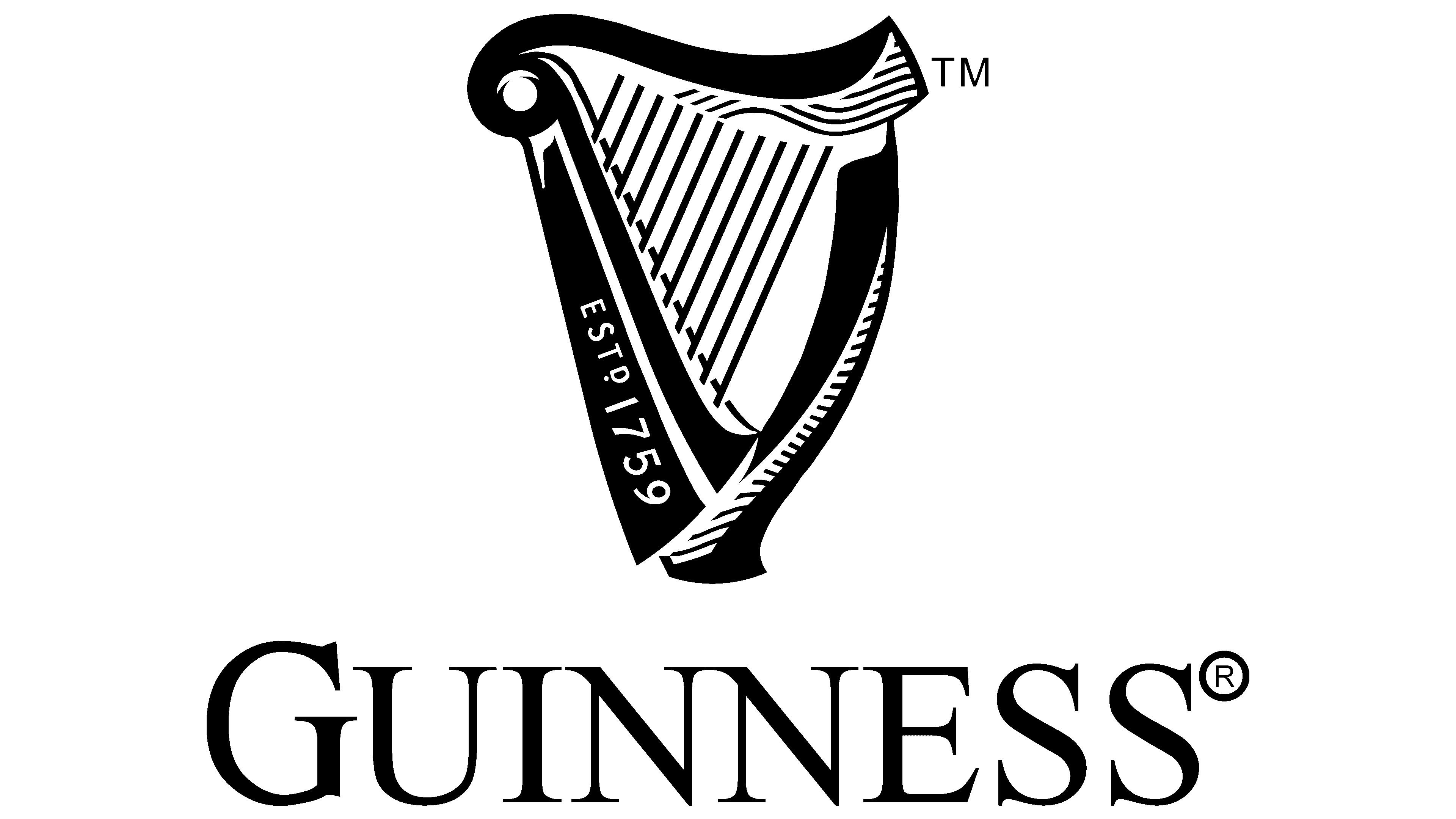
2016 – today
![]()
The logo now features a detailed harp. It has smooth lines, graceful curves, fine shading at the top and right, wide sides, and distinct, evenly spaced strings. The logo’s creators moved the company’s founding year to the left and marked it in white. They kept the name Guinness in black but brought back a full serif typeface.
Font and Colors
Despite the absence of a direct connection between beer and harp, it still exists. Moreover, this is a strong historical trend dating back to the days of Henry VIII, when this musical instrument became a heraldic element and was added to the Irish coat of arms. To distinguish their harp from the national one, the brewery’s management turned it to the left.
The inscription in the Guinness logo is set in the commercial typeface Agenda URW Light, designed by Phil Martin. The closest free font variant to it is Resavska BG Sans Bold. The beer brand’s signature palette consists of golden and black. In the early stages of the emblem’s development, it was dominated by monochrome black and white.