The Haas logo symbolizes movement because its elements are filled with visual dynamics. It also has the hidden power that characterizes powerful race cars, so the American Formula One team shows its determination to win.
Haas: Brand overview
Haas is an American auto racing team. It was created by Gene Haas in 2014 specifically for participation in Formula 1. Initially, it was planned that the team would play its first full season in 2015, but subsequently, the start of the brand’s sports history was postponed to 2016. It is worth noting that the Haas team is actively cooperating with Ferrari. This is evidenced by the use of the engine and gearbox from the legendary Italian brand of cars. The team is based in Kannapolis, USA.
In 2014, Gene Haas, known for his success in NASCAR with Stewart-Haas Racing, started the Haas F1 Team, reintroducing an American team to Formula 1 for the first time since 1986. Haas wanted to make a splash in F1, a sport he had always been passionate about and saw an opportunity to boost the American presence in this global competition.
Choosing not to build his team from the ground up, Haas partnered with Ferrari to get engines and other crucial parts. This move quickly got his team up to speed. The Haas F1 Team made an impressive debut in the 2016 World Championship, with driver Romain Grosjean finishing sixth in their first race and ending the season eighth in the Constructors’ Championship.
However, the road ahead was tough. The team struggled with maintaining speed and reliability and faced other issues that affected their performance. Despite these challenges, 2018 was a highlight year, with the team securing fifth place in the Constructors’ Championship, their best result yet. But this high point was short-lived as the team struggled in subsequent seasons.
In 2021, Haas took a bold step by bringing in two new drivers, Mick Schumacher and Nikita Mazepin, and shifted focus to developing their 2022 car, sacrificing short-term results for future competitiveness.
With new F1 regulations introduced in 2022, Haas aimed to climb back up the rankings and build a strong foundation for the future. The team’s close relationship with Ferrari and investments in infrastructure and talent showed their commitment to competing at a high level.
Despite the ups and downs, Haas F1 has remained a significant player in Formula 1, adding an American element to the sport. Led by Gene Haas and supported technically by Ferrari, the team is working hard to become a competitive force in the future.
Meaning and History
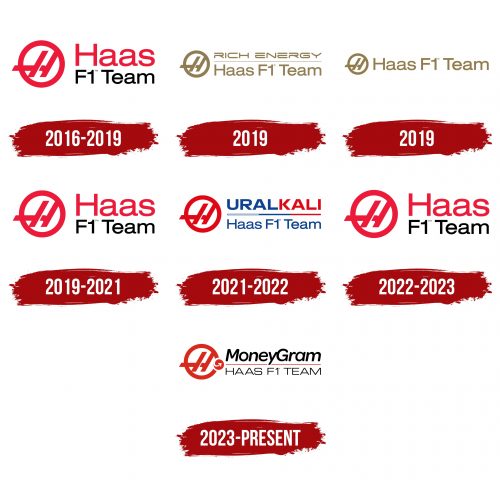
During the relatively short time, the Haas team existed, as many as six variants of the emblem logo were presented. In general, they are as similar as possible to each other, ensuring high visual recognition of the brand. An important component of the team’s popularity is the presence of Mick Schumacher. This is the son of the legendary Michael Schumacher, who in 2013 received a serious head injury.
What is Haas?
This popular auto racing team held its first start in 2016. Enjoys considerable popularity among Formula 1 fans.
2016 – 2019
The first version of the logo was a verbal inscription with the team’s name and an emblem on the left. The title was written in two lines: “Haas” in red letters and “F1 team” in black on the bottom. A classic sans-serif font was used with thin lines in the letters. The inscription is easy to read on any surface.
The emblem was the letter “H” in a red circle. It is worth noting that this symbol had a long horizontal line that went beyond the geometric figure.
2019 (Rich Energy)
The first major redesign took place in 2019. This was directly related to the team’s title sponsor, the energy drink manufacturer Rich Energy. The verbal inscription was also made in two lines. However, the “Haas F1 Team” part was moved down when “Rich Energy” occupied the top part. A golden horizontal line separated them. The word lettering was also done in this shade of yellow.
The inscription directly related to the command used an identical font. The “Rich Energy” part used a modern serif typeface with thin lines in the letters. The lettering style also features empty spaces in some lines, which makes the logo more mysterious.
The emblem remained unchanged, except for the change of color to gold.
2019 (after contract termination)
This version of the logo was completely identical to the previous version. However, the sponsor’s name was removed, and the verbal inscription began to be on one line. Consequently, the emblem was slightly reduced in size. Rich Energy said the contract was terminated due to the team’s poor results. The decision was made before the Italian Grand Prix.
2019 – 2021
At this stage, the team returns to the logo’s original version.
2021 – 2022
Another change in the logo was due to the emergence of a new sponsor, “UralKali.” Consequently, the verbal inscription was again presented in two lines. The name of the sponsor was located at the top. Moreover, the inscription was made in blue and red colors below the name of the team and its affiliation with Formula 1. The color for the bottom line was blue. It is worth noting that between these two elements, there was a horizontal line conditionally divided into three parts: blue, blue, and red. The emblem on the left remained unchanged.
2022 – 2023
After the Russian war against Ukraine started, the Haas team refused to cooperate with the Russian brand Ural Kali. Moreover, she expels the athlete of the aggressor country, Nikita Mazepin, from her team.
As a result, Haas is returning to the classic 2016 logo.
2023 – today
The logo brings together MoneyGram and the Haas F1 Team, symbolizing a strong partnership. The red and white colors of the MoneyGram emblem represent dynamism and passion, which are common to both the financial industry and motorsport. The round shape with an “H” and the addition of an arrow pointing at MoneyGram suggest that the team’s future is promising with such a sponsor.
The “HAAS F1 TEAM” is written in a plain, sharp font, emphasizing reliability and ease of understanding. The “MoneyGram” words use a heavier and bolder font, signaling the team’s power and steadiness. The black color of the words stands for bravery and elegance, and the red line accentuates the team’s racing roots while separating the two entities.
The Haas F1 Team’s history is tied to a constant drive for innovation and competition. The partnership with MoneyGram promises new growth and innovation opportunities, captured in the logo’s design, which balances stability with agility and reliability with forward-thinking.
Font and Colors
Word inscriptions at all company development stages used a classic sans-serif font with thin lines in letters. Perhaps the exception is the period when Rich Energy sponsored the team. An elegant font with serifs and empty spaces in the symbols was used for the name of this brand. The name “Haas F1 Team” is easy to read in all logo variations, and its visual recognition is high.
The team chose a red and black color palette, which was used in most cases. The exceptions were those periods when Haas had sponsors. For example, in collaboration with “Rich Energy,” a golden shade of yellow was used.
FAQ
Is Haas with Ferrari?
The Haas F1 Team is strengthening its partnership with Ferrari, a move described by team owner Gene Haas as crucial for improving their performance in Formula 1. This closer relationship with Ferrari, a team known for its long history of success, is expected to benefit Haas greatly. They plan to use Ferrari’s rich experience, advanced technology, and resources to better face the challenges of Formula 1. This collaboration, which includes technical and engineering support, is aimed at boosting Haas’s capabilities, helping them compete more effectively on the world stage.
What brand is Haas F1 Team?
Starting in the 2023 season, the Haas F1 Team entered into a major partnership with MoneyGram, which included naming the team the MoneyGram Haas F1 Team. This deal opens a new chapter for Haas, aiming to increase its visibility and support its goals in the competitive world of Formula 1. Along with MoneyGram, Haas has also teamed up with Chipotle Mexican Grill, adding another notable brand to its list of collaborations.
These partnerships are part of Haas’s strategy to work with globally recognized brands, helping to boost its competitive position and attract more fans. The deal with MoneyGram highlights a mutual commitment to excellence and innovation. The Chipotle partnership aligns the team’s and the brand’s values, aiming to connect with and excite fans worldwide. As Haas gears up for the 2023 Formula 1 World Championship, these collaborations are expected to contribute significantly to the team’s growth and success.
What car brand is Haas F1?
The Haas F1 Team, also known as the MoneyGram Haas F1 Team, is an American team that competes in Formula 1, using engines supplied by Ferrari. The team joined the Formula 1 World Championship in 2016, marking the arrival of a new American player on the international motorsport stage. While the team has not won championships, it has achieved notable results, including a best-race finish of 4th place.
The partnership with Ferrari is key to Haas F1’s approach. Ferrari, a legendary name in Formula 1, gives Haas a competitive advantage with its high-performance engines and technical support. This collaboration highlights Haas’s strategy of using top-notch resources to improve its performance in the competitive Formula 1 racing world.
The Haas F1 Team combines American innovation with Italian engineering prowess, aiming to leave its mark in the sport. Supported by partners like MoneyGram and equipped with Ferrari’s engines, Haas is focused on climbing the ranks in Formula 1.
Who owns F1 Haas Russian?
The Haas F1 Team is owned by Gene Haas, an American entrepreneur and the founder of Haas Automation, North America’s largest CNC machine tool builder. Gene Haas is also known for his involvement in motorsports, particularly through the NASCAR series with Stewart-Haas Racing. Dmitry Mazepin, a Russian businessman, has no ownership in the Haas F1 Team. His connection to the team came through his son, Nikita Mazepin, who was a driver for Haas until early 2022. Following Russia’s invasion of Ukraine in March 2022, Dmitry Mazepin was sanctioned by the European Union and the United Kingdom. Despite being one of Russia’s wealthiest individuals, as noted by Forbes, with an estimated $800 million in 2021, Dmitry Mazepin’s financial status and sanctions have no bearing on the ownership or control of the Haas F1 Team.
What is the Haas F1 Team motto?
For the current season, the Haas F1 Team has chosen “We The People” as its motto, inspired by the first line of the American Constitution. This motto is more than just a slogan; it captures the essence of being the only American team in Formula 1. It highlights Haas’s pride in American heritage and values, setting the team apart on the international Formula 1 stage.
It’s choice of “We The People” as its motto is significant, especially now that the role of American teams in Formula 1 is a hot topic. It reaffirms Haas’s status as an American team and aligns with values like unity, democracy, and resilience, key to the American spirit. This move aims to rally American fans and supporters, strengthening Haas’s connection to its American roots while competing in the intense world of Formula 1 racing.
What is the Haas F1 Team vision?
The Haas F1 Team aims for excellence in Formula 1 racing, with a big goal: to win World Championships and races. This isn’t just about the team’s success; it’s also about raising the profile of their sponsors and making a positive contribution to Formula 1. The team believes in tackling the sport’s challenges with creativity, honesty, and integrity. They value teamwork; these core principles help them design and build top-notch race cars.
Haas F1 focuses on innovation and ethical behavior to stand out in the competitive world of Formula 1. They’re committed to success and hold themselves to high ethical standards. This approach helps them aim high in the rankings and leave a mark on the sport.
Why does Haas have an F1 team?
Gene Haas, the founder of the Haas F1 Team, entered Formula 1 not just for the excitement of racing but also to promote his business, Haas Automation, the leading CNC machine tool builder in North America, on a global stage. His involvement in motorsports extends to NASCAR, where he runs a successful four-car team, Stewart-Haas Racing. This experience in racing has given him insights into sports management and marketing.
By starting the Haas F1 Team, Haas aimed to use Formula 1’s worldwide popularity to boost his company’s visibility and reputation internationally. Formula 1, with its sophisticated global audience, offered a perfect platform to highlight the Haas brand’s commitment to innovation, precision, and high performance, aligning with the values of the machining industry.
Through the Haas F1 Team, Gene Haas has created a link between manufacturing and high-speed racing, using Formula 1’s excitement and global reach to promote his machining business. This strategy has helped make Haas a recognized name in motorsport and global industrial and manufacturing sectors.

