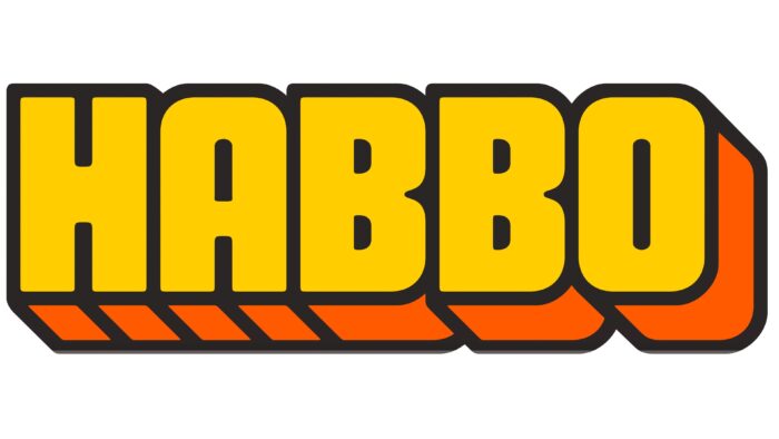
A large number of users and many topics for correspondence demonstrate the Habbo logo. The emblem is permeated with interpersonal connections and pleasant communication that brings joy. The sign also hints at the cartoon characters living in the villages.
Habbo: Brand overview
| Founded: | 2000 |
| Founder: | Sulake |
| Headquarters: | Finland |
| Website: | habbo.com |
Meaning and History
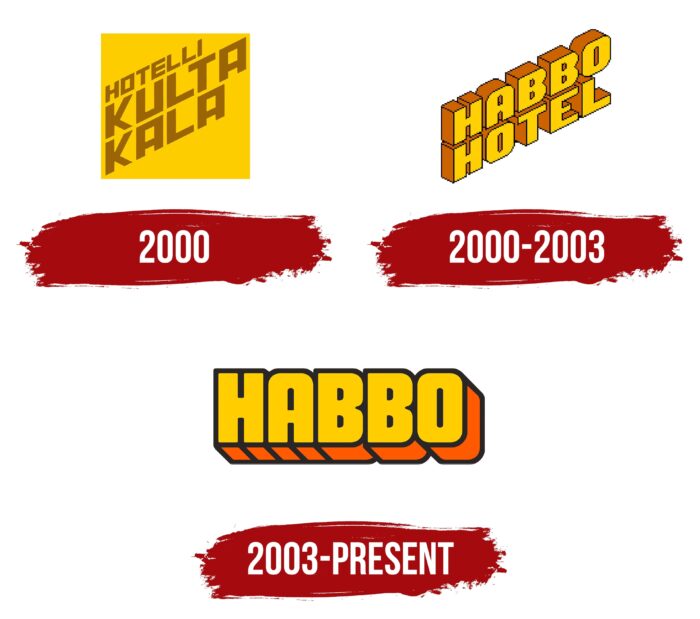
The social network logo has changed only twice during its operation on the market. Unlike most competitors, 3D letters were used to create a visual identity. They made it possible to distinguish the company, to attract the attention of the target audience, which by and large consisted of young people, communicating with them in the same language.
What is Habbo?
First of all, it is a resource for communication. It does not matter where the loved one is because, with the help of such social networks, the user will always have the opportunity to write what is important.
2000
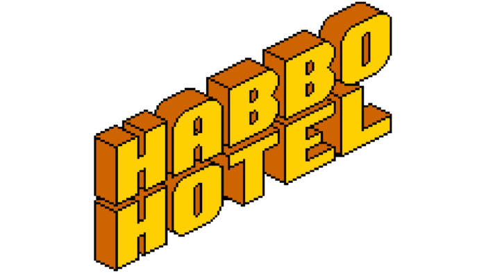
2000 – 2003
The first version of the logo consisted of three-dimensional letters turned left. The inscription consisted of capital letters in bold sans-serif type. Yellow was chosen as the main color. However, the orange shadow in 3D space occupied more than half of the total volume. A black outline was used to create a sense of volume. At the same time, it was not based on straight lines but consisted of many roundings. Visually, the logo resembled the icons of games that were actively released on game consoles. Interestingly, for the first three years, the verbal inscription consisted not only of the word “HABBO” but also of the word “HOTEL” at the bottom. There were no additional elements on the logo.
2003 – today
In 2003, it was decided to redesign the logo. The changes made it simpler but at the same time modern, close to the realities of that time. The word “Hotel” was removed from the name. However, the letters in “Habbo” were no longer angled towards the audience. Consequently, even though the three-dimensional effect was preserved, it became less noticeable than the previous version.
The color palette used is identical. Basic yellow color and black outlines to create volume. At the same time, it was decided to use gradient tones, which made the logo easier to read.
The font for writing characters became more stylish; all letters were a single element since they did not have spaces between them. Visually, looking at the logo, one feels that the main message for the target audience is the positive emotion that they will receive from communication within Habbo.
Since 2003, an icon has also been used for social networks. It features a bold “H” with rounded corners on a black background.
Font and Colors
The logo was created using a three-dimensional effect with a bold sans-serif typeface with rounded corners.
Yellow was used as the main color. However, with the help of the gradient, a feeling of the dominance of orange was created. A non-standard logo, like for a social network, was supposed to attract potential users.
Habbo color codes
| Tangerine Yellow | Hex color: | #ffcd00 |
|---|---|---|
| RGB: | 255 205 0 | |
| CMYK: | 0 20 100 0 | |
| Pantone: | PMS 7548 C |
| Mystic Red | Hex color: | #e3d4ad |
|---|---|---|
| RGB: | 255 90 0 | |
| CMYK: | 0 65 100 0 | |
| Pantone: | PMS Orange 021 C |
| Raisin Black | Hex color: | #2a2525 |
|---|---|---|
| RGB: | 42 37 37 | |
| CMYK: | 0 12 12 84 | |
| Pantone: | PMS Neutral Black C |
| Wenge | Hex color: | #635b5d |
|---|---|---|
| RGB: | 99 91 93 | |
| CMYK: | 0 8 6 61 | |
| Pantone: | PMS 411 C |
