


![]()
The Australian organization Habilis, which works with people suffering from chronic mental disorders, has introduced a renewed visual system created by the agency Biggie. Habilis aims to help residents find housing, regain control over their lives, and break the closed cycle of homelessness, hospitalizations, and isolation. The first center opened in the Sydney suburb of Summer Hill and became home to those who had been marginalized for decades.
The name Habilis has Latin origins and translates as “skilled” or “capable.” The name’s concept is tied to the organization’s mission: to create conditions that enable individuals to utilize their potential despite a diagnosis. The program helps people with severe illnesses, including schizophrenia, regain stability and independence.
![]()
The previous Habilis logo looked simplified. It included a schematic image of a house with a red arrow symbolizing shelter and hope. However, the execution appeared random: proportions were distorted, and the image did not convey either the scale of the organization’s work or its significance to society.
The new visual language is based on the monogram “H,” assembled from fragments. Its form reflects the instability faced by people with severe diagnoses and symbolizes the process of recovery. The scattered parts come together to form a whole, showing the path from crisis to balance. The mark has become a symbol that is both understandable and emotional.
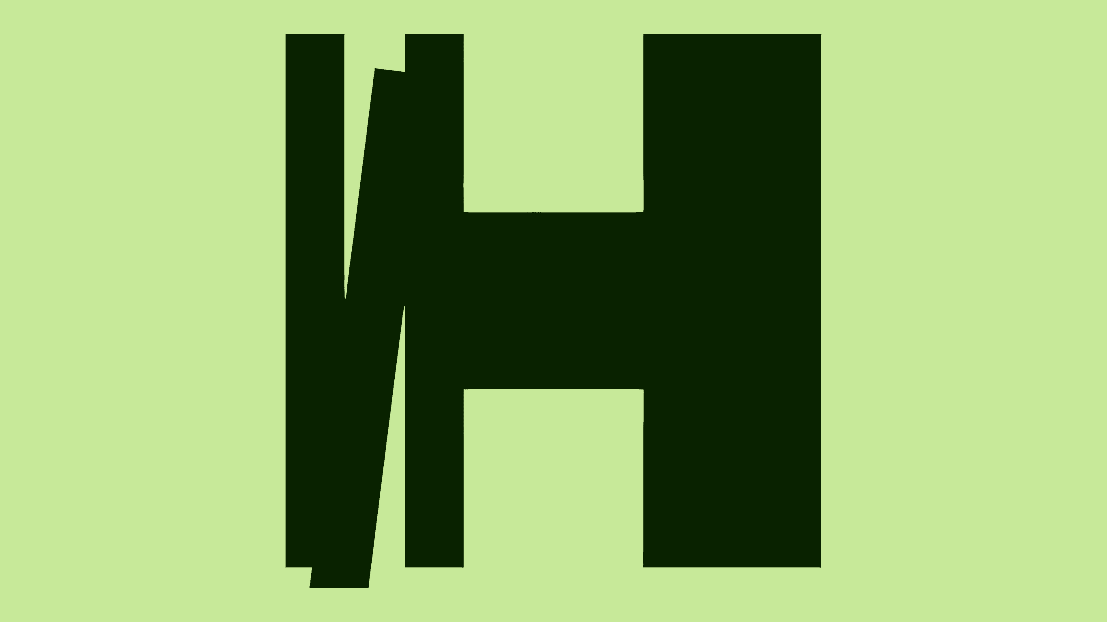
The strict geometry of the DuGrotesk typeface balances the dynamics of the monogram. The dark green palette of the logo is linked to the architecture of Habilis residential centers, where natural materials and earthy tones are used. This shade reinforces the impression of calm and stability.
The photographic style has evolved into a distinct direction. Projects use portraits of residents without artificial staging. The same person may be shown in different emotional states. The connection with the monogram is expressed through a method that serves as a reminder: personality consists of many facets, and Habilis’s task is to help bring them together into a whole.
![]()
The communication system has become convenient. Messages are written in clear language so they can be equally well understood by residents, their families, social service workers, and government representatives. They build trust and make interaction easier.
The identity does not seek to be a bright advertising shell. It was created as a tool that reflects Habilis’s real work. The visual language helps the organization strengthen its authority and expand the network of centers offering housing and support to those who have lived in isolation for many years.