


![]() Haikyuu Logo PNG
Haikyuu Logo PNG
Leap to Dream depicts the Haikyuu logo. The road to the top is never easy. On the way to your desires, you will have to overcome sheer cliffs and steep mountains. The emblem shows tenacity, unusual plot twists, and love for volleyball.
Haruichi Furudate was born on March 7, 1983, in Karumai, Iwate Prefecture. In school, he played volleyball and later turned that experience into the basis for “Haikyu!!” In 2008, Furudate’s one-shot King Kid received an honorable mention at the Jump Treasure Newcomer Manga Prize. In 2010, Weekly Shōnen Jump published his first full series, Philosophy School, Yotsuya Sensei’s Ghost Stories.
The first “Haikyu!” оne-shot appeared in Jump NEXT! on January 8, 2011, followed by another in Weekly Shōnen Jump on April 25. Reader response led Shueisha to approve a full series. Haikyu!! began weekly serialization on February 20, 2012. Its title comes from an old kanji term for volleyball, meaning “strike the ball.” At the time, Kuroko’s Basketball was growing alongside a more sports-oriented magazine. Haikyu!! moved in another direction, focusing on realistic volleyball mechanics, teamwork, and player psychology.
Professional volleyball players later praised the manga for its accuracy. In April 2014, Production I.G. launched the anime adaptation on MBS. The first 25-episode season expanded the audience and sharply increased manga sales. Season 2 arrived in October 2015, and season 3 followed in October 2016, focusing entirely on Karasuno’s final match against Shiratorizawa.
In 2016, Haikyu!! won the 61st Shogakukan Manga Award in the shōnen category. By December 2016, circulation had passed 24 million copies. The fourth season, Haikyu!! To The Top began in January 2020. The manga ended on July 20, 2020, with chapter 402 and 45 volumes. In February 2024, “Haikyu!! the Movie: Decisive Battle at the Garbage Dump” opened in Japan. By December 2025, the manga’s circulation had passed 75 million copies.
Meaning and History
![]()
Haruichi Furudate wrote the original manga. It was he who invented and illustrated forty-five volumes of tankobon. Most likely, this same person chose “Haikyuu !!” as such an unusual name. It translates to “volleyball” in Japanese, but in everyday speech, no one ever calls this sport “haikyuu.” The Japanese themselves use another word for volleyball: “bare-bo-ru.”
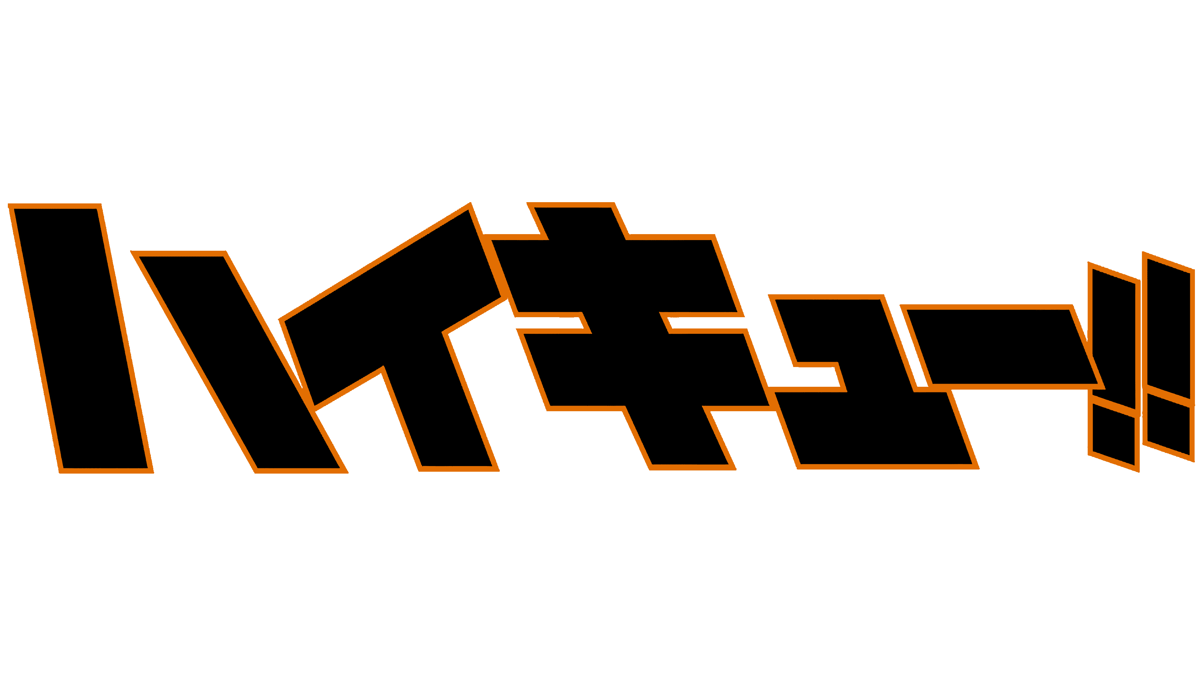
On the media franchise’s main logo, the name is written in Japanese katakana: “ハ イ キ ュ ー.” It turns out this phrase can be divided into two parts: “ハ イ” and “キ ュ ー.” In Japan, it is only indirectly related to volleyball. The first word was borrowed from English. It is derived from “high,” has the same meaning, and reads “hai.”
What is Haikyuu?
Haikyuu is a story about a teenager who dreams of a successful volleyball career despite his short stature. He forms a school team and competes in tournaments, overcoming all challenges. The original plot is laid out in a Japanese manga created by Haruichi Furudate. It began serialization in 2012, and two years later, an anime series was produced based on it. Later, a collection of additional films featuring the same main characters was released.
The second word represents the complex kyu (級) character written in katakana. The Japanese use this alphabet to simplify the text, especially on minimalist signs or emblems. “キ ュ” denotes the discharge that a person has achieved in his type of activity, and the symbol “ー” must be pronounced as an elongated sound; that is, the correct sound will not be “kyu,” but “kyuu.” It turns out that the manga’s title literally translates to “high level.”
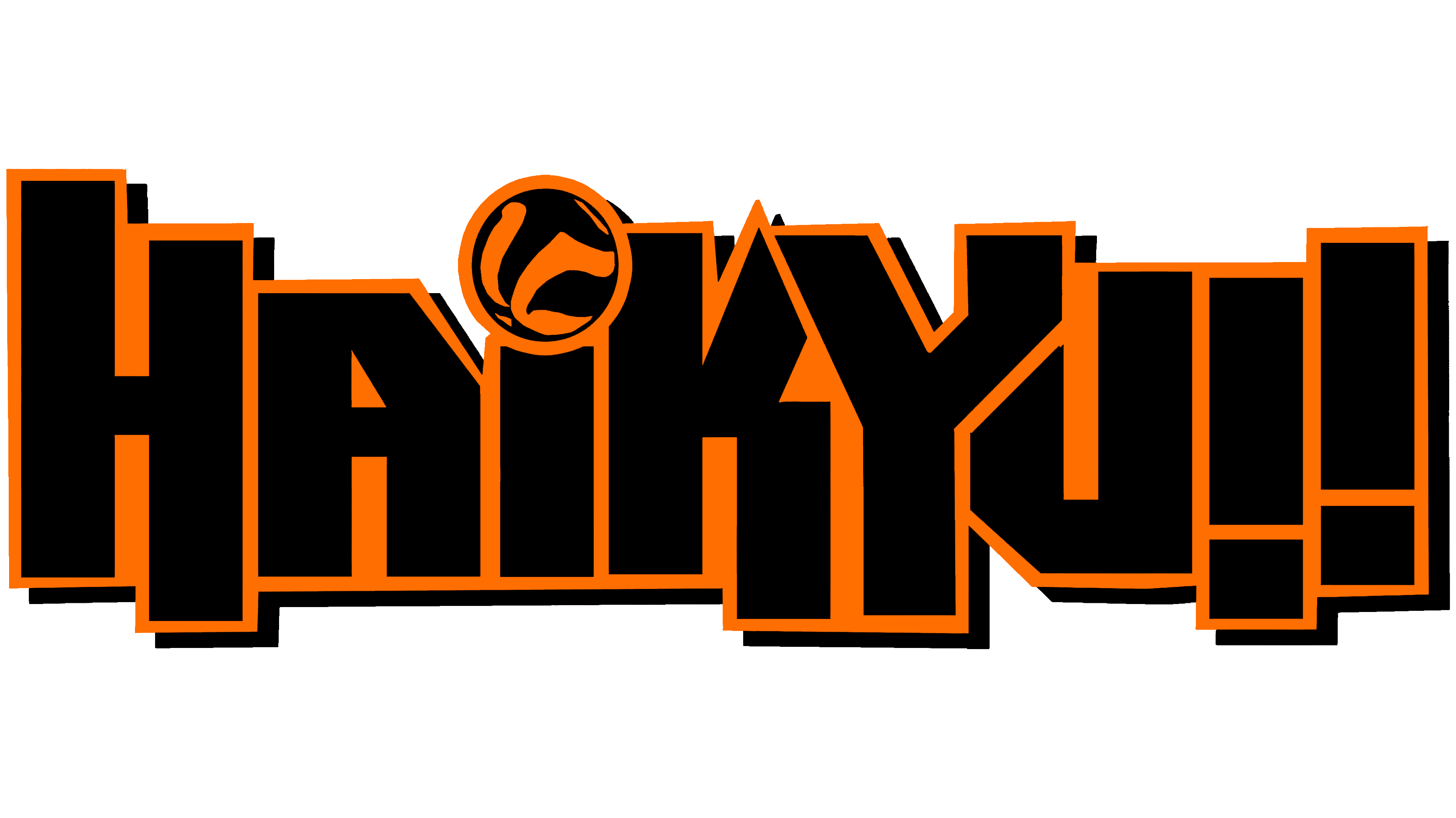
For English-speaking fans, “Haikyuu!!”, there is a version of the logo in a language they understand. The English lettering is designed in the same style as the Japanese one: each element consists of wide black rectangular stripes. Only in the original is the orange edging much thinner than in the adaptation.
The English symbol of the media franchise is smoother. Letters and exclamation marks are not slanted, and almost all lines are vertical, except for a few crossbars and diagonals. Some stripes extend beyond the bottom of the line. Above the “i,” instead of a dot, there is an orange-and-black ball. The “i” is assumed to be lowercase, although the rest of the letters are in uppercase. This version of the logo features additional black shadows, making the word appear to hang in the air.
The Japanese icon “Haikyuu !!” contains the manga’s title in the original language. It is written in the katakana alphabet to be read by those who do not know complex hieroglyphs. As for the English emblem, this is an adaptation made for foreigners. A new element has been added: a volleyball associated with the story’s plot.
Font and Colors
The main logo, “Haikyuu!!”, is a sample of Japanese calligraphy, somewhere between semi-italic and regular type. Although the styles are not identical, the typeface is close to the Greco family. The English name of the manga and anime is written in a font vaguely reminiscent of Fontalicious’s Dimitri. The letters are bold and sans serif but with irregular proportions.
But the color scheme for both emblems is the same. The black symbols are surrounded by contrasting orange lines that emphasize their strict geometric shape.