The Hainan Airlines logo elegantly captures the essence of the airline and its deep roots in Hainan Province, China. Known for its commitment to quality and service, the emblem represents the airline’s effort to connect China with the world, reflecting its broader ambitions in the global aviation market. The design draws inspiration from Hainan’s natural beauty and rich cultural heritage, known for its scenic landscapes and vibrant local traditions. This symbol embodies the spirit of hospitality and its promise to open new horizons, effectively showcasing the airline’s role as an ambassador of Chinese culture on the international stage.
Hainan Airlines: Brand overview
Hainan Airlines, headquartered in Haikou, Hainan province, is China’s largest privately owned airline. Established in 1989, it provides domestic and international scheduled services. Hainan Airlines has operated approximately 200 aircraft, making Haikou Meilan International Airport its hub, connecting it to over 100 domestic cities and numerous international locations.
This airline’s vast network extends to regions such as North America, Europe, Southeast Asia, South Korea, Japan, and Australia, enabling connections from various Chinese cities. Notably, Hainan Airlines became China’s first member of the SkyTeam alliance in 2011.
The airline expanded its global footprint in 2016 when it acquired a stake in Azul Brazilian Airlines, solidifying its presence in South America. Hainan Airlines is part of the larger HNA Group, which owns or holds shares in several other Chinese airlines, including Capital Airlines.
Hainan Airlines has a well-earned reputation for exceptional service, as attested by the numerous awards it has received. The airline features personal in-flight entertainment across all cabin classes. When considering revenue and fleet size, Hainan Airlines is the fourth-largest airline in China, following the ‘Big Three’ state-owned airlines. The company employs around 25,000 people across its various airline and ancillary businesses.
Meaning and History
What is Hainan Airlines?
It is a major Chinese airline headquartered in Haikou, Hainan. It operates an extensive network of domestic and international flights, connecting China to destinations in Asia, Europe, North America, and other regions. Known for its high standards of service and safety, it offers various classes of service, including economy, business, and first class. The airline is known for its modern fleet, comfortable seats, and quality in-flight amenities.
1989 – 1993
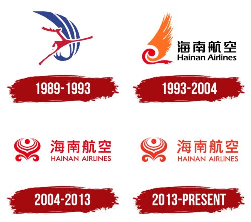
From 1989 to 1993, the company’s first emblem effectively showcased its connection with local features and culture. The logo included a wave crest formed by three blades, symbolizing the carrier’s geographic position—operating on islands surrounded by the sea. This element highlighted the sea’s importance to the region and its role in the company’s operations.
The background featured a stylized sail with a leaping deer, alluding to the famous attraction in Hainan Province, the “Luhuitou” park, which translates to “deer turning head.” This name relates to a nearby mountain and bay, emphasizing the deep ties with the island’s native people and their culture. This symbolic deer image provides a unique visual identity and deeply integrates with local history and mythology.
The emblem’s integration of sea waves and the deer suggests that the company’s airplanes act as a bridge to the wonders and attractions of Hainan. It reflects the company’s reverence for historical roots and the rich history of its homeland.
The depiction of the deer in mid-leap was intentionally chosen to position the company as dynamic and agile, similar to a deer swiftly crossing sea expanses. This imagery communicates the speed and elegance of the company’s flights. The brand engages with its audience through visual symbols instead of text captions, enhancing its global recognition and memorability.
1993 – 2004
When Hainan Airlines became the first joint-stock air transport company, it introduced significant changes in corporate branding to reflect its new ambitions and broader operations. As it started operating regular flights, the company unveiled a second logo, distinct from its original, underscored by using Chinese and English names, symbolizing its global reach.
The new logo features a bird-ship image representing the Fenghuang, or phoenix, a mythical creature considered in Chinese culture to embody the highest celestial elements. This symbol, with its wings spread in readiness for flight, mirrors the company’s strategy for growth and expansion.
The Phoenix was selected for its symbolic connections to celestial bodies in Chinese culture, where each part of its body holds specific symbolism:
- The wings represent wind, which is necessary for flight.
- The eye, associated with the sun, lights the path.
- The head symbolizes the sky, the primary arena for flight.
These elements highlight the nature of the airline’s activities and align with Hainan Airlines’ aspirations and direction.
In Chinese culture, the phoenix symbolizes good fortune and prosperity, enhancing the company’s focus on success. The logo’s visual representation of the phoenix aligns with natural forces and favorable conditions for the company’s growth, signifying its ambition to lead in the aviation industry.
2004 – 2013
As the fourth largest airline in China, Hainan Airlines has strategically chosen the magical peony flower as its new brand symbol—a national emblem. This choice reflects the peony’s associations with prosperity, greatness, and renewal. In the new logo, four peony petals wrap around a core depicting the sun, symbolizing light and life.
Each petal in the logo design represents one of China’s leading airlines, highlighting Hainan Airlines’ central role in the country’s aviation industry. The gradual unfolding of the flower visually forecasts the company’s continuous growth and flourishing future. The depiction of this flowering process metaphorically conveys the company’s commitment to evolve and provide passengers with quality flights.
The logo’s color scheme is entirely red, which is significant in Chinese culture. In China, red is a traditional symbol of luck, prosperity, and wealth. It represents leadership, energy, and dynamism, qualities that align with those of a growing and actively developing company. This color choice emphasizes Hainan Airlines’ aim to lead in the aviation industry while honoring deeply rooted traditions and values.
The larger characters in the logo emphasize the company’s dominance in China’s domestic airspace, highlighting its role as a major national carrier that offers extensive and quality services to its passengers.
2013 – today
After earning Skytrax’s highest award of five stars, the company updated its logo to reflect its achievements. The original red, symbolizing luck and wealth, was changed to orange. In Chinese culture, orange represents luck, happiness, and abundance, matching the airline’s new status.
Orange was chosen for its associations with warmth, joy, and positive energy. The airline aims to convey these qualities to passengers in every aspect of its service. This color highlights the company’s commitment to passenger care, comfort, and top-level service. It effectively communicates the airline’s high standards, focusing on personalized service and quality.
The airline’s switch from red to orange reflects its evolution. Red symbolizes past successes and traditions, while orange represents a vibrant, forward-looking vision. This change underscores the company’s dynamic nature and adaptability in a competitive industry.
The new orange logo embodies the airline’s refreshed brand identity. It conveys a welcoming atmosphere, ensuring passengers feel valued and appreciated. The color change signifies a commitment to enhancing the travel experience, making it enjoyable and memorable.
Furthermore, the orange logo reinforces the airline’s focus on exceptional service. It signals a renewed dedication to maintaining high standards and exceeding passenger expectations. This choice emphasizes the airline’s promise of a personalized approach, ensuring each passenger’s journey is comfortable and delightful.


