


 Hanes Logo PNG
The Hanes logo attracts attention due to its brightness, which combines restraint and originality. It blends presentability with aesthetic beauty, highlighting the company’s stability and commitment to tradition while remaining relevant in modern conditions. This logo creates a sense of harmony in colors and style, making it classic and contemporary.
The Hanes emblem exhibits a dynamic quality that perfectly complements its static and concise nature. This makes the brand easily recognizable and impossible to confuse with others. Such an effect is achieved by preserving key elements of the past, enhanced with original present features. The logo is timeless, remaining authentic and unique across eras.
Particular attention is drawn to the color scheme, which has remained unchanged since the first logo. This color choice allows different generations to instantly recognize their favorite brand. The geometric background shape, positioned horizontally, creates an impression of movement, adding a visual effect of rotation. The elegant letters, arranged in rows, emphasize integrity and unity, making the Hanes visual sign a consistent symbol of quality and reliability.
Hanes began in Winston-Salem, North Carolina, in 1901, when John Wesley Hanes founded Shamrock Knitting Mills to produce men’s knitted underwear. The company added socks in the 1910s, expanded its factories and national advertising in the 1920s, and entered women’s underwear during the 1930s. It also introduced double-layer fabric for added warmth and comfort. During World War II, production shifted toward underwear and socks for US troops.
Postwar growth brought stockings and pantyhose, including L’Eggs in 1965, sold in plastic egg-shaped packaging. During the 1970s and 1980s, Hanes moved into T-shirts, sportswear, and overseas production. Consolidated Foods, later renamed Sara Lee Corporation, acquired the business in 1979 and supported a wider product range and distribution network.
The 1990s brought performance fabrics, seamless underwear, and celebrity-led advertising. In 2006, Hanes separated from Sara Lee and became Hanesbrands Inc., an independent public company. Acquisitions followed, including Gear For Sports in 2010, Maidenform Brands in 2013 and Australian underwear producer Pacific Brands in 2016, extending the company’s presence in sportswear and underwear.
During 2021 and 2022, Hanes expanded online sales, adjusted its supply chain and increased its focus on sportswear as demand for casual clothing grew. By 2023, its portfolio covered underwear, socks, T-shirts, hosiery and athletic apparel across domestic and international markets.
Meaning and History
What is Hanes?
This is a well-known American clothing brand specializing in casual wear and underwear. The company produces a wide range of products, including socks, t-shirts, underwear, and casual clothing for children and adults. The popularity of the products is explained by their excellent balance of comfort, affordability, and durability. In addition to retail locations, the brand maintains a strong presence in online sales both in the US and abroad. Over the years, the brand has expanded its range by adding sportswear, shapewear, and even face masks. The focus is on functional, comfortable clothing, but the brand periodically collaborates with designers and celebrities to create limited-edition collections, adding interest to its core line.
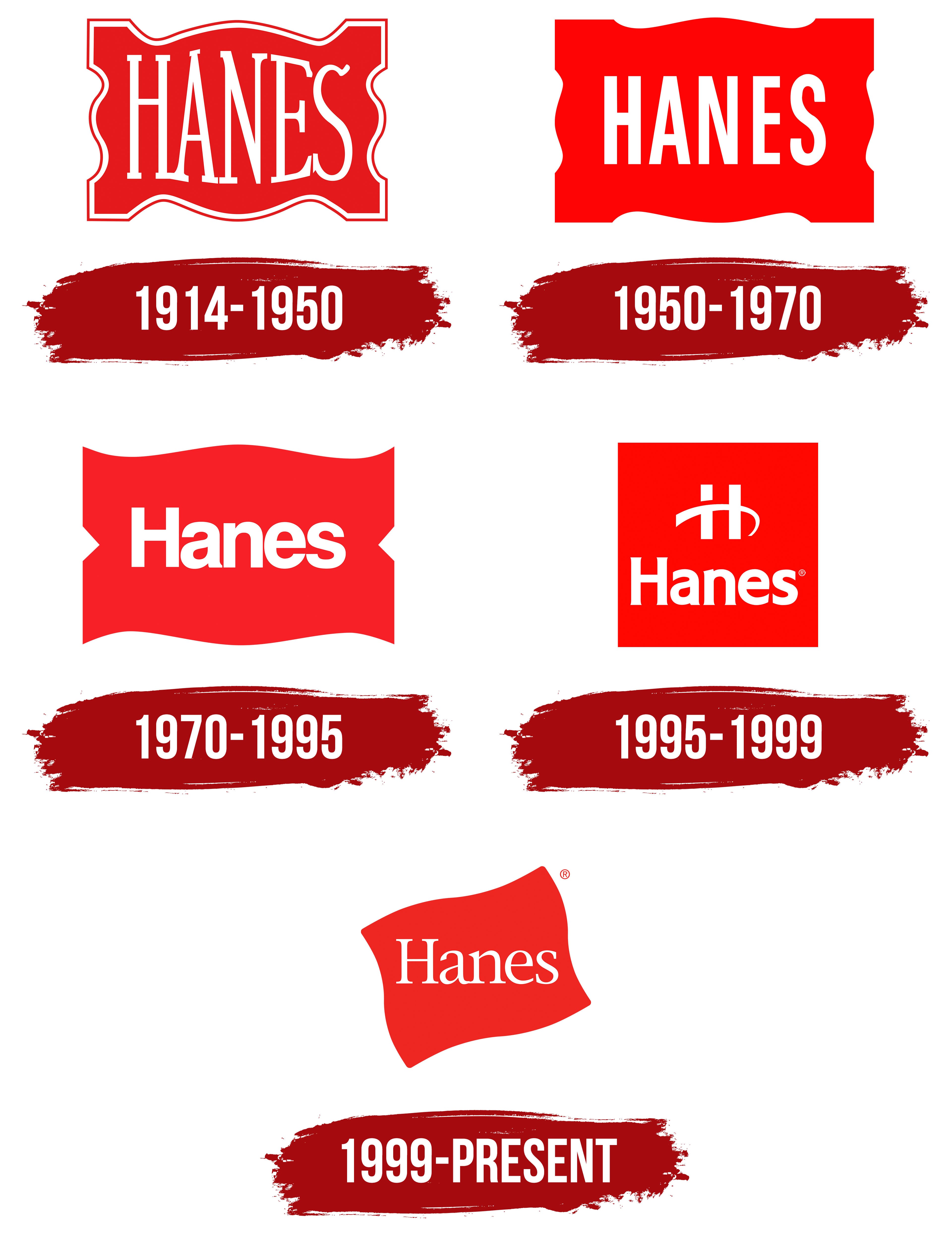
1914 – 1950
In 1914, a significant moment came for the brand: the company’s original logo, with more than 120 years of history, was introduced. That year was a turning point for the little-known company, founded in 1900. The logo attracted attention with its expressiveness and uniqueness, symbolizing the new brand, its elegant products, and its originality.
The first version of the identity featured three key elements: the word, the background, and the frame. Together, these elements indicated the emergence of a new, interesting company. The word “Hanes” represented the founders’ last name, the red background served as a magnet for attention, and the frame emphasized the company’s exclusivity and unique products. The design’s simplicity, clarity, and beauty made this logo recognizable and long-lasting. It fulfilled its mission to inform potential customers about the appearance of unique home and sleepwear, including exquisite knit sets for men and women’s underwear. The logo became synonymous with recognition and remained so for a long time.
The red background, framed by an elegant white border, was expressive like a flag, automatically making it stand out among others. The large white letters highlighted the brand’s individuality and identity, making it recognizable and associated with quality and reliability.
1950 – 1970

In 1950, the Hanes brand underwent significant changes affecting the production process. Many consider this period a true “revolution” in the textile industry, so rebranding the logo was a logical and justified step. The logo gained new individuality all additional elements and color accents removed, making it more concise. The white frame disappeared, and the letters were written more elegantly.
The geometric lines of the background became more expressive, with sharp angles and smooth, symmetrical curves now resembling waves. The letters were arranged in a strict horizontal line and styled in the brand’s white palette, which had already become traditional, standing out against the red background. Positioned at equal distances from each other, they created a sense of uniformity and harmony. The text element, without serifs or roundness, emphasized the brand’s reliability and stability. At the same time, the letters possessed a subtle lightness, giving the impression that each one was freely and slowly moving across the red field, adding a special dynamic and visual appeal to the logo.
1970 – 1995

The updated brand identity in 1970 took on a completely different appearance while retaining elements from previous years. The background and text colors remained unchanged, but the outline, reminiscent of a flag or fabric, became more geometrically defined. Straight angles now dominate the design, emphasizing the company’s focus, steady growth, and consistent success.
The letters in the new logo became larger in scale and more static and solid, contrasting with previous versions of the identity. This gave the logo a sense of seriousness and confidence. The logo was stripped of unnecessary text elements, retaining only indicators as arrows.
These arrows, positioned parallel to the tall letters on a single horizontal line and forming part of the outline, drew attention to the brand name. In this way, the company originally and unusually expressed its name graphically, making it the focal point and a symbol of stability and success.
1995 – 1999

Against the backdrop of its predecessors and subsequent versions, the logo created in 1995 stands out dramatically. It is perceived as an experiment in Hanes’ brand identity, which had previously always aimed for unity and stability in its symbol design. This time, the logo gained uniqueness through just one addition, almost completely changing its character. The background from previous versions, the beautiful frame, and the letters were now complemented by one significant detail: a letter resembling a graphic symbol. It was given a central place in the logo, capturing attention.
The capital letter “H” clearly referenced Hanes, but its unconventional font made it particularly notable and drew prolonged attention. Four straight lines form the logo’s outline and are connected, creating a square shape. The letters, in turn, lost their usual sharp angles and were replaced with soft curves and wavy lines, adding modernity and smoothness to the logo.
1999 – today
The modern Hanes logo accurately conveys its ambitious outlook and commitment to continuous growth and improvement. The white letters on a red background reflect the brand’s unwavering high quality throughout its history. Having revolutionized homeware production for men and women, Hanes remains mindful of its roots. The logo connects the past and future, blending the red background and white letters into a harmonious whole, symbolizing the strong traditions and family values established by the two founding brothers of the textile factories.
This bright and expressive logo, with rounded letters adorned with serifs, looks stylish and conveys the individual beauty and elegance inherent in every product released under the Hanes brand. The logo embodies the unbroken link between generations and the continuation of traditions while opening new horizons for the future.