


 Petit Bateau Logo PNG
The Petit Bateau logo carries a touch of romantic French heritage, which the brand has carefully preserved over the years. The company consistently upholds high-quality standards, aiming for dreams and continuous growth. Every emblem element is inspired and harmonious, reflecting the brand’s philosophy of blending tradition with modernity.
Petit Bateau began in 1893 in Troyes, France, when Pierre Valton founded the company to make underwear for women and children. Its name came from a French children’s song and means “Little Boat.” In 1918, Madeleine Valton, the wife of the founder’s son, created the first children’s briefs by cutting the lower part from a child’s chemise. This change shaped the brand’s future in children’s clothing.
During the 1920s, the company expanded and began using cotton knit fabric to make children’s garments more comfortable and practical. In the 1930s, Petit Bateau added adult clothing and became known for underwear and T-shirts. Production was affected by raw material shortages during World War II, but the company resumed growth after the war.
In the 1950s and 1960s, Petit Bateau entered other European markets. Financial problems led to its sale to the Yves Rocher group in 1988, giving the business new support. The 1990s brought a brand revival, designer collaborations, and the opening of a Paris flagship store in 1994.
The 2000s expanded the brand through stores in the United States, Japan, and other markets. Later steps included maternity clothing in 2004, an online store in 2010, the 120th anniversary in 2013, and a partnership with Carven in 2015. From 2016 to 2022, Petit Bateau updated its website, launched organic cotton clothing, expanded adult lines, opened new flagships in Europe and Asia, added loungewear, introduced a loyalty program, and combined retail stores with digital shopping tools.
Meaning and History
What is Petit Bateau?
This French company produces exquisite clothing for adults, children, and babies. This brand is known for well-made, well-fitting clothes thanks to its classic design and durable materials. It is known for basic T-shirts, mariniere striped shirts, and cotton underwear. In addition to essentials, the company offers a full collection of clothing and accessories for people of all ages. The brand uses silky, organic materials and maintains high craftsmanship in its apparel. The company’s global distribution channels include department stores, online retailers, and in-house boutiques.
1920s – 1930s
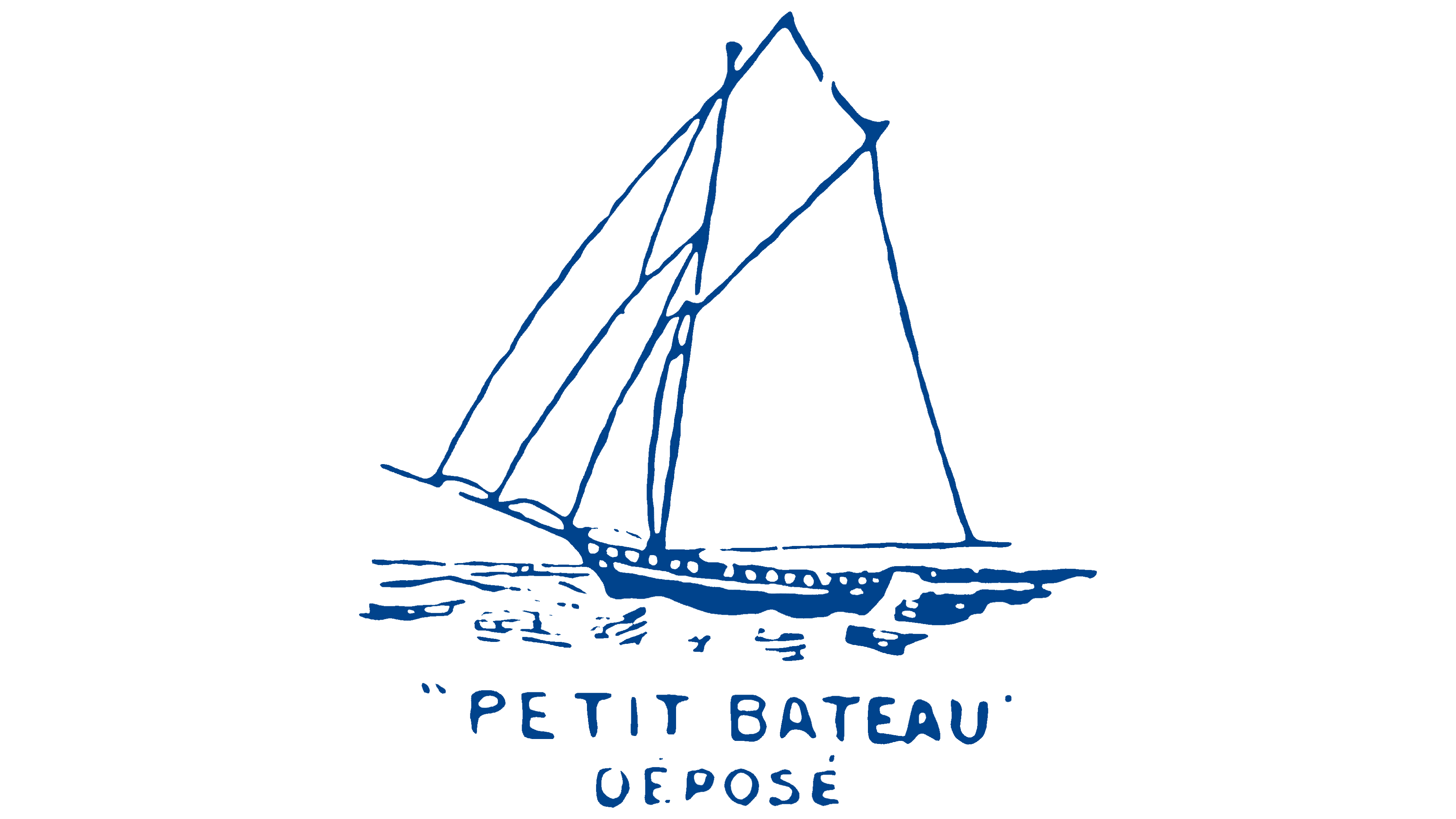
The brand’s symbol is a graceful sailboat gliding across the waves, evoking carefree childhood, adventure, and purity. Its silhouette is rendered in thin lines in a minimalist style, embodying freedom and forward movement and inviting a journey into the world of comfort and care the brand provides to every child. The logo, created in a soft color palette using white and blue, conveys a sense of the sea, freshness, and lightness.
Beneath the sailboat is the brand’s name, taken from the nursery rhyme “Maman les p’tits bateaux,” which translates to “mommy’s little boats.” This name is connected to the company’s early beginnings in making women’s underwear. This retailer reimagined and transformed underwear, introducing small, lightweight “panties” that laid the foundation for using diminutive, affectionate names.
1930s
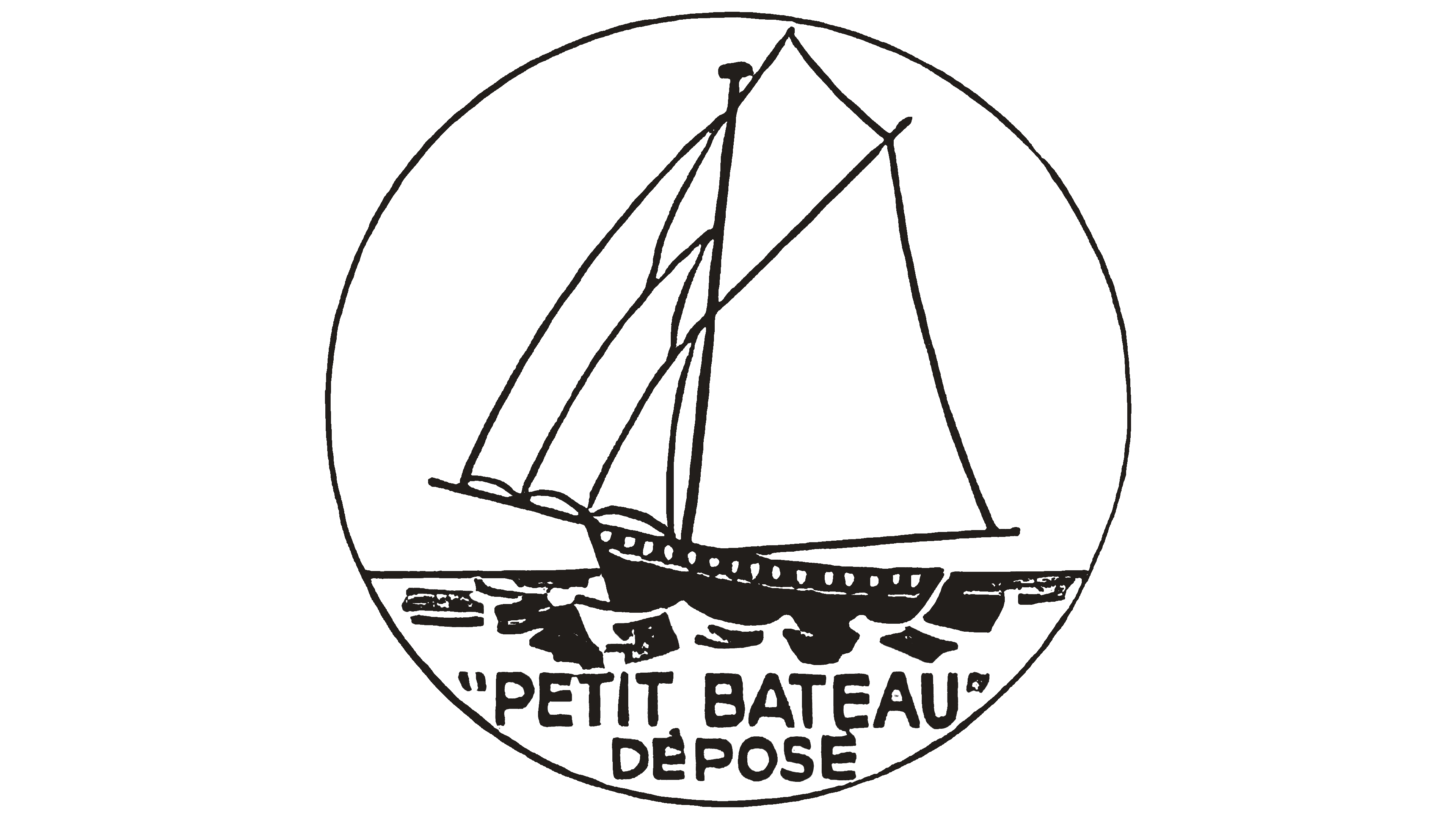
The Petit Bateau logo, refined in the early 1930s, is a symbol that evokes a romantic atmosphere of adventure and journeys. It was placed within a circle, creating the impression of a neat miniature reminiscent of a distant past and maritime adventures.
The thin black lines used to depict the sailboat appear light and airy, as if barely touching the water’s surface. These lines create elegant contours of the boat, giving it an almost ethereal quality and adding a touch of nostalgia and grace to the emblem. The emblem’s round shape enhances the feeling of completeness and precision, making it resemble a seal or tag that could be attached to a product.
The sailboat symbol reflects the brand’s maritime roots and emphasizes its connection to nautical traditions. It’s an image and an entire story hidden in simple lines and form. The logo evokes the romance of the sea, the freedom that travel brings, and the enduring value of traditions that are still cherished today.
1930s – 1940s
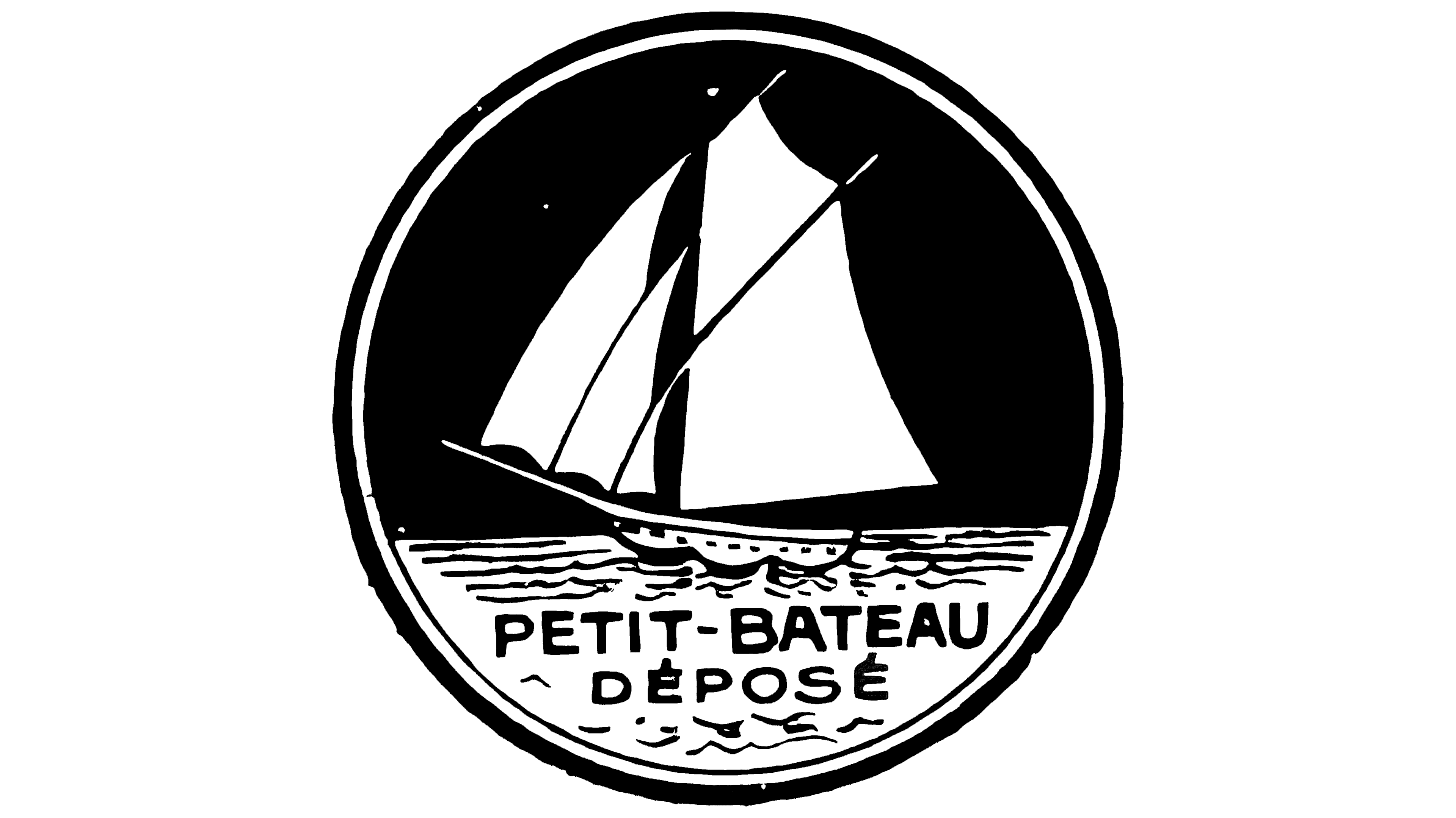
The emblem, created in the 1930s-1940s, was significantly altered to convey a sense of naturalness and tranquility. The image of a sailboat against a black night sky creates an atmosphere of calm and coziness. In the quiet of the night, waves shimmering in the moonlight enhance the effect of deep relaxation.
This logo symbolizes travel, rest, comfort, and safety, all of which are associated with the brand’s products. The company offers comfortable, high-quality underwear that promotes comfort and ensures deep, peaceful sleep. The emblem invites customers into a dream world, like sailing on peaceful night waters, enveloped in calm and imagination.
This symbol is closely tied to the historical context of that time, when people sought simple joys, such as comfortable sleep and solitude, especially during periods of instability and change. The emblem reflected the brand’s care for its customers, promising comfort and coziness at every moment of their lives.
1940s – 2000s

The logo was redesigned in a more childlike style, depicting a white schematic sailboat on a gray background. This sailboat resembles a toy, evoking associations with childhood imagination and a world where children are always reaching for new horizons. The brand offers clothing that doesn’t distract from play and provides young adventurers comfort.
2000s – 2010s

The design of the 2000s became one of the most memorable and accurately reflected the brand’s spirit. The emblem is enclosed in a blue circle, creating a sense of security and belonging to a world of childhood dreams. The ship sails on blue waves, and its yellow sail extends beyond the circle, symbolizing the strength and boundlessness of a child’s imagination. The logo combines a playful innocence with a sense of romance. During this period, the brand expanded its range by adding adult clothing. It opened a store on the Champs-Élysées, symbolizing its ambition for a greater future, toward which the ship on the emblem is sailing.
2010s – today

The modern logo features the silhouette of a sailing ship executed in a monochromatic dark blue palette. It symbolizes the journey toward dreams and great achievements, reflecting the company’s commitment to creating products that support customers on their life path.
At the beginning of its journey, the company produced high-quality underwear, which evoked the strength and reliability of sailors embarking on long sea voyages through its design and materials. The sailing ship became a kind of totem for the brand, emphasizing its connection to tradition and its drive to conquer new horizons.
The dark blue color symbolizes depth, stability, and professionalism. This color is associated with the sea and sky, highlighting the brand’s connection to nature and the inspiration it provides. The monochromatic design lends the emblem simplicity and elegance, making it easily recognizable and memorable.
The company name harmoniously completes the logo’s composition, written in an arc beneath the ship image. The font is simple and unadorned, emphasizing the originality and practicality of Petit Bateau’s products. The arc, in turn, creates a sense of movement and dynamism, echoing the image of the ship racing forward toward discoveries.
The logo’s visual style is both classic and modern. It reflects the company’s years of experience and commitment to preserving traditions while keeping pace with the times.