![]() Hardee’s Logo PNG
Hardee’s Logo PNG
The Hardee’s logo symbolizes traditional American fast food and brand reliability. Its simple, recognizable design highlights the company’s confidence in its products and is aimed at a broad audience.
Hardee’s began on September 3, 1960, when Wilber Hardee opened his first fast-food restaurant in Greenville, North Carolina. Inspired by McDonald’s, Hardee’s offered 15-cent hamburgers and 10-cent fries. By 1961, entrepreneurs Jim Gardner and Leonard Rawls acquired control and expanded through franchising.
In 1965, Hardee’s opened its first international location in Germany. In 1972, the company acquired competitor Sandy’s, adding 200 locations to its network. Breakfast, featuring our signature “Made From Scratch” biscuits, was introduced in 1977.
Canadian firm Imasco purchased Hardee’s in 1981 and later merged Burger Chef and Roy Rogers. In 1997, CKE Restaurants, owner of Carl’s Jr., acquired the chain.
In 2003, Hardee’s reintroduced charcoal-grilled hamburgers with the launch of Black Angus Thickburgers. Today, the brand operates over 1800 restaurants in the U.S. and 13 other countries, known for Thickburgers and biscuits. In 2014, Hardee’s partnered with the Colorado Rockies baseball team as a franchisee.
Meaning and History
![]()
What is Hardee’s?
It is an American fast-food chain popular for its large portions and bold marketing. Restaurants primarily operate in the Southern and Midwestern U.S., with a different brand name used in the West. Signature items include large burgers made with high-quality beef and handmade hot biscuits. Customers appreciate the affordable prices, generous meat portions, and distinct flavors.
1960 – 1967
![]()
The first Hardee’s emblem appeared with the opening of the Hardee’s restaurant in Greenville, North Carolina, on September 3, 1960. The visual concept was based on the drive-in format: a typeface with a signature-like character and an image of a waiter with a grill created an atmosphere of accessibility and casual communication. The architecture of the first locations, with hexagonal roofs and distinctive facades, complemented the image, creating a unified visual code for the new chain.
The composition included decorative cursive with elongated strokes. The lettering resembled the owner’s signature, setting a friendly tone and enhancing the name’s individuality. The font was accompanied by cartoonish cooks and waiters serving dishes, set against a red oval background. Around the background were three white stars with red captions: “Soft Drinks,” “French Fries,” and “Shakes.” They designated the key menu items for the chain’s first locations.
The palette was built on the contrast of red and white. The red shape created a focal field, while the stars and captions acted as navigational markers. The balance of shades reinforced the mark’s energy and aligned it with the aesthetics of mid-20th-century American roadside establishments.
The composition’s functionality lay in combining text and imagery: the signature and character formed a cohesive advertising image that reflected both the cuisine and the service method. The font communicated friendliness, the stars drew attention to the menu assortment, and the waiter’s figure emphasized the quick-service format.
1967 – 1969
![]()
The main innovation of the Hardee’s logo was the grill figure with flames, placed to the right of the name. The image of the grate and tongues of fire referred to the method of preparing burgers over an open flame, creating a visual representation of the “charbroiled burgers” method. The emphasis linked the identity to the key product and highlighted the brand’s differentiation from competitors.
The Hardee’s inscription retained its cursive form, but its lines became bolder, and the swirls appeared more confident. The decorative nature remained, but the glyph shapes conveyed a sense of maturity compared to earlier attempts.
The composition was built around the wordmark and the icon. The text and symbol balanced each other: the elongated curves of the letters and the dynamics of the flame created a single rhythm. The geometry of the fire and the grate added a vertical accent, compensating for the inscription’s horizontal layout.
The palette was based on the contrast between the solid font lines and the fire details’ brightness. The flame served as the semantic center of the composition, evoking cooking and energizing the overall visual concept.
The mark’s purpose was to secure the company’s image as a restaurant where quality and taste were tied to its cooking method.
1969 – 1975
![]()
The departure from narrative characters and literal imagery marked a new stage of visual identity. The company abandoned cooks, grills, and cartoonish scenes, shifting the focus toward abstraction and geometry. This step reflected the industry’s general tendency toward urban minimalism and concise symbols that could stand alone and scale across formats.
The mark was constructed from two mirrored orange shapes. Between them, a small square was placed, and together the elements formed the silhouette of the letter “H.”
The Hardee’s wordmark was positioned nearby. A heavy sans-serif font was used, with condensed letterforms grounded in strict geometric principles. Unlike the earlier cursive versions, the new font lacked decorative swirls and played on the contrast with the abstract symbol.
The palette featured two key colors: bright orange for the symbol and brown for the inscription. The combination appeared balanced: the symbol’s warm tone created dynamism, while the text’s dark tone provided visual grounding.
1975 – 1998
![]()
The development by the Lippincott & Margulies agency in 1975 set a new visual direction for Hardee’s. The team created custom typography without relying on existing commercial typefaces. This enabled the creation of a proprietary mark that reflected the era and remained part of the corporate identity for many years.
The composition was based on horizontally stretched sans-serif letters. Their proportions were wide and their silhouettes rounded. Smoothed lines and softened angles conveyed a sense of lightness and openness. The typographic construction aligned with the aesthetics of the fast-food industry in the 1970s, when simplicity and brand accessibility were highly valued.
The importance of this version is confirmed by its long use. The logo accompanied the chain for more than 20 years and remained in use even after the introduction of the new star mark. Its relevance returned in 2018: the slogan “Tastes Like America” was paired with this version, underlining continuity and a reference to heritage.
The period during which this logo was used coincided with the chain’s growth and its transition to Imasco management in 1981. The visual concept secured the brand’s image as a major player, strengthening its position in regional markets.
1998 – 2006
![]()
A radical shift in Hardee’s visual identity coincided with the transition to CKE Restaurants management. After acquiring the chain in 1997, the company aimed to unify the brands, and by July 1998, the smiling star familiar from Carl’s Jr. appeared on the signage. The new mark reflected the course toward unity and emphasized integration into the overall system.
The construction was centered around a five-pointed star with soft contours. Its tilt to the right created a sense of motion. The yellow symbol shape was outlined in red. Inside was a face with raised eyebrows and a broad smile, which enhanced the friendly mood. Below the symbol was the Hardee’s wordmark, set in a modified American Typewriter. The font had rounded outlines, dense proportions, and serifs that gave the inscription the character of a recognizable brand.
The palette was based on two dominant colors: warm yellow and saturated red. Their combination heightened emotional perception, while contrast helped highlight the elements of the composition. The symbol and text were in balance, with the star providing dynamism and the font providing the foundation of the overall structure.
The emblem carried several functions: it created an association with Carl’s Jr. and reinforced Hardee’s positive image. For many consumers, the company began to be perceived as “Carl’s Jr. of the East Coast.”
2006 – 2017
![]()
The mid-2000s update was carried out by Zeist Design, which presented the new logo on June 12, 2006. The team’s task was to integrate the brand’s traditional elements with current marketing practices to reinforce Hardee’s premium perception and clarify its product positioning.
The “Happy Star” symbol was preserved but redesigned. The yellow star received a golden gradient to add volume, and the red outline was thickened and more saturated. The face became more expressive, with the smile and eyebrows further enhancing the impression of friendliness and playfulness.
The Hardee’s wordmark was executed in a custom script font. Its wavelike line mimicked a handwritten autograph, giving the text a sense of dynamism. The outline was complemented by black-and-gray contours that created a three-dimensional effect and increased brightness. Below the main inscription was the slogan “Charbroiled Thickburgers,” set in yellow Copperplate Gothic, which emphasized product positioning.
The palette was built on saturated yellow and red, complemented by gray accents. The gradient fill gave the symbol more volume, while contrast increased the composition’s visual energy.
Two assembly versions existed: the star could function as an apostrophe in the word “Hardee’s” or be placed to the left of the inscription. The second version became more widely used and turned into the familiar configuration for consumers.
March–September 2017
![]()
The agency 72andSunny prepared a redesign presented on March 29, 2017. CKE Restaurants management sought to rethink the chain’s image, with the key task of moving away from the glossy aesthetics of previous years. The change in visual concept was accompanied by an advertising campaign featuring Carl Hardee Sr., through whom the idea of returning to roots was conveyed: a focus on food, traditions, and American heritage.
The composition was built on a maximally simplified form. The star retained its yellow color but lost the face and volumetric effects. The silhouette became flat, without expression or decorative details.
Next to the star was the Hardee’s name. A custom script font was created for the wordmark with smooth curves and soft line dynamics. All prior white outlines, shadows, and pseudo-3D techniques were removed, making the mark cleaner and more precise.
The palette was limited to two main colors: the symbol’s saturated yellow and black for the text.
2017 – 2018
![]()
The September 2017 restyling was a response to the need to balance the new minimalism with the brand’s historical heritage. Management decided to return an emotional element to the symbol while keeping the updated restraint of the visual concept.
On September 20, the audience first saw the “Happy Star” with a face: a broad smile and squinting eyes restored the charisma familiar from previous decades. However, the usual eyebrows disappeared, and the expression became more concise and neutral. The silhouette retained its flat form, and the yellow color ensured continuity with the March redesign of the same year.
The Hardee’s name remained next to the star. The custom script font proposed by 72andSunny functioned as the wordmark. Smooth lines, thickened strokes, and elegant glyph endings defined its character. The black text provided visual grounding for the composition and reinforced the contrast with the yellow star.
The update combined two directions: a new, stricter style and the restored smile, which had been part of the chain’s identity for decades.
2018 – 2022
![]()
The Havas agency presented the redesign on November 5, 2018. The basis was a reworking of the familiar combination of the “Happy Star” and the Hardee’s name. The team’s task was to preserve continuity while giving the mark a new sound that matched the spirit of the time and marketing demands.
The star retained its yellow color and slight rightward tilt. However, it was complemented by a red shadow that enhanced the sense of volume and motion. This linked the symbol to the theme of heat and grilling, recalling the “charbroiled” technique. Eyebrows were returned to the star.
The wordmark was also reworked. The custom script font used in the previous version gained smoother outlines and more even lines. Changes affected the “r” and “s” characters, whose new forms added greater harmony to the composition. The black color was preserved, but the text became more elegant, free of excessive heaviness.
The palette was built on a triad of yellow, red, and black. The red shadow on the symbol added dynamism, the yellow base ensured recognizability, and the black wordmark balanced the composition.
The presentation coincided with the “Tastes Like America” campaign, which ran from spring to summer 2018. It contrasted Hardee’s image with Carl’s Jr.’s advertising, which focused on regional traditions and American flavor. In 2020, the brand changed its slogan to “Feed Your Happy,” continuing the line of emotional engagement and friendly presentation.
2022 – today
![]()
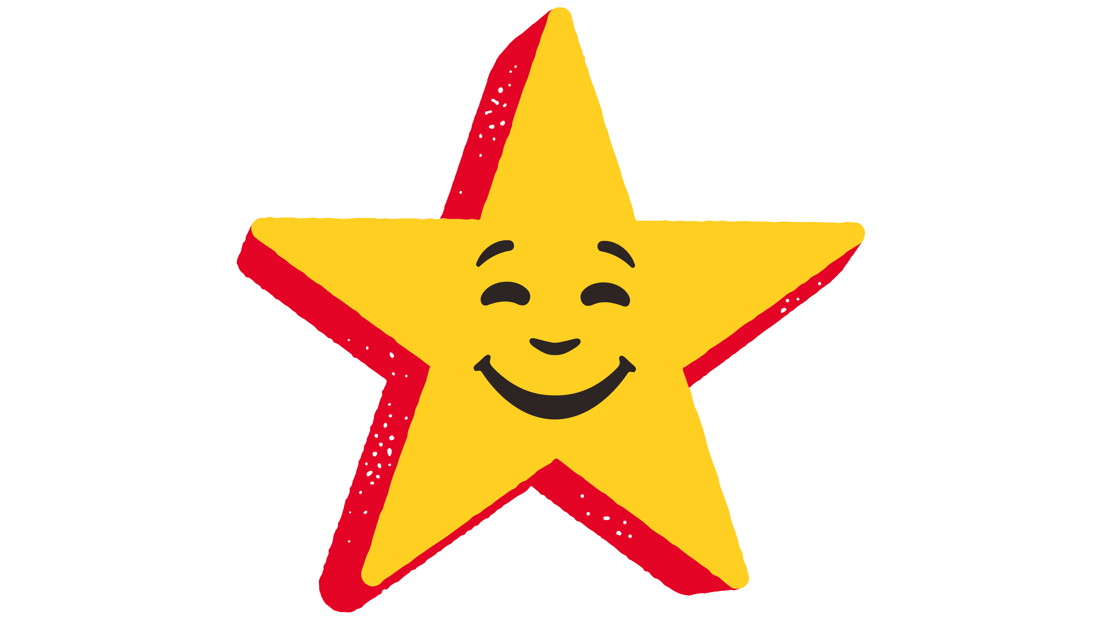
The work of the international agency Design Bridge in 2022 became part of the new Hardee’s logo. It was officially presented on September 22 and accompanied the update of the entire corporate identity system, with changes affecting packaging, staff uniforms, advertising materials, and restaurant design. The “Feed Your Happy” concept served as the basis for the update, linking the visual language to the brand’s emotional communication.
The visual composition was based on a redesigned “Happy Star” symbol. The yellow star was no longer tilted and was now vertical. On the left, a red shadow appeared, adding depth and dynamism. Along the silhouette’s edges, light-textured strokes are visible, indicating charring and a grill fire. The star had always faced left, but the current version, judging by the red shadow, faces right.
The Hardee’s wordmark preserved continuity in script style but became cleaner and visually slimmer. Smooth lines and more harmonious outlines distinguish the black letters. In this version, the text balances the symbol, remaining recognizable while reflecting evolution without straying from its past.
The palette was expanded and fixed within the system to include Charbroil Black, Flame Red, American Cheese Yellow, and Biscuit Cream. The colors are connected with the theme of fire and American cuisine. The contrast of yellow and black dominated perception, while red and cream accents reinforced the culinary theme.