![]()
Harry’s is a well-known men’s grooming brand. It began with simple shaving products but gradually gained the trust of millions of customers by adding body, hair, and skincare items. Its founders were among the first to sell products directly to consumers, bypassing retail stores. Today, it is the second most popular shaving brand in the world. The company actively supports men’s mental health programs, providing resources and assistance.
![]()
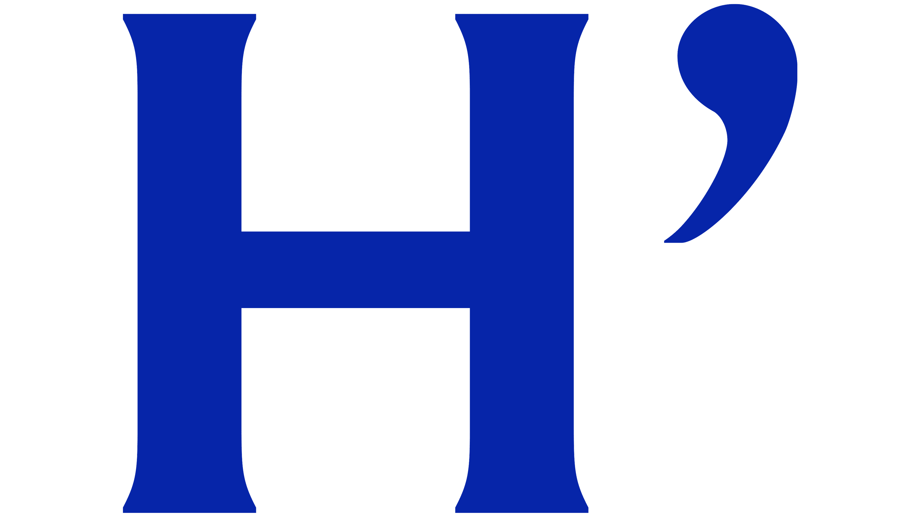
The previous logo was neat, neutral, and somewhat dull. It didn’t stand out among many similar logos from the 2010s. The new logo is a significant update and looks expressive. A beautiful serif typeface was chosen for the lettering, immediately giving the brand a mature feel. The letter “R” is slightly curved, adding interest and uniqueness. The logo turned out solid and friendly simultaneously, highlighting the company’s status and reliability.
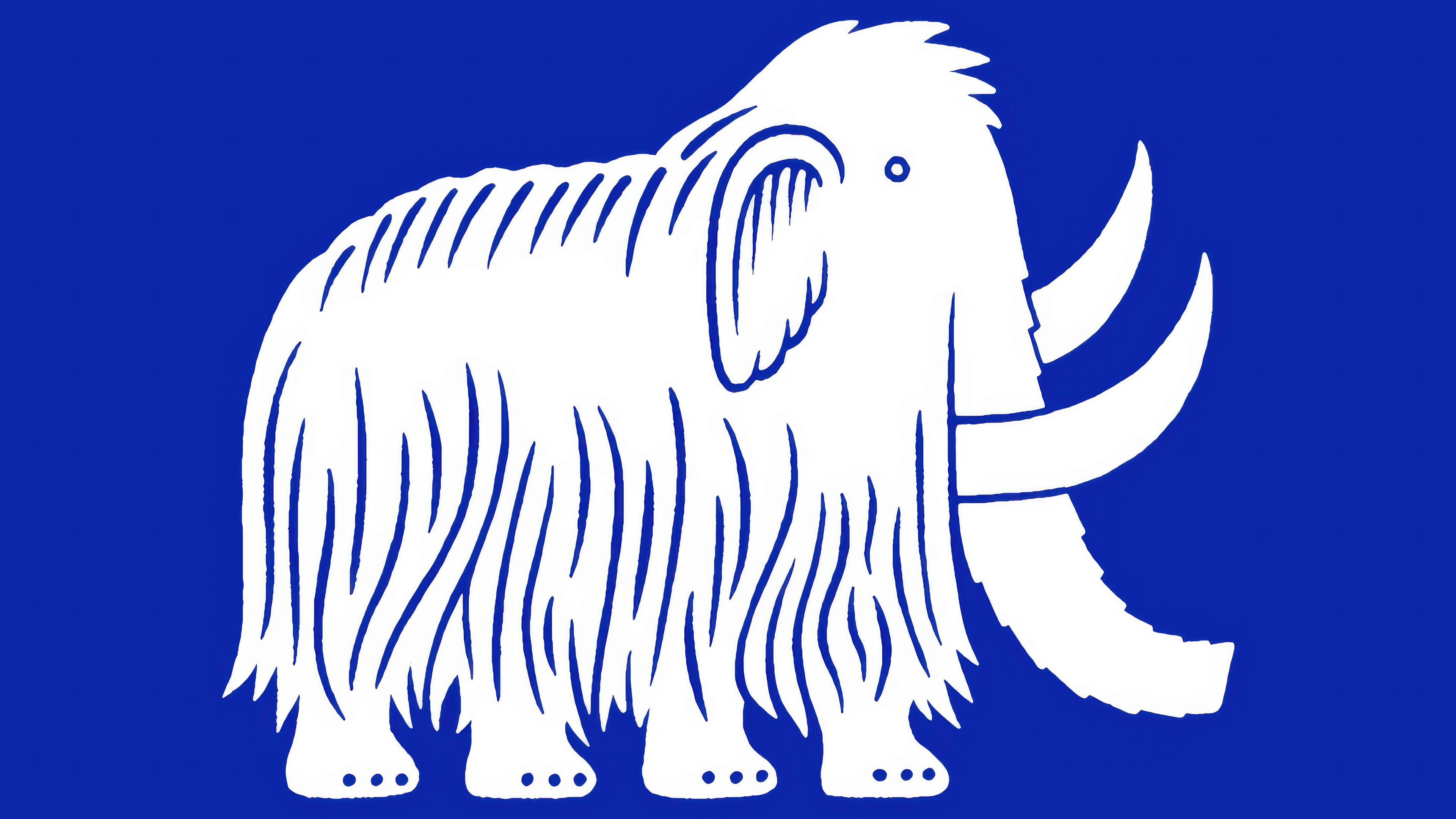
The brand’s main mascot, the mammoth, was also updated. It looks funny and stylish, with details resembling cute bows. Harry’s loved their mammoth so much that its parent company even changed its name to Mammoth Brands, making the animal the main character of the entire brand story.
The new packaging uses a bright, saturated blue color, easily standing out among competitors’ products in stores. The brand name on the package has become large and easily readable. Inside the package, the typography is pleasant, and the illustrations depicting product fragrances are simple and charming. This emphasizes the brand’s desire to appear lively and accessible to consumers.
![]()
The redesign was successful, making Harry’s look more interesting, noticeable, and pleasing to the eye while maintaining the simplicity and naturalness that its customers have long appreciated.