A brand of children’s goods should look bright and attractive, so the Hasbro logo has exactly this design. It appeals not only to kids but to adults as well because parents buy toys from manufacturers that they trust. The emblem symbolizes a smile and a good mood.
Hasbro: Brand overview
| Founded: | 1923 |
| Founder: | Henry Hassenfeld, Hillel Hassenfeld, Herman Hassenfeld |
| Headquarters: | Pawtucket, Rhode Island, U.S. |
| Website: | corporate.hasbro.com |
Hasbro is one of America’s oldest toy and board game companies. Its production facilities make it possible to fully provide stores with products both within the country and abroad. This makes Hasbro the world’s largest supplier of goods in this industry. A feature of the manufacturer is the availability of licenses for creating toys based on well-known animation studios (including Disney and DreamWorks).
The visual identity comes through a bright, friendly logo consisting of a smile-like figure and a cartoonish typeface. The concept also provides for an appropriate color palette that evokes pleasant emotions. The combination of classic white and blue colors demonstrates lightness, fun, and trust. These features are a reflection of the values and aspirations of the brand. Hasbro is committed to making quality products that bring joy and enjoyment.
Meaning and History
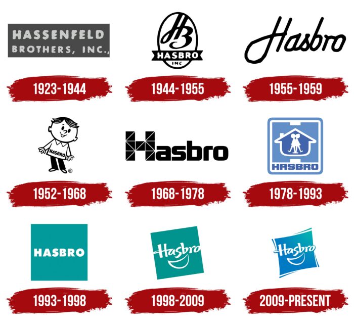
Hasbro is a unique company with a long history. During its existence, it introduced exclusive toy lines, opened subsidiaries, and achieved international success. The brand also changed its name and corporate identity several times. The modern Hasbro logo was formed in 2009.
The emblem is presented as a playful picture, the key element of which is a sign that looks like a smile. The color scheme also emphasizes the positive visual concept. It includes light, harmonious shades that demonstrate childhood and carelessness.
What is Hasbro?
Hasbro is a major toy manufacturer of American origin. The company specializes in creating exciting board games and children’s toys. The brand’s collection includes a variety of types of goods, including unique lines created under license from major studios PopCap, Blue Sky Studios, etc.
1923 – 1944
The company was founded in 1923 and specialized in the production of textiles. Its founders were the Hasenfeld brothers. At that time, the original logo was created, which was a simple picture with an inscription. It clearly showed two words denoting the name – Hassenfeld Brothers. They were made in a light gray shade, and a dark color was used as a background. The classic achromatic palette and soft sans-serif symbolized reliability and stability.
1944 – 1955
In 1944, a rebranding was carried out. As a result, the company received a new creative logo, symbolizing the desire for improvement. It featured an oval frame, an elegant monogram, and the abbreviated name Hasbro INC. A soft sans-serif typeface was used for the inscription, and all letters were in capital letters.
She did not just dilute the logo but emphasized the value and importance of the brand. Above it was a designer monogram in which the letters H and B were beautifully superimposed on each other. Their style was like a handwritten one. These elements had a harmonious classic color, consisting of black and white. Such shades symbolize professionalism and responsibility.
1955 – 1959
Since 1955, the brand has used a completely new version of the emblem. It was a simple, laconic picture in which there was nothing superfluous. The main element was the Hasbro inscription, capitalized on the first letter. For its design, a hand-drawn stylish font was used, created with thin, smooth lines. An additional feature was the italic format, which made the inscription more pleasing to the eye.
1952 – 1968
In 1959, the visual concept changed again. This time, the changes were also dramatic – the logo took the form of a funny man and the Hasbro inscription on whose clothes there were. The outlines of the image were black, while the clothes and face were white. A bold rounded font was used for the inscription, symbolizing comfort and trust. Goodwill was emphasized by the fact that the little man smiled sweetly.
1968 – 1978
Another change of visual identity took place in 1968. The funny little man was replaced with a stylish, confident Hasbro inscription. It was made in an unusual format. The capital letter H looked like a small mosaic, as it was formed from many small triangles. The rest of the letters were painted in strict black. The new design emphasized strength, status, and reliability.
1978 – 1993
This period became a landmark for the overall visual concept. The brand has a color logo for the first time. It consisted of a light blue square, inside of which there were several figures:
- stylized large letter H;
- a house created with white outlines;
- figurines of two children;
- Hasbro name.
The inscription traditionally consisted of bold, massive letters without serifs, which evoked positive associations. Figures of children emphasized that the company produces children’s goods.
1993 – 1998
In 1993, management decided to use a simpler and more concise emblem. It was a one-color square with Hasbro in bold. The name used thick white letters with soft edges. The square itself was filled with a color reminiscent of the shade of a sea wave. The chosen design evoked a feeling of safety, reliability, and comfort.
1998 – 2009
In 1998, a more original version of the previous logo appeared. The square is placed at an angle so that one of its corners is at the top. Inside it was still located a massive Hasbro inscription. But, in the new version, a smooth stretched font was used, similar to the design of cartoons. Below it was another innovation – a symbol of a smile. This design emphasized the brand’s products, which give joy and fun.
2009 – today
The modern version of the emblem was formed in 2009. It retained the basic points of the previous visual concept, but it became more perfect in some details. The main changes were the use of a brighter and more saturated blue color and the appearance of outlines around the square. The new image showed the value of tradition, high quality, and professionalism.
Font and Colors
Hasbro’s bold badge is inspired by the type of product the company makes. This is confirmed by the funny font used in the inscription and rich light colors. The emblem combines two primary colors – white and bright blue. The first demonstrates freshness, purity, and conscientiousness.
The saturated blue color, which is predominant in the color scheme, symbolizes carelessness, joy, and trust. The unusual font harmonizes perfectly with the chosen coloring. It is characterized by smooth, soft lines of different thicknesses. Below, a smile is made in the same format. This is an original graphic symbol that carries a special semantic load. She demonstrates children’s joy, delight, and pleasant emotions with Hasbro products.
Hasbro color codes
| Star Command Blue | Hex color: | #007bc3 |
|---|---|---|
| RGB: | 0 123 195 | |
| CMYK: | 100 37 0 24 | |
| Pantone: | PMS 3005 C |
| Verdigris | Hex color: | #02adb2 |
|---|---|---|
| RGB: | 2 173 178 | |
| CMYK: | 99 3 0 30 | |
| Pantone: | PMS 7467 C |
