The Havas emblem is a remarkable feat of design that exquisitely blends the elements of simplicity and complexity. Its minimalist aesthetic is conveyed through a restricted number of components. Yet, the intricate detailing in shaping the letters exhibits a fascinating juxtaposition of bare simplicity and elaborate complexity. This logo symbolizes Havas’ approach to business – highlighting the simplicity in project management, the elegance in devising strategies, and the dynamism in responding to the evolving market demands and client needs.
Havas: Brand overview
| Founded: | 1968-2000 – as Havas Conseil, 2002 – as Havas Group |
| Founder: | Alain de Pouzilhac, Jacques Herai |
| Headquarters: | Paris, France |
| Website: | www.havasgroup.com |
For more than a century, Havas SA, the French multinational advertising and public relations company, has been a driving force in the global communications industry. Headquartered in the vibrant city of Paris, Havas has experienced remarkable growth, solidifying its position as one of the world’s largest advertising and communications groups, with a presence in over 100 countries.
The story began in 1835 when Charles-Louis Havas established Agence Havas, the world’s first press agency in Paris. Havas revolutionized the media landscape by distributing news and information to subscribing newspapers, forever transforming how we consume information.
Agence Havas recognized the growing demand for effective communication and promotion as the media industry progressed. In a bold move, the company ventured into advertising in the late 19th century, offering comprehensive services to its clients.
In 1968, Havas Advertising emerged from the collaboration between Havas and Publicis, two advertising giants. This merger laid the foundation for Havas SA’s international prominence. Through organic growth and strategic acquisitions, Havas SA expanded its reach, becoming a formidable player in the industry.
With a strong global presence, the company provides a comprehensive range of advertising and communication services across continents, catering to diverse industries such as automotive, healthcare, technology, and finance.
Meaning and History
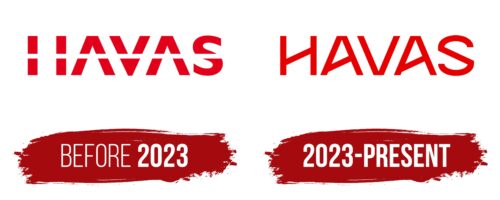
One of the oldest news agencies in the world (founded in 1835) has turned into a multi-tasking structure covering several related directions. Now it is a holding company named after the founder – Frenchman Charles-Louis Havas, a well-known writer and translator. Centuries later, his surname flickered in the logo, attracting the attention of potential customers. Although the style of the inscription has evolved from bold and business-like to light and artistic, its content remains unchanged.
What is Havas?
Havas provides creative and strategic advertising services to help improve communications strategies for companies worldwide. Since its founding in 1968, Havas SA has consistently played a transformative role in the advertising world. From Havas Conseil to its reincarnation as Havas Group in 2002, the organization has consistently championed originality, inventiveness, and cutting-edge communications strategies. Havas SA has been changing how the world looks at advertising for over half a century.
before 2023
2023 – today
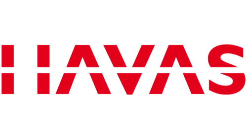
The Havas logo is a masterpiece of design that beautifully balances simplicity and complexity. It carries an air of minimalism through its limited number of elements while simultaneously showcasing intricate detailing in the formation of the letters, presenting a mesmerizing interplay of stark simplicity and sophisticated complexity.
This complexity primarily lies in using diagonal stripes that give the glyphs an elegant geometric quality. The central lines of the letters “N” and “A” take a sharp lean towards the left, while the “S” leans to the right, infusing an element of asymmetry. This subtle deviation from uniformity breathes life into the design, transforming the static emblem into one that exudes a sense of movement and dynamism.
The letter “V” demonstrates a clever design choice where the external angle is omitted, leaving only the sharp, white internal angle intact. This strategic move helps align the bases of all the adjacent glyphs, contributing to a harmonious, cohesive look. The last letter stands out as the exception, its bottom part inherently curved, adding a gentle touch to the otherwise straight-edged logo.
Typography plays a vital role in the design, employing a semi-bold, uppercase font. Its clean, sans-serif style aligns perfectly with the logo’s minimalist ethos. An interesting element is the positioning of the crossbars on both “A”s, which, thanks to their specific placement, create small isosceles triangles in the negative space. These hidden shapes add another layer of intrigue, piquing interest and drawing the viewer’s eye deeper into the design.
Font and Colors
The logo’s color palette is striking and bold, making a powerful statement with a vibrant shade of red. This color choice captures attention and embodies strength, passion, and energy – characteristics that resonate with Havas’ brand identity.
