


![]() Hawkeye Logo PNG
Hawkeye Logo PNG
The Hawkeye logo is concise and precise, like the flight of an arrow. The emblem represents a character whose personal qualities are not always bright but highlight his hard work and ability to achieve goals.
In the mini-series Hawkeye, available on the Disney+ streaming service, viewers are introduced to the enthralling world of Marvel Comics. Created by Jonathan Igla, the series centers on the stories of two key characters: Clint Barton, better known as Hawkeye, and Kate Bishop, who also bears the title. The story begins with Clint preparing to end his superhero career and searching for a suitable successor. He chooses the young Kate, who undergoes training to become the new Hawkeye. Barton must teach her to be a superhero without special powers, relying solely on skills, wits, and precision. The plot begins with the Battle of New York events shown in The Avengers and leads to the present, where, on the eve of Christmas, years after the battle with Thanos, Kate finishes college. She accidentally destroys an ancient chapel during this time, showcasing her long-range archery skills. Meanwhile, Clint Barton spends his days in New York, enjoying time with his children and attending a musical about the Avengers. The six-episode premiere of Hawkeye took place on November 24, 2021.
Meaning and History
![]()
The first logo for an Avengers team member in the Marvel Universe was developed by comic creators Stan Lee and Don Heck. The latter conceived and created a character resembling Robin Hood in 1964. The artist gave him a purple costume with a large letter H on the head, initially serving as the character’s logo. The well-known modern sign appeared after the story transitioned to the world of cinema.
What is Hawkeye?
A fictional orphan character from Iowa, Clinton Barton, is nicknamed Hawkeye for his ability to shoot accurately with a bow and is ranked 45th among the greatest comic book heroes ever. Featured in five volumes of Marvel Comics and several Marvel Universe films (Thor, The Avengers, Captain America: Civil War) and in a namesake mini-series dedicated to the hero. He was married to Mockingbird. In the film, the character was portrayed by Jeremy Renner.
2011 – today

The current hero symbol consists of a circle with black and purple rings. The image resembles a dartboard or archery target. The choice is highly symbolic and emphasizes the hero’s main skill, which he learned from Trick Shot in a traveling circus.
At the center is a figure resembling the fletching of an arrow. The logo does not use a complete weapon to avoid confusion with Green Arrow. The placement of the drawing in the center, at the 10-point spot, symbolizes accuracy.
It resembles a schematic pupil, echoing the name of the bird Barton called himself. It seems like an eye is looking from the emblem, unusual and slightly intimidating. Interestingly, Iowa, where Barton was allegedly born, is known as the Hawkeye State, named after the Native Americans who inhabited the territory. This name was used for the famous warrior Black Hawk. Thus, the character’s nickname not only represents excellent vision but is also a tribute to the history of his homeland.
The symbol looks compact and concise, underscoring the comic hero’s straightforward and reliable character. In modern culture, the symbol is a prototype of resilience and courage. Hawkeye did not receive superpowers. He is trained to the limits of human capabilities, allowing him to stand alongside superheroes.
2021 – today
![]()
In 2021, Hawkeye appeared in Marvel and Disney’s What If…? project, receiving a completely new emblem.
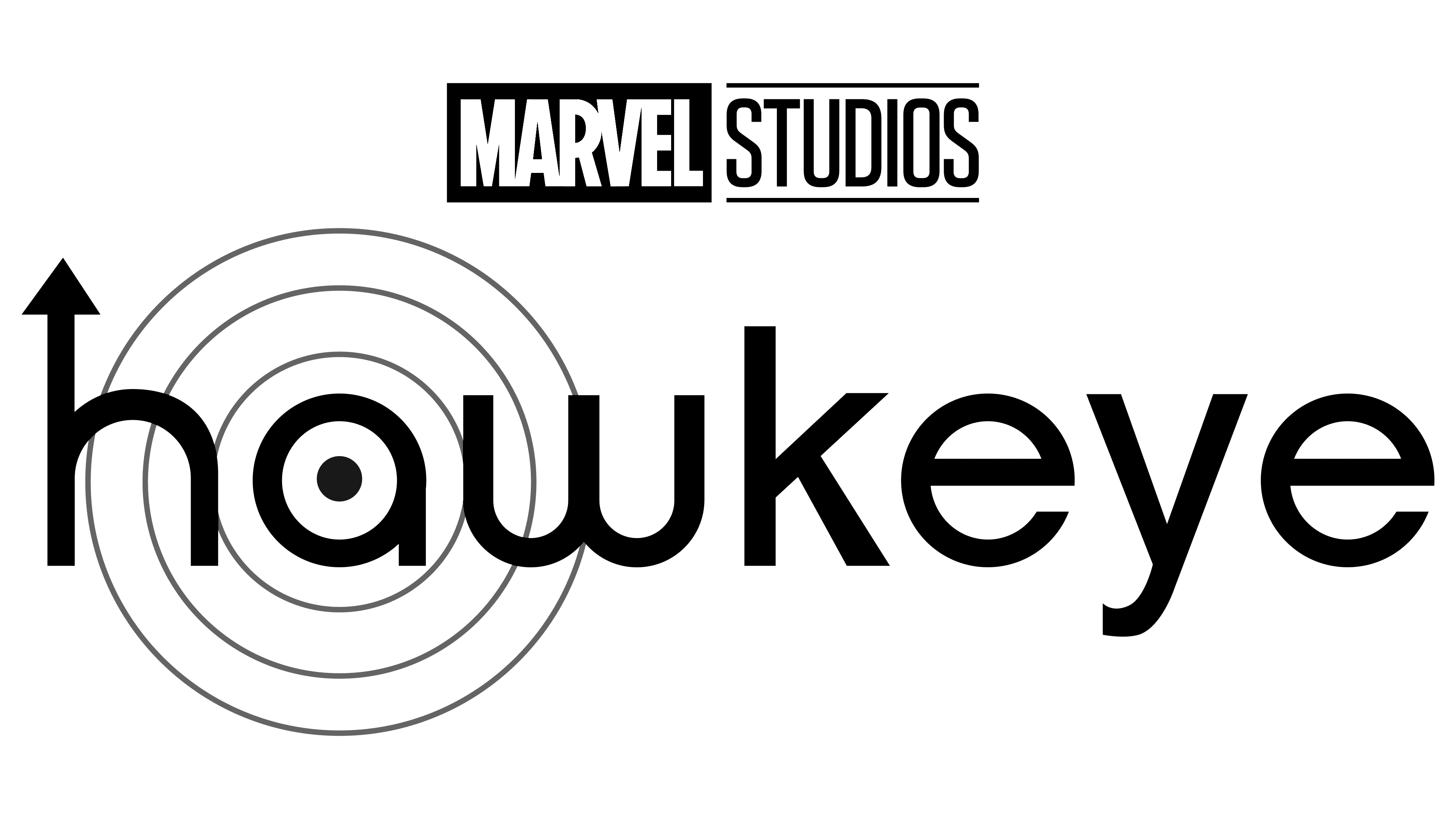
The logo is designed in a clean, minimalist style dominated by yellow. The character’s name is written in lowercase letters. The design incorporates visual references to Hawkeye’s core skills: the letter “h” is transformed into an upward-pointing arrow, while the letter “a” is integrated into a target composed of several thin concentric circles. At the center of the target is a purple dot, symbolizing precision and the character’s expertise.
A second version of the logo, used for the Hawkeye series, differs slightly: it includes a graphic target of several black rings, emphasizing the connection to a new character introduced in the storyline. The yellow sans-serif lowercase letters are paired with the purple center of the target. At the top, a neat Marvel Studios insignia is placed.
The updated logo effectively reflects the series’ atmosphere, maintaining focus on the character and his defining abilities.
Font and Colors
Black and purple, the primary colors of the emblem, echo the shades of Hawkeye’s costume. Black signifies the initial evil associated with the fictional character. Growing up without parents or a home, he joined a criminal gang, which would later affect the future Avenger. Only later did he join the positive characters. Black also emphasizes that Hawkeye can hit the target even in darkness.
Purple represents self-development. Clinton Barton is an ordinary human. His accuracy and strength are trained skills.
The alternating rings symbolize continuous self-improvement, overcoming insecurities and misguided inclinations. This ongoing process of perfection allows the character to become popular and earn his series.
Adding bright yellow to the animated logo highlights the child’s theme and the hero’s positive qualities.
The typography of the new logo stands out through the distinctive design of individual letters. The characters are stylized to subtly highlight key elements of the character and his story: the letter “h” visually resembles an arrowhead, “a” is shaped like a target sight, and “w” mirrors the curve of a bow.
The typeface is smooth and clean, free from unnecessary details, and somewhat reminiscent of Rounded Elegance Regular, but with its custom features. The letterforms include gentle curves, creating a cohesive overall style suited to a contemporary interpretation of the character and his world.
The overall impression of the emblem is light and fresh, naturally conveying the series’ tone and blending elements of adventure with a modern visual aesthetic.