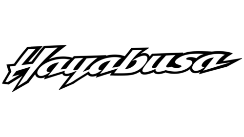
The Hayabusa logo is sharp and swift, like a gust of wind or a flame. The emblem embodies the brand’s motorcycles flying along the road, their virtuoso riding, and lightning-fast response to control—the sign of maneuverability and speed.
Hayabusa: Brand overview
| Founded: | 1999 – present |
| Founder: | Suzuki |
| Headquarters: | Toyokawa, Aichi, Japan |
Hayabusa is a motorcycle brand of the Japanese automobile corporation Suzuki. They produce at factories in Toyokawa and Gurgaon. The first generation appeared in 1999 (170 hp), the second – in 2008 (197 hp), and the third – in 2021 (188 hp for the sake of environmental friendliness). As a result of the initial operation in 2000, the model changed the aluminum rear subframe to steel and reduced the speed to 299 km / h.
Meaning and History
The emblem perfectly represents the fastest motorcycle in the world, focusing on the most important thing – speed. When you look at the logo, you can feel the whistle in your ears from the bike passing by. The sign is full of movement and striving for victory. Each character has leadership. There is nothing superfluous in the elements distracting the eye. Only Hayabusa flying towards the target.
The brand logo is verbal, without images and figures. It consists of a name written in white letters with a massive black stroke. A strong tilt to the right shows speed. The model is capable of accelerating up to 312 km/h. In this, it corresponds to the name. The peregrine falcon, when falling vertically, overcomes the mark of 380 km / h and is considered the fastest in the world.
What is Hayabusa?
Race bike manufactured by Suzuki in Japan and India for road, closed circuit, tandem, and top-speed events. A 2.1 m long bike with a 20 l gas tank and fuel consumption of 6.7 l per 100 km.
Interestingly, the brand’s name was chosen to emphasize the victory over competitors. Hayabusa’s main rival is the Blackbird model from Honda. In nature, peregrine falcons hunt thrushes, destroying them.
All elements of the logo are sequentially connected to each other and are a prototype of the race track, obstacles that the “iron predator” is able to overcome. There are straight sections, zigzags, turns, cliffs, and springboards. The motorcycle is easy to handle and maneuvers well, thanks to the perfect body kit.
The alternation of wide and thin glyphs tells about the balance of functions. Most owners note that the bike has good characteristics that are not reduced for the sake of speed.
Sharp parts emphasize risk and danger. The rider needs to make quick decisions if he wants to drive such a motorcycle.
The black backing forms a single figure from the logo. Its undulating edges are similar to a motorcycle’s bulging, bumpy shape.
Sometimes a Japanese character in white, black, or red is used instead of the English name. Speed is also read in its lines, as in the standard English version.
Font and Colors
The logo’s main colors correspond to the black and white plumage of the peregrine falcon; they are also the leading colors of the bike. The white color creates a feeling of flight and embodies the title of the fastest production motorcycle received by the brand in the late 90s. Black gives confidence and stability.
The font is voluminous capital with an inclination to the right. Indicates development and movement. The sharp ends of the glyphs speak of purposefulness and unwillingness to concede primacy.
Hayabusa color codes
| Black | Hex color: | #000000 |
|---|---|---|
| RGB: | 0 0 0 | |
| CMYK: | 0 0 0 100 | |
| Pantone: | PMS Process Black C |


