


![]() Herbal Essences Logo PNG
Herbal Essences Logo PNG
The Herbal Essences logo shows that each shampoo bottle is filled with a bouquet of beneficial herbal compounds. The emblem focuses on the natural composition that gives hair health and silkiness.
Herbal Essences began in 1971 when Clairol introduced Clairol Herbal Essence Shampoo. The product used plant-based ingredients, came in a clear bottle, and featured imagery tied to nature. It aligned with early 1970s interest in natural lifestyles and quickly found a broad audience.
Through the 1980s, the formula and positioning changed little. By the early 1990s, the shampoo segment had become crowded. Pantene, backed by Procter & Gamble, led the market with aggressive promotion and a strong product message. Herbal Essences lost share and remained in demand mainly in California.
In 1994, Clairol relaunched the brand as Herbal Essences and expanded the line to eight core products. Pricing was set at $3.29 for 12-ounce bottles. The “Totally Organic” campaign used provocative humor and staged scenes in public places, supported by a $20 million media budget in 1995.
In 1996, the range expanded to include hair-styling and bathroom products. In 1997, the brand entered the UK and other international markets. In 1998, Ruth Westheimer appeared in ads that reinforced the tone established in earlier campaigns.
In 2000, Britney Spears joined the campaign, including a radio spot and print ads. The target audience shifted toward younger audiences, and the advertising budget rose to $30 million. Between 1994 and 1999, the brand’s market share tripled, placing it second in US shampoo sales.
In 2001, Procter & Gamble acquired Clairol from Bristol-Myers Squibb for $4.95 billion. After 18 months of research with Libby Perszyk Kathman, the brand was redesigned with new packaging, scents, and positioning aimed at women aged 15–30. Global sales increased by 40 percent, and in 2007, Herbal Essences received the Rebrand 100 Global Award.
Meaning and History
![]()
After the transition to a new owner, the trademark retained its original visual identity. And to make it even more recognizable and in demand, Procter & Gamble redesigned it because the debut versions had a cartoon image of a girl in flowers. By now, the brand has changed its main logos five times.
What is Herbal Essences?
This is a division of Procter & Gamble that harnesses the power of plant-based ingredients to make daily hair care more effective and enjoyable. The brand stands out for its rich fragrances, turning routine hair washing into a sensory pleasure while delivering visible results for a range of hair types and needs. The products include natural ingredients such as rose, coconut, and argan oils, enabling an extensive range of shampoos, conditioners, and hair care products to address multiple goals, from deep hydration to volume enhancement and hair restoration.
1971 – 1978
The emblem features various plants and flowers.
1978 – 1980
![]()
At this time, the logo depicted a girl surrounded by pink flowers and green leaves.
1980 – 1995
![]()
At the end of this period, when the herbal line was acquired by Procter & Gamble, labels became more diverse as new shampoos were developed under the collective name Herbal Essences. The base plant was located in the center and surrounded by a wide ring with the line’s name. A double red-and-white border followed it.
1995 – 2005
![]()
Orange flowers, like marigolds, gave way to a large pink rose. A simple hand-drawn style was replaced by a naturalistic design. The plant looked like an illustration from an encyclopedia or like a fragment of a photograph. In the dark green ring that surrounded it, recesses were made in the shape of protruding petals. The frame served as the basis for the brand name, written in white letters with fine serifs. On the outside, the Herbal Essences logo was surrounded by a hot pink stripe.
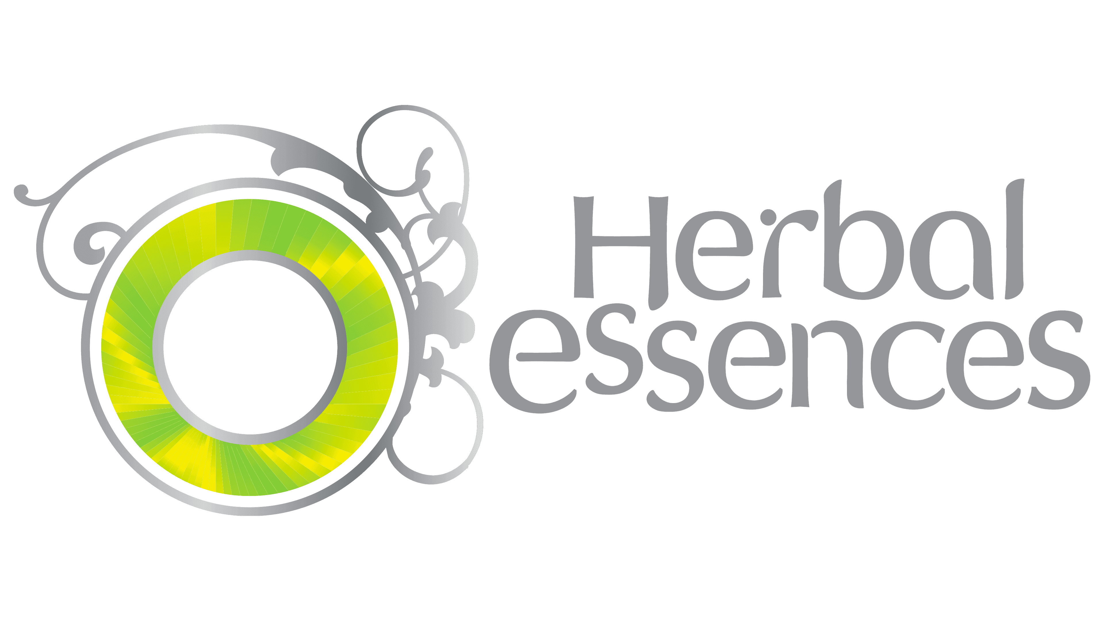
2005 – 2014
![]()
The brand has modernized the logo. In 2005, for the first time, an empty circle with floral curls appeared on the right, and the name was written at the bottom.
2014 – 2017
![]()
The designers changed the ring’s light green palette to a dark one, matching the line’s name.
2017 – today
![]()
Now, a symbolic image of a flower wreath is used, woven from several branches with small leaves. Illumination is visible in some places. In the center is the phrase “Herbal Essences.”
Font and Colors
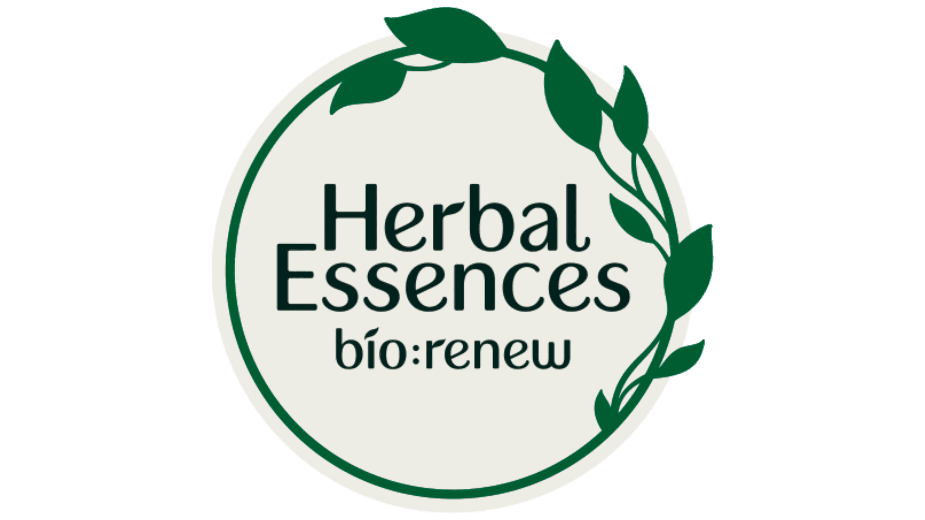
The logo has evolved from a complex structure to a simple one. In the beginning, the image showed a girl surrounded by an armful of plants and flowers; now, a thin wreath with several leaves is drawn.
In the current version, one of the Sans Serif series typefaces is used. Sans-serif letters, rounded, curved, which resemble the curves of stems. The main color of the emblem is green with shades.