The Hertz logo conveys speed and drive because it belongs to a car rental company. And while no obvious symbols are associated with movement, the designers have created a sense of dynamism with small but important details. The logo symbolizes Hertz’s reliable and high-quality service, reflecting its long history of offering outstanding travel experiences.
Hertz: Brand overview
Hertz is a large international car leasing and rental company. It belongs to the parent company Hertz Global Holdings and is headquartered in America (Florida). The company’s activity is scaled to the world level. Outside of America, it has more than 25 thousand branches, which allows you to get high profits. Another feature of Hertz is the presence of its fleet of high-tech Tesla electric vehicles that support the company’s environmentally friendly line of business.
In 1918, Walter L. Jacobs started a car rental business in Chicago with just 12 Ford Model T cars, called Rent-a-Car Inc. His idea was to make car travel easy and accessible for everyone. A few years later, in 1923, John D. Hertz, owner of Yellow Cab and Yellow Truck and Coach Manufacturing Company, saw the potential in Jacobs’ business and bought it. He renamed it to Hertz Drive-Ur-Self System, marking the start of a new chapter in personal transport.
Throughout the 1920s and 1930s, Hertz was more than just a car rental company; it pioneered the introduction of a rental credit card in 1926 to make renting cars even easier. By 1953, Hertz went public, showing its commitment to growth and innovation. The next decades saw Hertz expanding worldwide, opening offices in Canada, Europe, and South America, and launching new services like Hertz Rent a Car, Hertz Truck Rental, and Hertz Rent a Plane.
Despite challenges, including being bought by RCA in 1967 and sold to UAL Corporation in 1985, Hertz continued to innovate with services like the Hertz #1 Club Gold and the Hertz NeverLost navigation system. The 2000s were a time of independence and new beginnings for Hertz, even as it faced challenges from ride-sharing apps and financial difficulties leading to Chapter 11 bankruptcy in 2020 due to the COVID-19 pandemic. At the moment, it has again resumed work in many countries.
Today, Hertz is a global car rental name known for its resilience and commitment to improving customer service with new technologies. It’s a story of overcoming obstacles and constantly moving forward, proving Hertz’s strength and spirit in shaping the future of travel.
Meaning and History
You can recognize the company with its incredibly stylish and natural logo. It represents life, energy, and constant movement and demonstrates the desire for development. Characteristics are manifested in a well-chosen color scheme consisting of 2 colors and a unique stylized font. These elements are perfectly combined, creating the impression of harmony and completeness.
The use of contrasting memorable colors, a modern font, and a stylish shape characterizes the visual component of the identity. The central element is a neat inscription in the form of the company name. It is clearly expressed against the background of a small rectangle of bright yellow with a tint. Light highlights on the figure create the volume effect and make the emblem look like a real plate.
What is Hertz?
Hertz is a well-known American car rental company. The range of services includes leasing and rental. Not only residents of America but also other countries can order them. In total there are more than 20 offices in different countries. Working at the international level ensured the company’s success, which is confirmed by a fairly large revenue (about $ 10 billion).
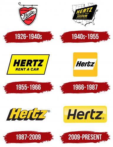
1926 – 1940s
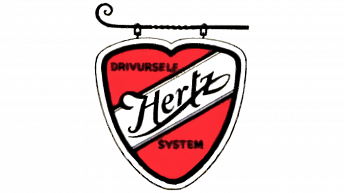
In the 1920s, Hertz was paving its way as a leader in the car rental industry. This period marked the era of Walter L. Jacobs, who started the company with just a dozen Ford Model Ts and grew it into a thriving business. By the time John D. Hertz bought the company in 1923, it had already developed well, and its logo reflects this time of growth and innovation. The shield in the logo stands for the brand’s durability over time, with decorative elements paying homage to the Art Deco influence of that era.
The heart of the logo is a bright red shield, a classic symbol of strength and protection. It symbolizes the reliability and safety customers can expect from a car rental service. The bold, italicized “Hertz” text is at the shield’s center. This font mirrors the era’s preference for hand-crafted signs and suggests a personal touch and the human element in their service.
The flowing, cursive font evokes a sense of movement and speed, resonating with the rapid development of the automotive industry from the 1920s to the 1940s. At this time, cars became a popular means of transportation, a symbol of freedom and progress.
The dominant colors of the logo are red and white. Red signifies passion and energy, reflecting the brand’s dynamic and innovative spirit in the car rental industry. White conveys purity and simplicity, representing the ease and straightforwardness of the brand’s services.
The logo’s style reflects a time of economic prosperity and technological advancement in the US, leading to the Great Depression and World War II. It embodies the era’s optimism, with design elements promising a service as reliable and enduring as the most esteemed cars of that time.
1940s – 1955
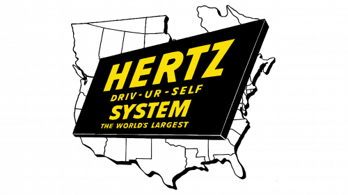
The Hertz logo from 1940 to 1955 reflects a time of post-war growth and the expansion of American road culture. During this era, Hertz had already established itself as a market leader. After World War II, the car production and highway construction boom matched Hertz’s expansion. The logo’s forward-looking fonts and colors symbolize the company’s innovation, like in 1950 when it became the first to offer a car rental payment card.
The logo features all text on a black background shaped like the United States, creating a strong and confident feel. The yellow font against the black background stands out, signaling optimism and clarity. Using all capital letters in “HERTZ” communicates a dominant and strong presence, reflecting the company’s market stance.
The choice of a sans-serif font speaks to modernity and efficiency, qualities prized in the fast-paced era of the 1940s and 1950s. The design is uncluttered and clean, showing the brand’s commitment to straightforward and hassle-free service.
Black symbolizes the open road, wide and full of potential, while yellow highlights the brand’s bright outlook and easily recognizable services. The slogan “Driv-Ur-Self System” captures the spirit of independence and personal empowerment. Cars represented more than just transportation; they were symbols of freedom, adventure, and confidence. The phrase “The World’s Largest” isn’t just about size; it suggests a pioneering spirit and leadership position.
Overall, the 1940-1955 logo showcases Hertz’s vision and alignment with American culture’s newfound mobility and prosperity in the post-war era.
1955 – 1966
During this period, Hertz’s memorable corporate logo immediately caught the eye. It was a bright plate, similar to a parallelogram. Its sides were tilted to the right, which gave the emblem a dynamic look. The figure had thin black outlines and a bright yellow background.
Inside the parallelogram was the main component of the logo—the company name, supplemented by an explanation of the field of activity. The first inscription was more massive and bold, and the second phrase (Rent a car) had a smaller size and thin letters. The chosen design underlined the ambitiousness of the young company, as well as its reliability and high quality of services.
1966 – 1987
On September 30, 1966, the new Hertz logo was introduced, designed by Lippincott & Margulies. Arthur King led the branding project. In the center, the designers depicted the name of a car rental and leasing company. The inscription was made in individual bold italic without serifs. All letters except the first “H” were in lowercase. The background for the word was a white parallelogram, which, in turn, was located inside a yellow square with rounded corners.
1987 – 2009
In 1987, Herts carried out another rebranding. The new logo had a different concept. It symbolized the brand philosophy in a more concise and modern way. The designers removed the frame as a geometric figure and used the effect of shadows to create a more voluminous inscription. The absence of a frame confirmed the opening of wide opportunities for the brand and the elimination of any restrictions on the promotion.
This feature became iconic as Herts gradually went international. Another key change was reflected in the font. It has become more massive and voluminous due to the shadows, demonstrating stability, resilience, and a strong position in the market. The color palette remained the same with the addition of a white background. The base of the letters was painted in a rich yellow, while the outlines and shadows were tinted black. This combination showed energy, strength, and perfection.
2009 – today
The brand badge used by Herts and now was formed in 2009. At that time, the management decided to make the emblem more modern and the message more expressive. The updated version is a neat rectangle with smooth corners and an iridescent background. The name Herts is traditionally placed inside but in a more stylish design. The font has become thinner and more original.
It combines lines with smooth and sharp cuts, making the chosen style unique and the concept more recognizable. The letter r stands out especially, unlike the rest of the characters. In addition to a clear inscription, the logo has no other graphic elements, which confirms the company’s focus on a specific range of services and the desire to improve them. The logo’s colors include yellow and black, complemented by light highlights.
Font and Colors
The current version of Hertz looks confident, stylish, and modern. This is achieved through friendly, energetic coloring, a stylized box-shaped border, and clear lettering. The last element is in a Roman sans-serif, characterized by flowing lines and straight cuts. This means the company is open to experimentation while maintaining a stable strategy.
The Hertz logo stands out with its bold, italic letters in a modern sans-serif font, showing off its cutting-edge and energetic nature. The choice of font, similar to Jiho Bold Italic or HongKing Medium Italic but with slight adjustments, gives the logo a unique look that grabs attention. These modifications make the logo unique, emphasizing Hertz’s dedication to excellence and top-notch customer service.
The slight italic slant of the letters also makes the emblem more dynamic. Another element that reflects the company’s essence is a beautiful two-tone palette. It consists of classic black for the letters and a yellow tint for the background. Dark tones symbolize resilience, reliability, and professionalism, while bright yellow shows friendliness, energy, and convenience. These two colors are the main message of Hertz – providing the most comfortable conditions for cooperation and high-quality service.
FAQ
What font is the Hertz logo?
The Hertz logo stands out in the car rental market with its bold and modern font. This font, without the small lines at the ends of letters known as serifs, gives the logo a sleek and up-to-date look. It matches Hertz’s reputation for being reliable and efficient. The logo’s letters lean forward, creating a sense of movement and speed, which fits well with the idea of travel and transportation that Hertz is all about.
Although Hertz’s exact font might not be public or could have been specially made for the company, fonts like Jiho Bold Italic and Hong Kong Medium Italic are very similar. These fonts mimic the boldness and forward lean of the Hertz logo, keeping the design fresh and modern. Sometimes, the shapes of the letters in the Hertz logo might be slightly changed to make it unique and easily recognized.
These small adjustments help the logo stand out and become memorable. Overall, the font and design of the Hertz logo play a big part in showcasing the company’s modern, efficient, and dynamic nature, helping it shine in the competitive world of car rentals.
What does Hertz do?
Hertz (Hz) measures the number of times something happens in one second, especially regarding vibrations or wave cycles. This unit is crucial in physics, sound, and electrical engineering, helping experts describe how often waves occur. To picture this, think of watching a blue line move up and down on a graph. This movement, or cycle, going from one peak to another, shows us the frequency of a wave. If this cycle happens 60 times in a second, that’s a frequency of 60 Hz, meaning the wave repeats 60 times every second.
Understanding Hz is essential in many areas. Music tells us about a sound’s pitch; higher Hz means a higher pitch. In electronics, it’s about how electrical devices work and helps design and fix them. For communication technologies like radio and Wi-Fi, Hz helps transmit data across distances. So, Hz plays a big part in hearing, using our gadgets, and staying connected.
Is Hertz still in business?
Yes, Hertz is still in business. As of the end of 2021, they reported having $7.3 billion in revenue and $19.7 billion in assets, showing they’re doing quite well. They also have a big team, with 23,000 employees. This all points to a company that’s not just running but growing and impacting its industry.
A key moment for Hertz was getting out of Chapter 11 bankruptcy in July 2021. This type of bankruptcy lets companies rearrange their business to handle debt better, and Hertz made it through. This means they sorted out their finances, approved their debt plan by the people they owe and the court, and are now set toward future growth and stability.
All this shows that Hertz has overcome its recent financial troubles and is in a strong position to keep moving forward, holding a solid spot in the market thanks to its resources, money-making, and team.
Where did Hertz come from?
The term “hertz,” which we use to measure frequency, is named after Heinrich Hertz, a German physicist who made significant discoveries in electromagnetism from 1857 to 1894. His work helped us understand how electric and magnetic fields interact and demonstrated that light is electromagnetic radiation, supporting James Clerk Maxwell’s theory. Because of his groundbreaking contributions, particularly his experiments showing electromagnetic waves’ existence, the unit of frequency was named “hertz” in his honor in 1935 by the International Electrotechnical Commission (IEC).
Before using “hertz,” people commonly described frequency as cycles per second (cps). Naming the unit “hertz” made measurements more standardized worldwide and fit well with the metric system’s orderly approach. This change also showed the scientific community’s respect for Hertz, ensuring his legacy lives on with a fundamental unit of measurement in physics and engineering. Hertz’s work laid the groundwork for future technologies like radio, television, and radar, impacting our modern world significantly.
