Hisense: Brand overview
Hisense, founded in 1969 in Qingdao, China, as a radio manufacturing company, has grown into a multinational conglomerate involved in home appliances and consumer electronics. In the 1990s, the company strategically absorbed several inefficient Chinese electronics firms, expanding its reach. By 1994, the company rebranded itself as Hisense Group, and just three years later, it became a publicly traded company on the Shanghai Stock Exchange.
At the beginning of the 21st century, Hisense set its sights on global markets by exporting and opening international sales offices. By 2004, the company had consolidated its position as China’s leading TV manufacturer. A landmark event came in 2015 when Hisense acquired the Sharp TV manufacturing plant in Mexico, expanding its manufacturing capabilities into the North American market.
Hisense has more than 90,000 employees and operates through 54 sales offices and 18 R&D centers around the world. As a brand, Hisense is well-known in China and actively promoted in international markets, particularly in North America, Europe, Australia, and South Africa.
Meaning and History
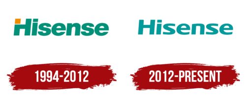
1994 – 2012
2012 – today
The Hisense logo is in the form of text and uses a font that was specially chosen for this project. The letter “s” is not curved as usual but straight, which gives the name a unique look. The same can be said for the bottom of the letter “e,” which also does not have a pronounced curve. The rectangle above the lowercase “i,” which replaces the dot, and the right foot of the letter “H” has one rounded corner each. The emblem is colored in a pleasant tea-green hue.
The straight lines in the letters “s” and “e” give the text a futuristic look, like in a sci-fi movie. One rounded corner of the rectangle and the letter “H” is like a wink or a small twist in a simple story, just enough to maintain interest. The green-brick color evokes tranquility, like taking a deep breath on a weather day.
Hisense color codes
| Dark Cyan | Hex color: | #019999 |
|---|---|---|
| RGB: | 1 153 153 | |
| CMYK: | 99 0 0 40 | |
| Pantone: | PMS 7467 C |
