


![]() Hoegaarden Logo PNG
Hoegaarden Logo PNG
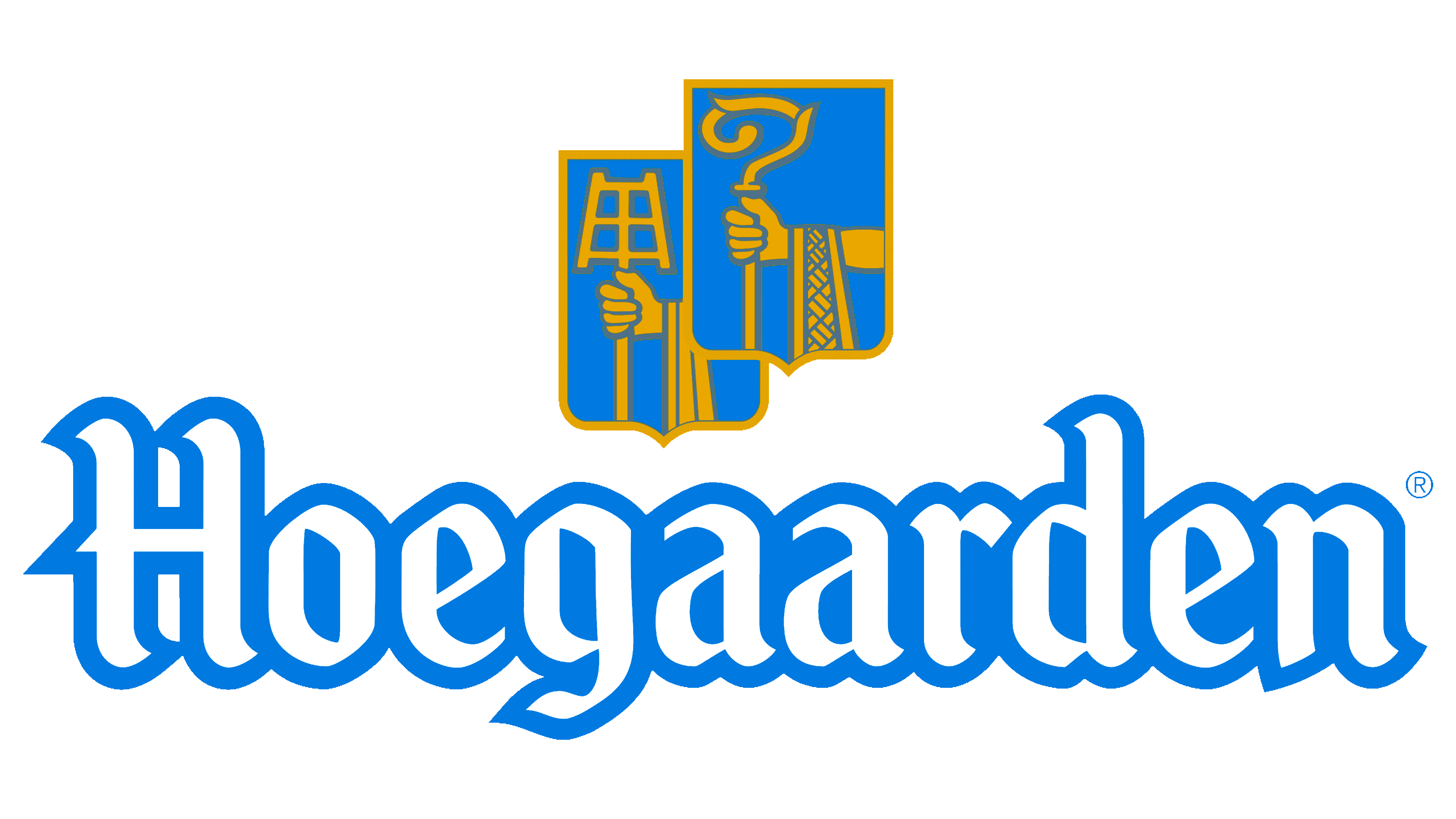
The Hoegaarden logo hints at the use of whole natural ingredients. The orange notes of the emblem convey the flavors that make the beer special. The sign emphasizes the drink’s prevalence and popularity from Belgium to Egypt.
Hoegaarden’s history dates back to 1445, when monks in the Brabant village began brewing wheat beer with coriander and dried Curaçao orange peel. The spices softened the sour edge of the wheat beer of that period. By 1726, Hoegaarden had 36 breweries and 110 malt houses, making witbier a local specialty sold across Belgium and the Netherlands.
By the mid-20th century, lager had taken over much of Europe, while older top-fermented styles faded. In 1957, the last brewery in Hoegaarden, Tomsin, closed. Pierre Celis, born in 1925 on the village square, had worked there as a boy and later became a milkman. In 1965, he began recreating the beer in a stable on his father’s farm, using equipment bought from an abandoned brewery in Heusden-Zolder.
The first commercial Hoegaarden batch was brewed on March 19, 1966, with an annual output of only 350 hectoliters. Demand grew fast. In 1978, Celis bought the former De Kluis lemonade factory and turned it into a brewery. By 1985, production reached 75,000 hectoliters, and Belgian breweries began making their own witbier versions.
A fire destroyed the brewery in 1985. Interbrew helped finance the rebuild, later pressing for recipe changes. Celis sold the brewery and moved to Austin, where he founded Celis Brewery. Interbrew kept Hoegaarden, merged with AmBev in 2004 to form InBev, and later kept production in Hoegaarden after a failed 2005 plan to move it to Jupille. Celis died on April 9, 2011. His daughter Christine revived Celis Brewery in Austin in 2017.
Meaning and History
![]()
The village of Hoegaarden was famous for its top-fermented wheat beer back in the Middle Ages, so it has been known since 1318. A century later, his popularity spread as two monasteries in that area began brewing beer. The industry’s active development led to 13 breweries and nine distilleries operating in the village at once in the 19th century.
However, during the war, the population was subjected to intense pressure from Germany: due to robberies, the village became impoverished, and the original brewing suffered losses. The last enterprise producing an unfiltered white drink was closed in 1957. However, in 1966, local milkman Pierre Celis, who had previously helped brew the beer, decided to revive the ancient custom and the lost recipe. He opened the de Kluis brewery in the hayloft, using the same ingredients as his ancestors.
What is Hoegaarden?
This company is located in the heart of Belgium, producing one of the world’s most unique wheat beers. Its refreshing, distinctive, hazy appearance stands out in a glass. Beer enthusiasts worldwide appreciate this variety for the delicate sweetness of orange peel and coriander, complemented by light spice notes. This balance creates a refined and approachable flavor profile. Every sip of this beer tells the story of Belgian brewing. This craft was on the verge of disappearing until it was revived, transforming from a local specialty into a globally renowned brand, now part of the AB InBev family.
Business went uphill; therefore, to expand the sites, the entrepreneur bought the building of a former lemonade factory. But in 1985, a fire destroyed almost everything. Then the largest Belgian brewing company, Interbrew, came to Celis’s aid by allocating funds to restore production.
However, later the owner realized that the money had been provided for selfish reasons: Interbrew began demanding that he change the beer recipe and switch to the varieties it offered. The owner refused and sold her his entire business, and with the proceeds, he moved to the United States. There, his daughter and her husband resumed production of the original beer.
The misunderstandings about two types of the same drink, brewed in the United States at the Celis plant in Austin, Texas, and in Belgium, in the village of Hoegaarden, did not last long. In 1989, the Belgian brewery was bought by Interbrew. She then merged with AmBev to create a new entity, InBev, which now owns the brand. She refused to change the recipe for unfiltered white beer under pressure from the local population, who staged protests.
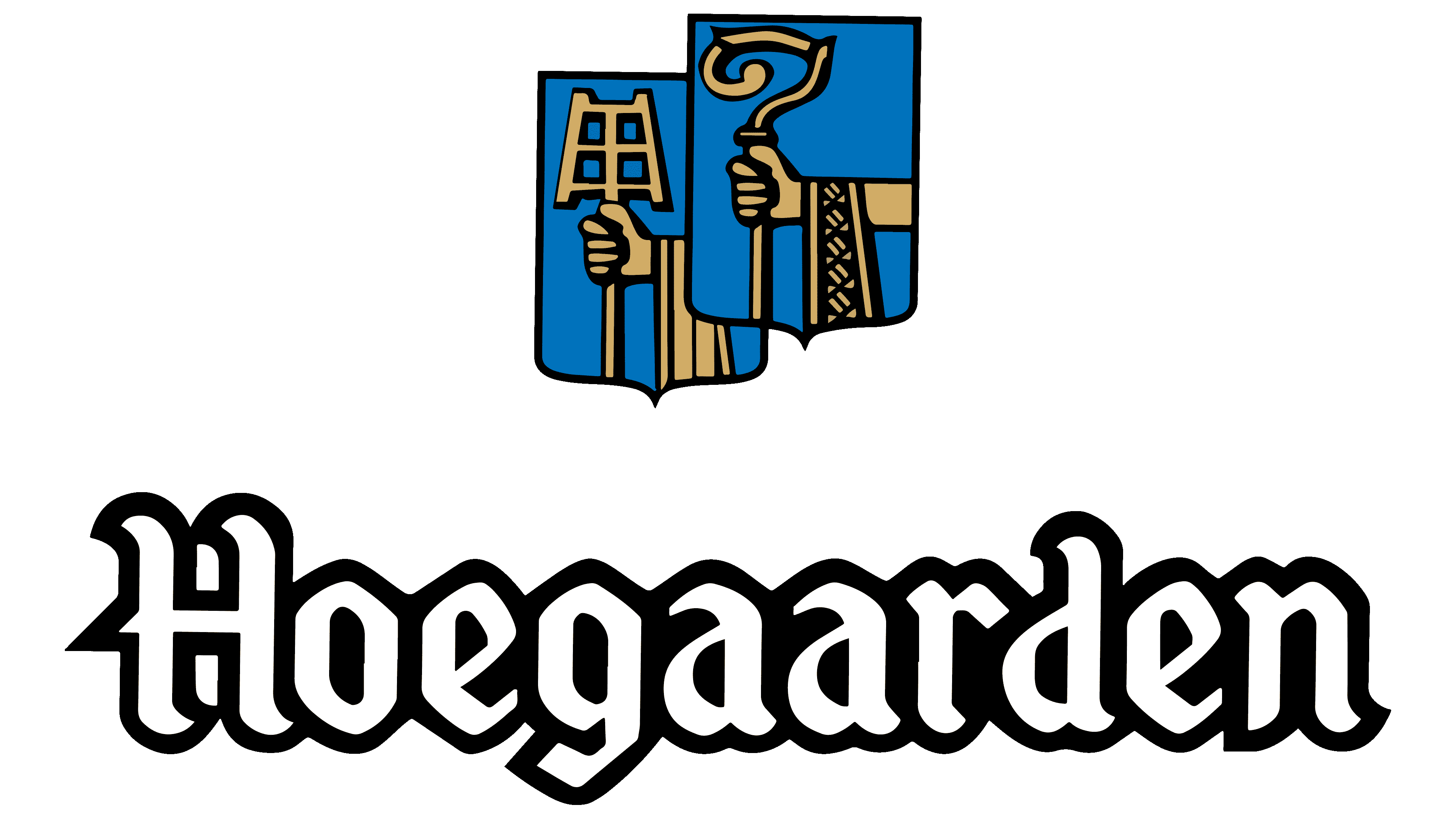
The beer brand’s logo consists of the name written in large Gothic type. White letters are formed by the wide blue edging, which is visible even in the gaps. Above it are two symbols: pentagonal shields with rounded bottoms, shaped like coats of arms. But still, they are not because they have nothing to do with heraldic signs. These are the attributes of the brewing process and the episcopal dignity in honor of the monks who once produced beer. They are painted in a light gold color.
The far icon shows a hand holding a perforated spatula. It was used to stir the wort in ancient times – a thick slurry consisting of malt brewed in hot water. Brewers manually “shoveled” the fermenting viscous substance. The work was hard, so the shoulder blade remained a reminder of those distant times.
Another hand is depicted on the near shield, this time holding a staff with a rounded upper end. This is a patronage symbol of the Bishopric of Liege. The staff has a spiral tip with two small branches. He says that the clergyman is a “pastor” for his population (previously, the bishop was the head of the entire state), and he especially favored the brewers. Therefore, the hand of a high-ranking Catholic is visible on the icon.
Font and Colors
The inscription in the Hoegaarden logo is typed in a typeface called AurelisADFNo2Std-Regular. This is a sans-serif gothic style, but with small points at the ends of the letters “H,” “g,” “d,” and “r.” The corporate palette has always consisted of blue and yellow. They personify water and grain (wheat, barley, oatmeal), which is the basis of a unique drink.