The Holden logo personifies the royal features inherent in the company’s machines. A representative of the ruling dynasty is not ashamed to sit behind the wheel of such a car. The assembly’s grace, strength, and reliability will help you move confidently and quickly along the track.
Holden: Brand overview
Meaning and History
James Alexander Holden immigrated to Australia from the British city of Walsall. Having appeared there in 1852, he opened a saddle and saddle workshop in Adelaide four years later. In 1879, the son of the founder, Henry James Holden, joined the family business. In 1885, the German H. A. Frost became a business partner, so the company was later named Holden & Frost Ltd.
Many years later (in 1905), James’ grandson, Edward Holden, took up the job. He started the active development of the company and took on various orders, including repairing car upholstery. Then, the young industrialist began to re-equip the outdated chassis, install bodies, grind, and paint them. The requirements of the war period forced the enterprise in 1917 to switch to manufacturing bodies completely. To do this, Henry James Holden opened a new company and, in 1919, registered it as Holden’s Motor Body Builders Ltd.
The company specialized in bodywork for a long time, building three factories: Adelaide, Geelong, and Woodville. As a result, it has become General Motors’ exclusive bodywork supplier. They were suitable for platforms for a wide range of world-famous car brands. In 1926, an expanded structure of the Australian enterprise General Motors Limited appeared with production workshops in many continent cities. Only the Woodville plant, which produced body parts and cars, remained independent. Holden’s Motor Body Builders Ltd. merged in 1931. with General Motors (Australia) Pty Ltd, which gave rise to General Motors-Holden Ltd.
Then, there were many more transformations with ups and downs until, in the 2010s, production was shaken by the falling Australian dollar. It became unprofitable. The Elizabeth plant was closed in fall 2017, and the Holden Commodore was discontinued. In the winter of 2020, General Motors Corporation announced that by the beginning of 2021, Holden would be completely liquidated. GM Specialty Vehicles appeared instead. Its tasks include the supply of Chevrolet Silverado and Corvette C8 vehicles. So, in December 2020, the logo with the corporate lion and stone disappeared. He moved into the category of rare symbolism.
What is Holden?
It is a long-standing car manufacturer that started in Australia in 1856 and was originally a saddle manufacturer. In 1931, it became a General Motors trademark. GM has decided to liquidate Holden by 2021.
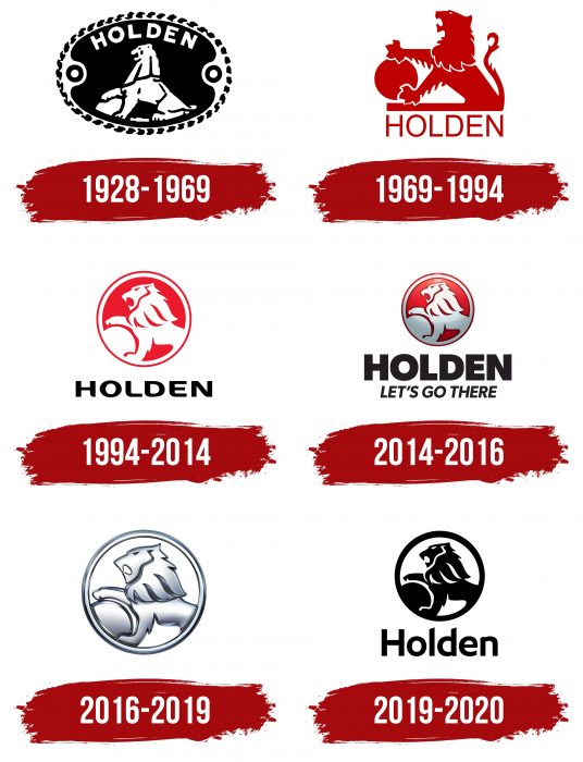
1928 – 1969
The badge of that time was monochrome and consisted of two colors – black and white. The emblem featured a lion sitting opposite a stone. The animal put its right paw on it. The beast looked proud and majestic. The mouth was open, and the lush mane fell freely over the shoulders. Above the lion’s head was the inscription “Holden” in sans serif capital letters. All elements were enclosed in an oval with curly cutouts on the right and left. A broken line served as a frame. It was wide and consisted of simple ornamentation. The background was black, and the details on it were white.
1969 – 1994
In this version, the lion has changed – he has become more regal, with his head held high. The predator is painted red and sits in profile. The designers rounded the stone and gave it the shape of a wheel. The animal is detailed: it has a distinctly traced mane, paws with claws, hair, muzzle, and tail.
1994 – 2014
The developers suggested a round logo frame. They placed the lion in the center, capturing the head, part of the back, and a stone fragment. The animal is depicted in a dash-like fashion: it seems to appear on a red background. This option was important for the corporate identity because it was a model for all subsequent logos. The lines of the talisman have been softened and refined. The authors took the name of the car brand out of the round sign and placed it at the bottom. They also changed the font to make it smoother and more streamlined.
2014 – 2016
The developers took the previous logo and converted it into a 3D sign. To do this, they used shading, highlights, and a gradient that made the lion half-gray. The designers left the double edging. They also made the font larger and bold, added angularity, and placed its motto at the bottom.
2016 – 2019
Everything in the updated logo has remained unchanged except for the color scheme. Its developers have transformed it into a silvery-white, removing the aggressive red color. They corrected the lettering using a thin font with beveled ends for the “l” and “d.” In addition, the designers replaced the uppercase letters with lowercase (but not the first one – it remained uppercase).
2019 – 2020
The last logo was flat and mournful, consisting of black elements on a white background. It had a wide single bezel, unlike other versions with a double bezel, which consisted of white and red rings. On December 31, 2020, the production of right-hand drive vehicles under the Holden brand was discontinued.
Holden: Interesting Facts
Holden, once known as General Motors-Holden, is a famous Australian car brand with a long history and a big influence on the car industry there and elsewhere.
- Start of Holden: James Alexander Holden founded Holden in 1856 as a saddle company in South Australia. Later, it moved into the car industry, first making car interiors and body parts for GM cars from overseas.
- First Australian Car: The first car made entirely in Australia by Holden was the Holden 48-215, also called the FX, introduced in November 1948. This was a big deal for Australia’s car industry and helped make Holden a leading car maker.
- Famous Cars: Holden made well-known cars like the Commodore, Kingswood, and Monaro. These cars were known for their good performance and durability.
- Racing Success: Holden was involved in car racing in Australia, especially in the V8 Supercars series. The Holden Racing Team is one of the top teams in this series.
- Exports: Holden also sold cars in other countries under different names, like the Chevrolet Lumina in the Middle East, the Pontiac GTO in the United States, and the Vauxhall Monaro in the United Kingdom.
- End of Manufacturing: In October 2017, Holden stopped making cars in Australia because they were too expensive and the market was changing.
- New Business Model: After stopping car production, Holden began importing cars as part of General Motors. However, in February 2020, General Motors decided to stop using the Holden brand by 2021, ending Holden’s presence in Australia and New Zealand.
- Cultural Impact: Holden played a big part in Australian culture, representing national pride and manufacturing skills. Holden cars have been featured in Australian movies, music, and books.
- Innovation: Holden introduced new car technologies in Australia, like standard seat belts, airbags, and electronic stability control.
Even though Holden stopped making cars, it’s still a loved brand in Australia, remembered through car shows, clubs, and racing events.
Font and Colors
The Australian company’s visual identity has always been associated with the image of a majestic lion holding his right paw on a round stone. This was probably a hint of right-hand drive vehicles.
The automaker first opted for a typeface with streamlined letters rounded at the ends for its emblem. It was the NEC Font from typographer Julio Garay. In later versions, large characters with right and sharp corners appeared. The absence of serifs united all the fonts in Holden’s logos.
The signature palette consisted of two classic combinations that were used alternately. The primary colors were white with red or black.
FAQ
What is the Holden emblem?
Reiner Hoff designed the 1928 emblem featuring a lion holding a stone. The logo is inspired by a fable about how lions helped people discover the wheel by rolling stones.
In 1948, the company updated the logo with the release of the 48-215. Over the years, the logo has changed several times to suit evolving brand values and market needs. Each version features a lion and a stone, representing the brand’s strong and innovative spirit. These updates help keep the brand relevant and attractive in the competitive automotive market.
Why is Chevrolet called Holden in Australia?
Chevrolet is called Holden in Australia because of its historical brand and marketing strategy. The company, originally known as General Motors-Holden’s Ltd (GM-H), was founded following the merger of General Motors with the Australian company Holden. The merger marked GM’s significant entry into the Australian market.
Over time, the Holden brand became synonymous with GM’s operations in Australia, eclipsing the Chevrolet brand. The cars were sold under the Holden brand due to its high recognition and appeal among Australian consumers. The company maintained its identity in Australia until it ceased operations in 2020.
What does the Holden logo mean?
The lion and stone emblem tells a story of innovation and strength. Created in 1928 by Reiner Hoff, it was inspired by the fable of how lions used stones to aid in hunting, which prompted humans to invent the wheel.
The lion symbolizes strength and leadership, aligning with the brand’s goals. The stone represents a raw material used for the development of humanity, symbolizing longevity and resilience. Over the years, the logo has been updated to remain modern while maintaining its original meaning.
What country is Holden from?
The company began its career in Australia and became a key player in the automotive industry. Founded in 1856 by James Alexander Holden as a saddlery business, it expanded into automobile production and became part of General Motors (GM) in 1931. This marked its beginning as an automobile brand, initially known as General Motors-Holden’s Ltd (GM-H).
Although the brand was based in Australia, it was owned and operated by the American company GM. Over time, cars were produced in several countries, including the United States, Poland, Germany, Thailand, and South Korea.
Who started Holden?
The story begins with James Alexander Holden, an English immigrant who founded J.A. Holden & Co. in Adelaide, South Australia, in 1856. Initially engaged in the saddlery industry, it produced saddles, harnesses, and leather goods for horse-drawn vehicles.
The brand switched to automobile production as the automobile industry developed and horse-drawn carriages declined. This change was initiated by Holden’s grandson, Sir Edward Wheewall Holden, who joined the company in the early 20th century and focused on car body manufacturing. 1931, the company merged with General Motors (GM) to form General Motors-Holden’s Ltd.

