The Hollywood Undead logo seems to be assembled from a construction kit, just like the band’s creativity, which includes several styles. The logo “sounds” choppy and rhythmic, in time with the recitative, but emphasizes the harmony of the melodies.
Hollywood Undead: Brand overview
Hollywood Undead is an American rap-rock band of five musicians founded by Aron Ehrlichman and Jorel Decker in 2005. The artists have recorded eight albums that have sold 10 million copies. In addition to offline activities, the band actively promotes itself on the Internet. Forty-four digital singles and nine music videos have been released.
Meaning and History
Like most musical groups, the artists have been playing together for a long time but only thought about visual style closer to the release of their first album in 2008. The design and promotion was handled by MySpace Records. The logo style changed once, but only slightly. After the rebranding, the logo became more harmonious, emphasizing the professional growth and pleasant sound of the brand’s new compositions.
What is Hollywood Undead?
A musical band from Los Angeles that achieved popularity even before the release of their first studio album. By making their lyrics freely available, they gained over 400,000 followers. Their second album climbed to number two on the Billboard 200. New compilations are released every 2-3 years. The performers were chosen as the favorite band of 2011 by WGRD.
2008 – 2013
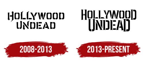
The logo first appeared on the debut album Swan Songs. The logo is wordy and consists of the band’s name in two tiers.
Originally, the guys planned to call themselves Undead. The current name came from their first composition, Hollywood, recorded in 2005. After the recording, the musicians repeated “Hollywood Undead” in different ways and decided that it sounded interesting and fit their ideas and style. So they took this phrase as their name and changed the title of the track to No.5.
The name Undead is quite fitting for a rock band. During performances, the band members wear masks of various evil forces to fit the image. Hollywood is a neighborhood of Los Angeles, the city where the musicians were born and performed. The artists planned to rise to such heights that they would be on par with the stars of Hollywood and live in the neighborhood.
The title is written in a stencil font. However, some letters were later transformed by adding sharp arrows and serifs. The band’s work reflects the problems of this world and the young generation, including the themes of war, love, suicide, etc., in a stencil-like manner. The problems are presented through catchy, edgy content, using profanity, as evidenced by the transformations of the letters.
The combination of standard font and “devilish” elements speaks of the music of the performers who mixed rock and rap. The letter elements in parts embody the rhythmic, jerky sounds and lines of rap. Guitar solos and interludes appear as individual sharp elements in the emblem.
2013 – today
2013 saw the release of the band’s third studio album, Notes From The Underground, the first of which reached platinum status. The A&M/Octone Records label gave the band complete musical freedom, and they decided to make an album similar in sound to Swan Songs.
However, the album’s logo is a lettering similar to the first logo, with no transformation of the letters. Instead of protrusions and serifs, serifs have been added, and the first and last letters of each word are capitalized. This technique demonstrates completeness. The band’s creativity covers all important aspects of life. Their music is enough for both enjoyment and contemplation.
The emphasis is on the word Undead. The letters of the inscription are enlarged and brought to the forefront. The technique emphasizes the images of the artists, which, from performance to performance, become more and more stylish and impressive – quality masks and glowing eyes. The image of evil spirits has become a trademark of the musicians, which is evident in their identity.
Font and Colors
The emblem is dominated by black color, reflecting the male brutal spirit and the sounds of rock.
The font resembles a mirrored Northash. The elongated tail of the letter L makes it resemble a scythe, as a suitable tool for fighting evil spirits. The two halves of each symbol hint at the band’s two founders, its two lead singers, and two different styles of music combined into one.
Hollywood Undead color codes
| Black | Hex color: | #000000 |
|---|---|---|
| RGB: | 0 0 0 | |
| CMYK: | 0 0 0 100 | |
| Pantone: | PMS Process Black C |

