


![]() Holsten Logo PNG
Holsten Logo PNG
Real men will always appreciate the taste of beer, as reflected in the Holsten logo. As in past centuries, after battles, and now, after a hard day’s work, connoisseurs of the brand rush for a portion of foam. The emblem promises a cheerful spirit and recuperation.
Meaning and History
In 1879, Holsten-Brauerei was founded in Hamburg. It launched the production of light malt beer, which quickly gained popularity. The recognition was so widespread that in 1901, the company began building its first overseas branch. It was centered on the outskirts of London.
Then the brand actively acquired competing companies in northern Schleswig-Holstein. From 1909 to 1925, she bought several breweries in nearby areas, and in 1927, she significantly expanded and modernized them, increasing her production capacity.
What is Holsten?
This is a well-known German brewing company founded in Hamburg, where it has since produced its unique beer. From a local favorite in Hamburg to a globally recognized brand, it has become known for its crisp, premium beers that embody German brewing traditions. Its recognizable knightly crest symbolizes Hamburg’s historical ties to medieval trade routes and has become a symbol of German brewing excellence. As part of the Carlsberg Group, the company continues to produce the iconic Pilsener and other varieties admired by fans across Europe and beyond, remaining true to Hamburg’s heritage.
During World War II, the Holsten breweries were badly damaged: many were destroyed, and a few were partially destroyed. The company’s management undertook the restoration of buildings in 1946. But the original taste and premium level of beer were achieved much later, in 1953.
Despite the difficulties, the company continued developing, improving technology, and producing beer under its standard sign – a knight on horseback with a shield and a sword. This is a collective image of the heroes who previously lived in Schleswig-Holstein, where the main production plant and the central office are located. The character is a representative of a local Germanic tribe, after which the lands are named and, as a result, the brewery operating on them.
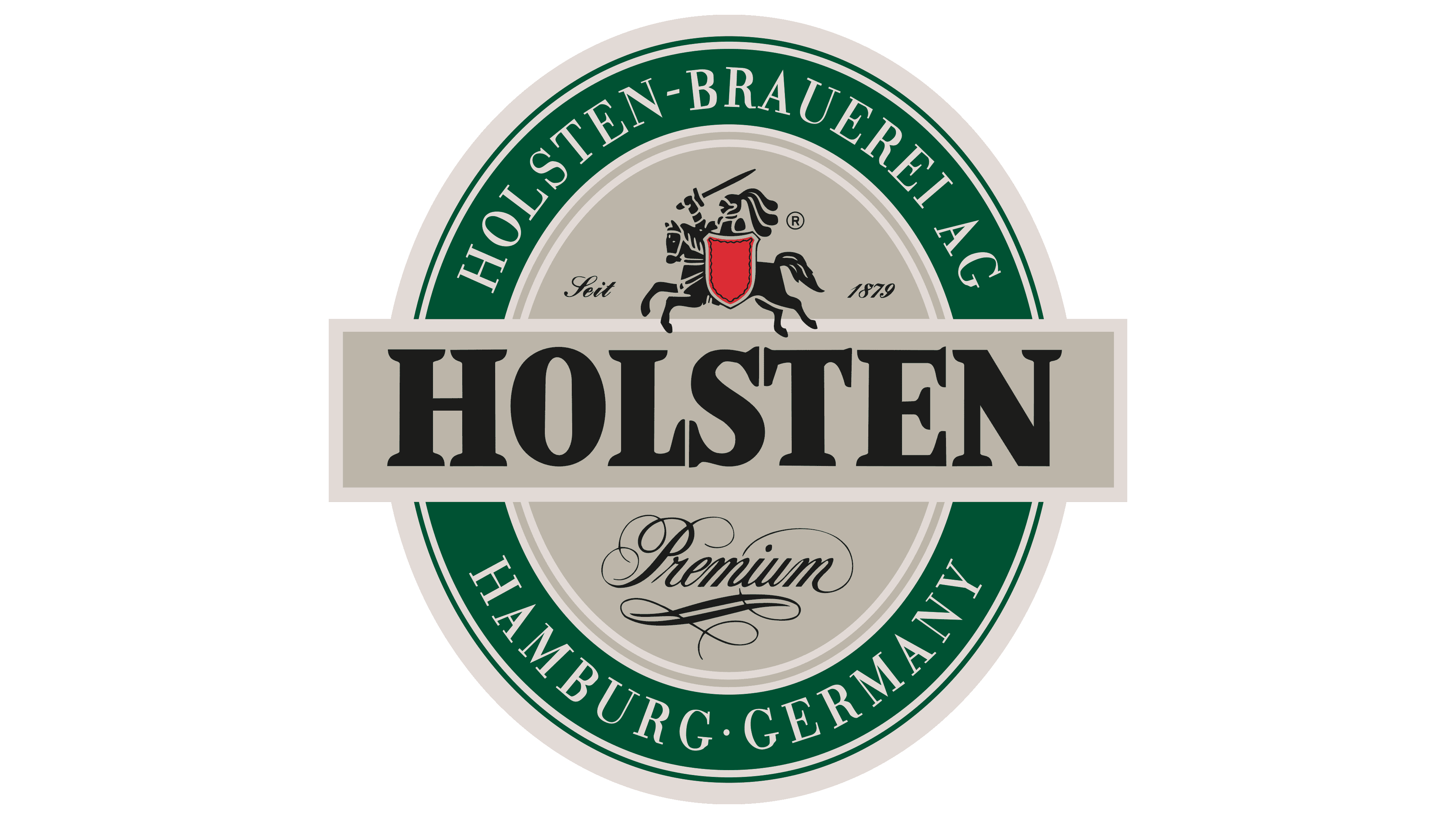
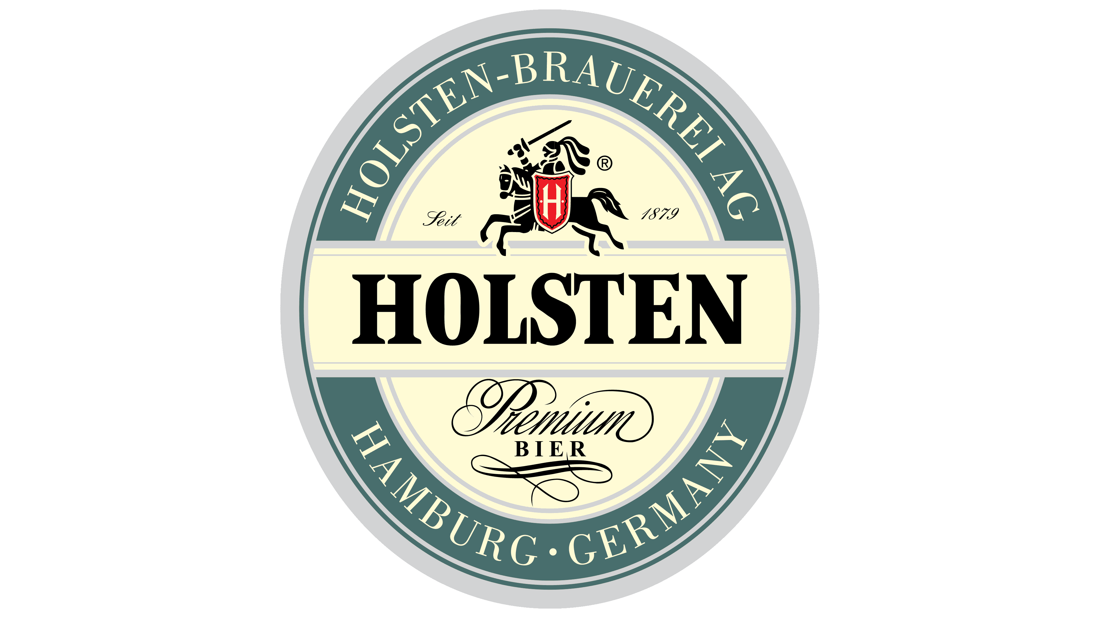
The brewing company’s main logo depicts a knight in full armor. He sits on a horse with a sword raised. On the other hand, he has a large figure shield representing “H.” It is very important to brand identity because it symbolizes the Germanic tribe, the enterprise’s location, the company’s name, and the beer brand. The designers painted the letter white and set it against a red background to emphasize it. In this version, the horse and rider are directed to the left.
There are several other versions of the emblem. One of them is used for product labeling; the other is used on the official website. There is a similar sign on the labels, but not in black and red, but in green and red. The knight does not hold a sword in his hands but a spear with a flag on a long shaft. The horse is prancing and looking to the right. The only unchanged element was a triangular shield pointed at the bottom with a white letter in the middle.
The site logo version is a complete repeat of the emblem. On it is the same rider, holding a flag shaped like a pointed spear and a red shield. The visor of his helmet is open, the horse’s tail flutters in the wind, adding dynamics, and she stands on her hind legs, moving her front legs in the air as if preparing for a powerful jump. All elements are painted in turquoise, white, and black. Around the central character are the brewery’s name, its location, and the year it appeared.
Font and Colors
All logos for the beer brand feature the name in large, bold serif. This is a classic typeface with wide serifs and cut-off ends. The corporate palette includes black, white, red (used on the main emblem), and green and turquoise colors (present on additional options).