Like a laurel wreath of victory, the Holt logo represents a company that created a high-quality agricultural machine. The emblem emphasizes leadership, as the brand was at the forefront of the automotive industry. The logo immortalizes the brand’s main masterpiece for future generations.
Holt: Brand overview
Holt Manufacturing Company dates back to 1883, when Benjamin Holt founded Stockton Wheel Service in Stockton, California. A decade later, in 1892, he officially founded the Holt Manufacturing Company, focusing on creating agricultural devices such as harvesting machines. In 1904, the company made a breakthrough by creating the first efficient tracked tractor, marking a new stage in the development of agricultural machinery.
In the early twentieth century, Holt Manufacturing became a leading manufacturer of steam traction engines and grain harvesters. By 1913, the company had grown to an enormous size, employing more than 1,400 people, and its tractors, known as “Holt tracks,” were internationally recognized.
In 1915, Holt Manufacturing merged with its competitor, Best Tractor Company, to form Holt Caterpillar. This venture became the forerunner of the company we call Caterpillar Inc. today. The combined company continued to produce Holt and Best tracked tractors and other Caterpillar equipment until 1925, when it became the Caterpillar Tractor Co.
Benjamin Holt and his siblings, Charles and William, greatly influenced the development of agricultural engineering. They laid the cornerstone of what later became Caterpillar’s international success story, significantly advancing the technology and practicality of farm equipment.
Meaning and History
1912 – 1917
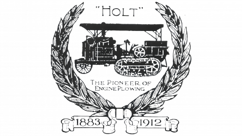
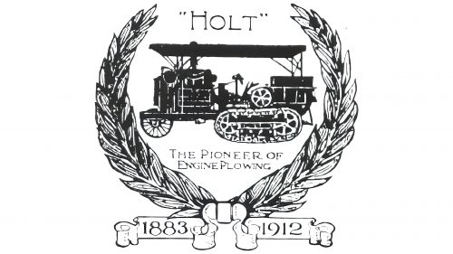
The company’s first logo featured a tracked tractor, the brand’s most famous invention. The image highlighted its impressive size, well-designed details, and mechanisms. AA fine ink pen drawing was chosen for the emblem to capture the tractor’s elements fully to capture the tractor’s elements. Above the machine, the name “Holt” is written, taken from the founder’s surname. Using quotation marks indicates that it refers to the brand name, not the person.
Under the tractor, a slogan emphasizes the company’s pioneering role in engineering developments. A wreath surrounds the entire composition, but instead of laurel leaves, wheat stalks showcase the brand’s achievements in agriculture.
Below the wreath are heraldic ribbons with two important dates for the company: 1883, the founding year of Holt’s first company, Stockton Wheel Service, which later became Holt Manufacturing Company, and 1912, the year the tracked tractor was invented. It should be noted that Holt bought the patent from English inventors and later claimed the pioneer’s fame.
Overall, the emblem presented the Holt brand as a leader with significant success.
1917 – 1925
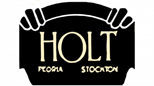
The word “HOLT” is written in an antique font with vertically elongated letters and irregular serifs. The gold lettering stands out against a black “curtain” designed as an ornate rectangle with a decorative arch.
The antique font evokes history and tradition, underscoring the brand’s long-standing reputation. The gold color signifies luxury and high quality. The black “curtain” and decorative arch add theatricality, hinting at grandeur and sophistication. This combination conveys elegance and high status.
The antique font’s unique style reflects the brand’s heritage and commitment to excellence. The gold lettering enhances visual appeal and suggests luxury and superior craftsmanship.
The black “curtain” adds depth and complexity to the logo. This design introduces a sense of drama and refinement reminiscent of classic theater settings. The contrast between the gold lettering and the black background makes the brand name stand out.
The decorative arch atop the rectangle adds to the logo’s sophisticated appearance, reinforcing grandeur and high-status themes. The balanced design ensures each element complements the others, creating a cohesive and visually engaging logo.


