The emblem falls on the surface in waves, like sweet streams of honey. The Honey logo symbolizes profit, tasty addition to the purchase. Service by any means will lead to the desired coupon. This is seen in the winding curls of the characters.
Honey: Brand overview
| Founded: | October 2012 |
| Founder: | George Ruan, Ryan Hudson |
| Headquarters: | Los Angeles, California, United States |
| Website: | joinhoney.com |
Meaning and History
Honey is a successful startup founded by two entrepreneurs in 2012. It has partnerships with many marketplaces that cover everything from pizza delivery and travel arrangements to fashion clothing and electronic gadgets literally.
The loudest event in the company’s history happened in 2020 when the PayPal holding bought it. He spent a record amount on this acquisition: almost $ 4 billion. It is noteworthy that the new owner did not change the brand identity but left the old logo to preserve the plugin’s client base after the deal was concluded. Before that, the design had changed quite often: Honey had three versions of word signs with different stylings.
What is Honey?
Honey is a company that introduced a browser extension of the same name in 2012, which finds coupons for online stores. It is based in Los Angeles (USA) and has been owned by PayPal since 2020. Its main product has revolutionized the world of online shopping. The extension automatically checks for valid discounts and coupons when a user visits a shopping platform.
2012 – 2015
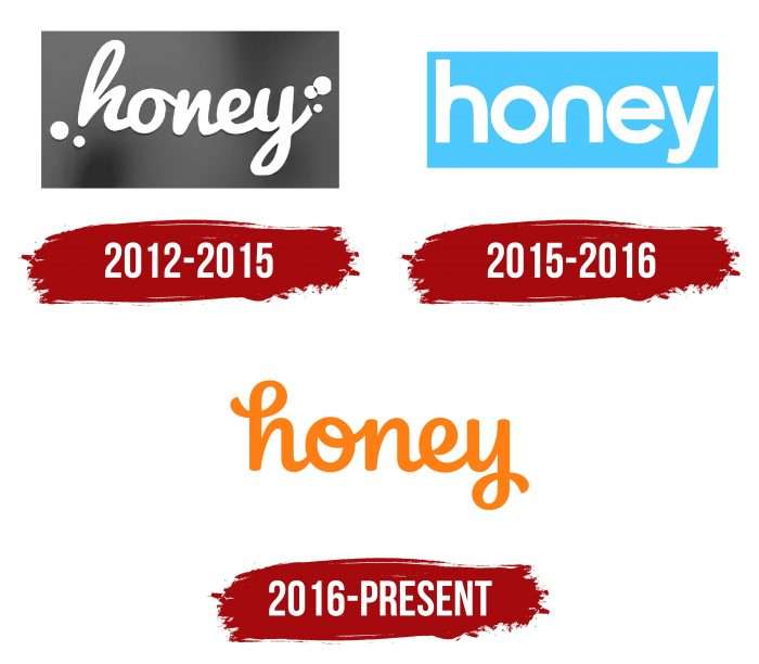
When the service first appeared, it used a logo with the word “honey” in white. The round and jagged letters made the script look like a bubble font. There were spots on the sides that looked like paint splashes (two next to the “h” and three to the right of the “y”). A large rectangle served as the background. The artists used a gradient, adding uneven transitions between several shades of gray.
2015 – 2016
In 2015, a small redesign took place, after which the rectangle became narrow and light blue. The typography has also changed: the handwritten font has been replaced by the CM Sans Serif 2012 Medium modification. The developers slightly changed the style of “n,” removing the protruding stroke on the left side and making the letter symmetrical.
2016 – today
In the current version, the word again looks like it was written by hand. The design of the text is noticeably different from what it was before. The letters appear smoother and cleaner. The rectangle disappeared without a trace – in its place, there was only empty white space. Thus, the designers had to repaint the name of the Honey Science plugin in a bright orange color so that it does not get lost on a light background.
Honey: Interesting Facts
Honey, launched in 2012 by Ryan Hudson and George Ruan, revolutionized online shopping with its coupon-finding capabilities.
- Origins: The idea for Honey emerged from Hudson’s desire for an easier way to find online coupons while ordering pizza, leading to the creation of Honey with co-founder George Ruan.
- User Growth: Honey quickly became popular, attracting millions of users worldwide thanks to its user-friendly platform that simplifies finding online savings.
- PayPal Acquisition: In January 2020, PayPal acquired Honey for about $4 billion, aiming to enhance the shopping experience by incorporating Honey’s features.
- Technology: Honey employs advanced technology to automatically find and apply the best coupons and deals at checkout, streamlining user savings.
- Rewards Program: Honey offers the Honey Gold rewards program, allowing users to earn points redeemable for gift cards on purchases made through Honey.
- Accessibility: Honey is known for its browser extension, which is compatible with Chrome, Safari, and Firefox. It also provides a mobile app for shopping convenience on the go.
- E-commerce Influence: Honey has changed online shopping by prompting users to seek the best deals, altering consumer expectations and behavior.
- International Services: Honey has expanded beyond the U.S. and now supports international shoppers with coupons and deals in several countries.
- Charitable Efforts: Honey engages in charitable activities, including matching donations and supporting various causes, reflecting its community-positive mission.
- Innovations: Among Honey’s notable features are Droplist, which tracks price drops, and the Honey Smart Shopping Assistant, which offers broader deal-finding and wish list management.
Honey’s rise showcases how technology can change the way we shop online. It offers a valuable tool for consumers to save money while benefiting retailers. Its partnership with PayPal signifies its importance in the broader digital payment and e-commerce landscape.
Font and Colors
The company, which became famous for the browser extension, relies on its fame. Therefore, its logo contains only the word “honey” and is not decorated with any other elements: it is assumed that users already know what they are dealing with. In management, additional details only distract attention from the most important thing – from the brand name.
Since Honey only uses wordmark, the designers have focused on font choice. After some experimentation, they settled on handwritten text with an imitation of a neat handwriting. Some letters (“h”, “o”, “y”) are decorated with decorative loops. All corners are rounded. The characters are lowercase and are interconnected.
The color of the inscription corresponds to the company’s name: the word “honey” is orange like Honey. The shade is bright enough and very similar to Pumpkin (# FF7518). The HEX color code value is # FF7F22.
Honey color codes
| Safety Orange | Hex color: | #ff7f22 |
|---|---|---|
| RGB: | 255 127 34 | |
| CMYK: | 0 50 87 0 | |
| Pantone: | PMS 1575 C |
