Whatever activity the company undertakes, the work will be done with high quality and taste. The Honeywell logo reflects the desire to be useful to people and make their lives easier. The elements of the sign attract attention, as well, as the company’s products stand out against the general background.
Honeywell: Brand overview
| Founded: | 1906 |
| Founder: | Mark C. Honeywell |
| Headquarters: | Charlotte, North Carolina, U.S. |
| Website: | honeywell.com |
Meaning and History
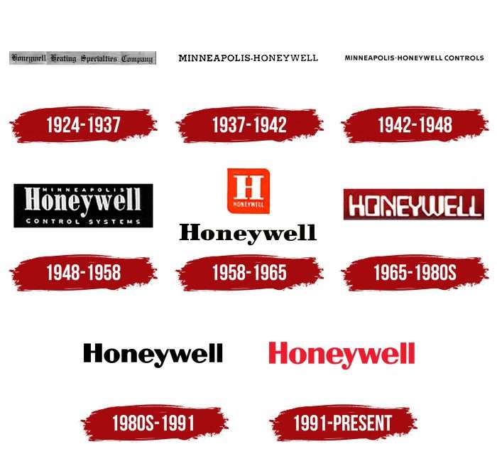
The evolution of logos traces the history of Honeywell. And it was very turbulent because this corporation repeatedly changed its name and absorbed other companies to get their technology. Its wordmark has always reflected the current name – be it Honeywell Heating Specialty Company or Minneapolis-Honeywell. Each variant had a different font, including emblems with a single “H” in a rectangle. The colors also varied, but most of the writing was either black or red.
What is Honeywell?
Honeywell International Inc. is a company that develops progressive industries and actively invests in scientific research. It consists of four business groups responsible for various tasks. They create gas and oil processing technologies and produce chemicals, safety systems, barcode scanners, turbochargers, aviation engines, and much more. The corporation’s inception dates back to 1906.
1924 – 1937
Until 1927, there were two separate companies: the Honeywell Heating Specialty Company, formed in 1906, and the Minneapolis Heat Regulator Company, which was founded in 1885 under a different name. Both of them were engaged in thermostats and automatics for coal stoves, so they entered the struggle for leadership. Due to conflicts of interest, they had to merge into the Minneapolis-Honeywell Regulator Company. The merger took place in 1927, and before that, the inventor Mark Honeywell company used the logo with the words “HONEYWELL HEATING SPECIALTY COMPANY.” The Old English typeface with complex textural shapes was in keeping with the spirit of the time.
1937 – 1942
In 1937, 10 years after the two competing enterprises merger, the newly formed company had about 30,000 employees. Its emblem bore the abbreviated name: “MINNEAPOLIS-HONEYWELL.” The hyphen between the words looked like a bullet. The font was far from medieval classics. This time, the designers preferred an antique with thin, straight lines.
1942 – 1948
One of the earliest logos contained the words MINNEAPOLIS-HONEYWELL CONTROLS. The last word indicated the type of product the company was making: control thermostats for heating systems. The serifs have disappeared, and the letters have taken on a sharper shape.
1948 – 1958
The next emblem also mentioned the main product of the manufacturer: “CONTROL SYSTEMS.” The phrase was found under the word “Honeywell,” where only the first “H” was capitalized. For the first time, designers used lowercase letters for a company name. At the very top, between the “H” and “ll,” the small print read “MINNEAPOLIS.” The light gray text was inside a black rectangle.
1958 – 1965
In 1958, a combined logo appeared, consisting of a black lettering “HONEYWELL” and an orange rectangle with a large white letter “H” and a small word “HONEYWELL.”
1965 – the 1980s
In the second half of the 20th century, the company adopted a wordmark with a white “HONEYWELL” inside a burgundy rectangle. The typeface became stylized for the first time: it was not an ordinary grotesque, but a version with disproportionate letters.
the 1980s – 1991
The designers removed the inscription from the rectangle and repainted it black. Also, they changed the font, making the lines symmetrical.
1991 – today
In anticipation of the new millennium, the company slightly modified the logo. As a result, the lettering turned red, and the overall style did not change.
Honeywell: Interesting Facts
Honeywell International Inc. is a huge company in aerospace, building tech, and safety products.
- Start and Growth: Honeywell began in 1906 in Indiana, making water heaters. Now, it’s a tech giant in various industries.
- Thermostat Innovations: The company is famous for creating early thermostat versions, starting with a furnace regulator in 1885. This kicked off Honeywell’s journey in making environmental controls.
- Wide Range of Products: Honeywell makes a lot of different things – from aerospace gear and building controls to turbochargers and chemicals. This variety has helped it stay strong and grow.
- Space Tech: Honeywell has been a big part of space missions, including the Apollo moon landings. They make parts for spacecraft and work on projects like Mars rovers.
- Going Green: The company aims to be carbon neutral by 2035. It’s focusing on eco-friendly products like green refrigerants and saving energy.
- Digital Shift: Honeywell is all in on digital, with investments in software, the Internet of Things (IoT), and data analytics. They have platforms like Honeywell Forge to make industrial operations smarter and safer.
- Top 100: Honeywell is often included in the Fortune 100, which shows that it’s one of the biggest and most successful U.S. companies.
- Worldwide Work: Honeywell has a global impact, with operations in over 70 countries and about 110,000 employees.
- Growing Through Acquisitions: The company has grown by buying other businesses, adding new tech, and entering new markets.
- Safety and Efficiency: Honeywell also focuses on products that make workplaces safer and more efficient, like protective gear and automation tech.
Honeywell has been innovating and growing for over a century, leading the way in technology while focusing on sustainability and making the world safer and more efficient.
Font and Colors
An international corporation has always had a word mark – both now and a hundred years ago. The only exception was the orange square emblem with the letter “H” inside. This was exactly the secret of Honeywell’s popularity: the company made its name a center of visual identity and made everyone recognize it.
Endless experiments with the design of the lettering ended with the designers settling on Helvetica. At least this particular font is listed in the branding guide. But if you pay attention to the details, small differences become noticeable. Another similar typeface is the Britannic Bold.
The company chose the color the easy way: its logos are either black or red. The current version uses a bright shade called Honeywell Red (# EE3124) for the word and Brilliant White (#FFFFFF) for the background.
Honeywell color codes
| Imperial Red | Hex color: | #ee1b2e |
|---|---|---|
| RGB: | 238 27 46 | |
| CMYK: | 0 89 81 7 | |
| Pantone: | PMS Bright Red C |
