


 Honor Logo PNG
Bright overflows make the Honor logo look like a smartphone screen that opens a window to fun and communication. The emblem indicates innovation and the wide possibilities of the company’s devices. The sign conveys a sense of community and connects with progressive people worldwide.
Huawei launched Honor in 2013 in Shenzhen as a consumer electronics brand focused on affordable smartphones and online distribution. The sub-brand targeted younger users and relied on direct online sales to reduce costs. On December 16, 2013, Honor debuted in China with the Honor 3C, featuring an 8 MP camera, a quad-core processor, and a 5-inch HD display. In 2014, the brand entered Europe, starting with the UK, where it launched the Honor 6 as its first local release.
By 2015, it expanded to Germany, France, Italy, and Spain. That year, Honor introduced a flagship model with a metal body and fingerprint sensor. In 2016, a dual-camera device with a glass body strengthened its position in the mid-range segment. In 2017, the company entered the US market and presented smartphones, laptops, and tablets at CES. In 2018, Honor added AI-based image processing to the Honor 10. In 2019, the brand released its first 5G smartphone and expanded the MagicBook laptop line.
In November 2020, Huawei sold Honor to a consortium after US sanctions limited access to American technologies. In 2021, the company relaunched independently with the V40 series, running Android and using Google services. In 2021, Honor returned the 50 series to global markets with full Google integration. In 2022, the portfolio expanded across smartphones, laptops, and wearables. By 2023, Honor operated as an independent brand across multiple international markets.
Meaning and History
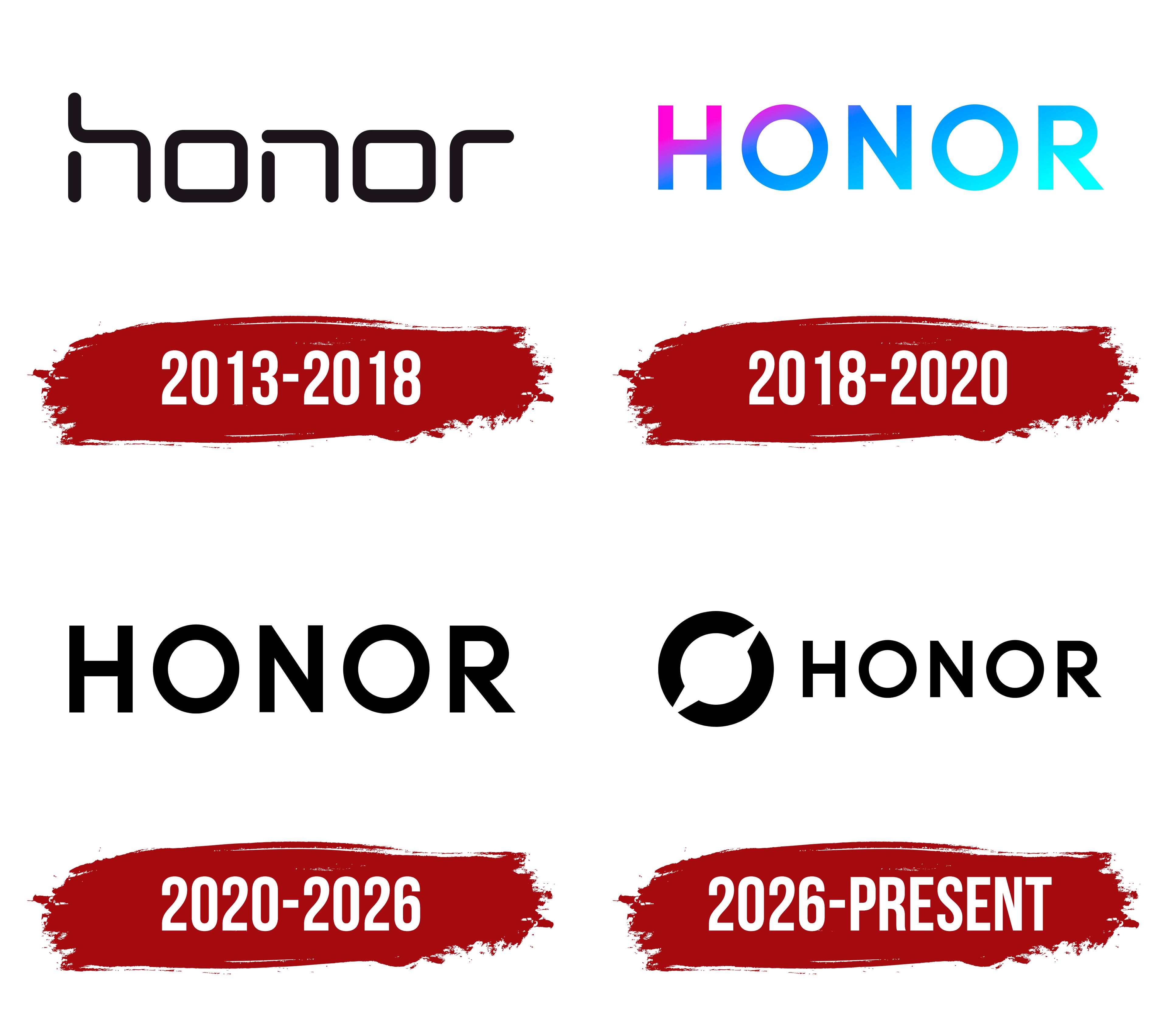
Although the company was founded in 2013, its logo debuted two years earlier, in 2011. This reflects the project’s preparation.
What is Honor?
Honor is a Chinese manufacturer of smartphones, computers, and household appliances. Ren Zhengfei established it in 2013, and it quickly gained popularity worldwide. In 2020, Shenzhen Zhixin New Information Technology Co., Ltd. acquired it. The brand’s headquarters is located in Shenzhen.
2013 – 2018
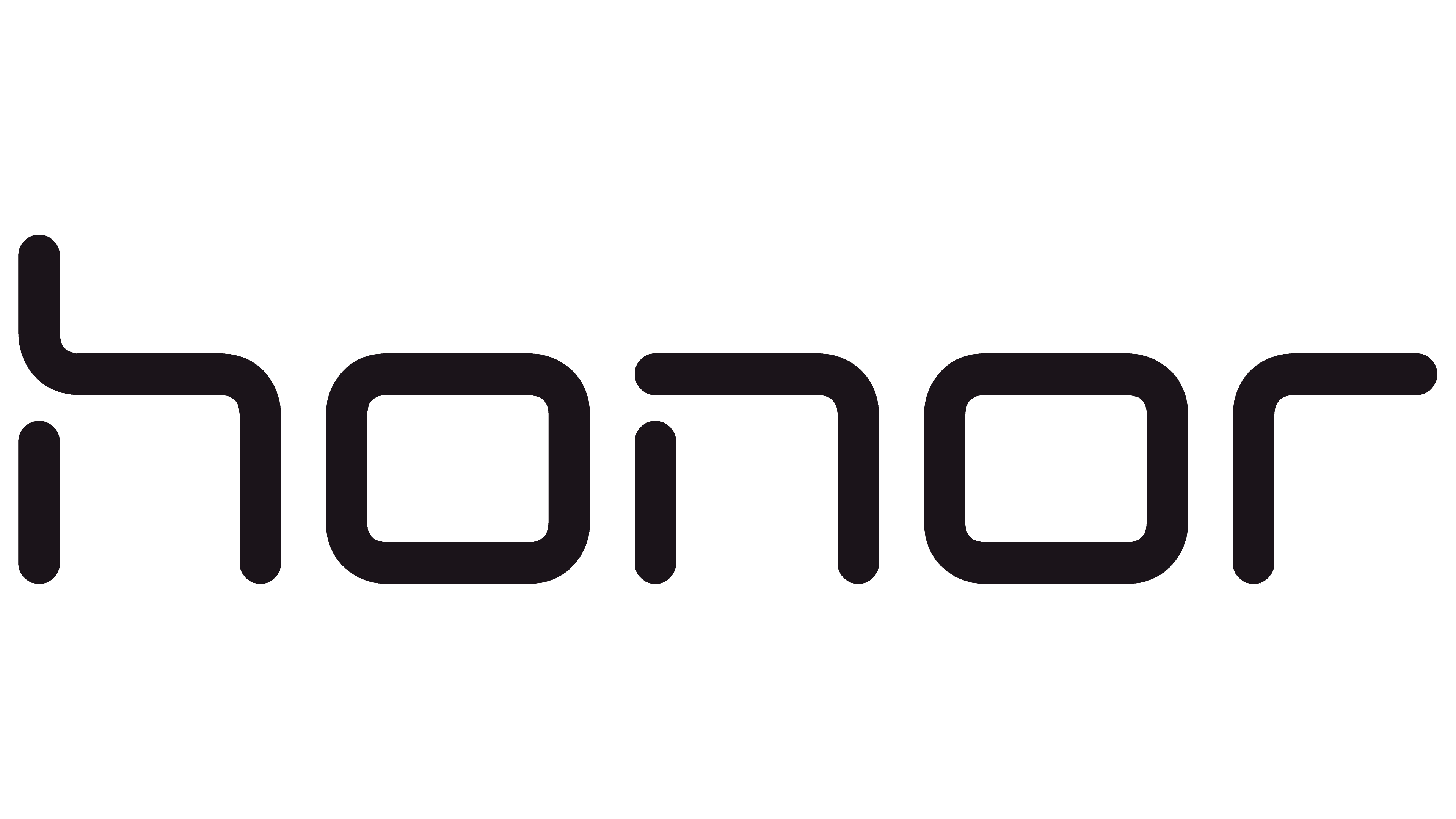
Honor launched on December 16, 2013, as a Huawei smartphone brand aimed at young consumers and online shoppers. The launch helped Huawei compete with Xiaomi. The product lineup later expanded to include laptops, tablets, watches, and other devices. The international name, “honor,” conveys esteem and respect. The Chinese name, “Rongyao,” means “glory.” The Latin-letter name formed the basis of the logo, while early versions used in China paired it with Chinese characters.
The original honor wordmark used lowercase letters with nearly uniform stroke widths. Straight lines met at rounded corners. The letters had squared shapes, with gaps interrupting some of the strokes. These separated sections resembled segments of a digital clock display, linking the lettering to electronic devices. The similarly shaped “h” and “n” differed in the height of their left strokes. In the “h,” the tall vertical stroke joined the top horizontal stroke, while a small gap separated the lower section on the left. The “n” featured a similar break.
Both “o” letters had closed outlines. Their outer edges resembled squares with rounded corners, and the openings inside followed the same shape. Their resemblance to zeros reinforced the impression that the lettering was assembled from display segments. The final “r” had a long top horizontal stroke and an open upper-right corner.
The logo appeared in black and blue. In the Chinese version used in 2013 and 2014, the right portion of the initial “h” was red, while its left stroke and the remaining letters were black. From 2014 through 2018, the entire name appeared in light blue.
The slogan “For the Brave” arrived in 2014 alongside the Honor 6. It continued the brand’s appeal to a young audience. English-language versions placed the short slogan in uppercase beneath the name. The small, upright letters let the large, rounded Honor wordmark remain the logo’s main feature.
2018 – 2020

Honor unveiled its updated wordmark on August 30, 2018, during the announcement of the Honor Magic 2. The device launched on December 11, 2018. The brand was preparing a new identity for an international audience, reflecting young consumers’ interest in device aesthetics, personal style, and social connection.
The lowercase honor became the uppercase HONOR. Gaps in the strokes disappeared, and the two squared “o” letters became circular “O” letters. The “H” became straight and vertical, the “N” gained a diagonal, and the “R” gained an angled leg. All five letters shared the same height. The Chinese name was removed from the international logo. The wordmark retained geometric sans-serif lettering, but continuous outlines replaced the segmented construction.
A gradient called “Moving Color” was developed for the color version. Pink and purple transitioned into blue, light blue, and turquoise. The colors shifted within individual letters and across the wordmark, moving from pink at the upper left toward lighter tones at the lower right. Their intensity approached neon hues. Through these transitions, Honor expressed technology’s warmth and potential, along with the diversity of youth culture.
On January 22, 2019, Honor president George Zhao introduced the refreshed brand to an international audience at the Honor View20 launch in Paris. The logo was accompanied by “HONOR MY WORLD,” using the brand name as a verb. The phrase spoke to young consumers’ interests and their right to shape their own lifestyles. The gradient wordmark and new tagline were part of the broader brand refresh.
2020 – 2026

The black HONOR wordmark first appeared as a print version of the 2018 logo and became the primary version on April 1, 2020. It retained the uppercase letters, circular “O” shapes, straight vertical lines, and diagonal strokes. The name appeared in black on light backgrounds or white on dark backgrounds. The letterforms remained unchanged, with a solid fill replacing the gradient.
On November 17, 2020, Huawei sold its Honor business to Shenzhen Zhixin New Information Technology Co., Ltd. Following the separation, Honor Device Co., Ltd. was established, and the brand began moving into the premium market. The company needed an identity that would distinguish Honor from Huawei. London agency Williams Murray Hamm was brought in to work on the project. In 2021, the agency merged with Identica to form WMH&I. Under its new name, the agency added the Honor project to its portfolio.
The HONOR wordmark was retained, with black and white given equal weight in the identity. Shades of gray complemented them. Blue remained as a link to the brand’s earlier identity. The refresh focused on the colors around the name and the logo’s usage rules. The letterforms kept the same geometry introduced in late 2018.
The project centered on a system called “Frame & Canvas.” Black-and-white frames defined spaces for images and text. Shapes drawn from the logo’s letters informed the broader identity. The system was developed for packaging, printed materials, in-store applications, and digital use.
Garrick Hamm served as the project’s creative director, with Chris Ribet leading the creative work. Ellie Cockle, Becky Sewell, and Baz Forrister worked on the identity, while Jason Budgen handled animation. In 2022, the rebrand won bronze in the Branding category of the Creativepool Annual awards. The award recognized the comprehensive identity, including its monochrome treatment and geometric shape system.
2026 – today
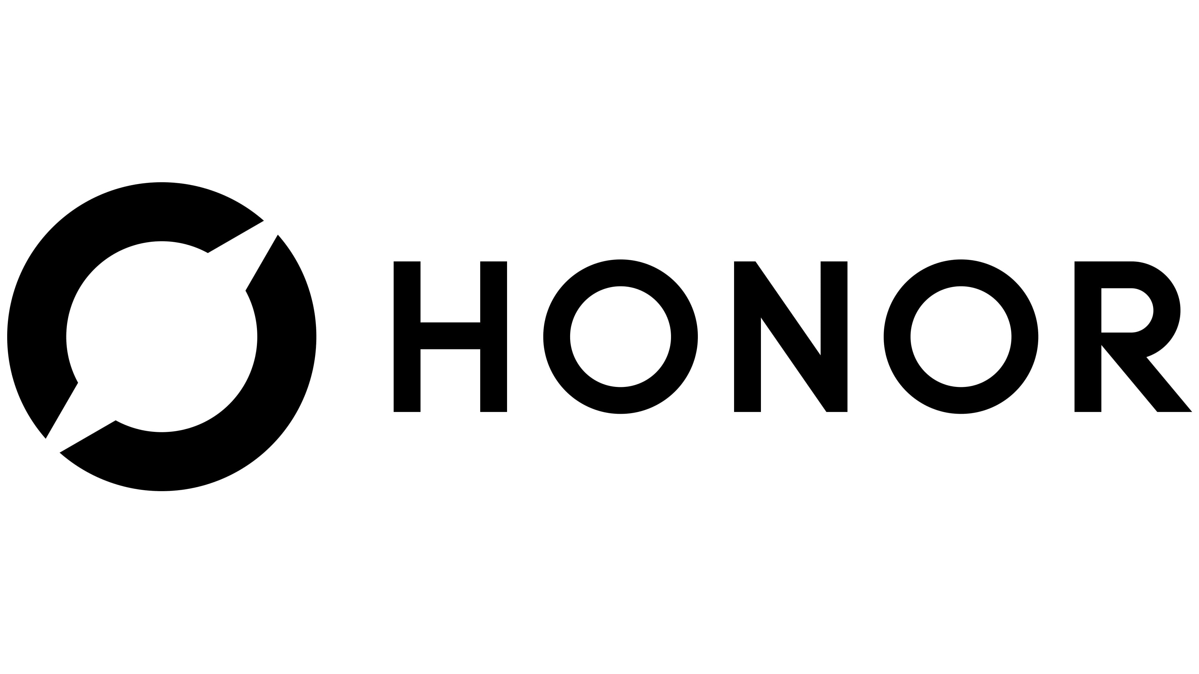
Honor’s shift from smartphone manufacturing toward an ecosystem of AI devices was reflected in a new emblem. On July 23, 2026, CEO Li Jian introduced the “Honor Ring.” The uppercase HONOR name remained, now accompanied by a separate symbol. In the horizontal version, the ring sits to the left of the wordmark. In the vertical version, the two components are stacked.
Two thick arcs form the ring, with diagonal gaps at the upper right and lower left. The center opening is circular, and the cut ends of the arcs align along a single diagonal axis. The gaps express openness to exploration and a willingness to push past limitations. In introducing the emblem, the company spoke of breaking open a closed circle of perfection, exploring the space within it, and reaching beyond its boundaries.
The refresh was accompanied by a Chinese phrase meaning “Dare to Think, Dare to Be Different.” The English tagline “DARE TO BE” replaced “Go Beyond.” Li Jian connected the new identity to Honor’s expanding work in AI devices.
The ring was designed for use in black, white, and blue. In the color version, the blue symbol is paired with a black or white HONOR wordmark. The new blue has an RGB value of 0/155/255. The horizontal logo has a minimum height of 5 millimeters in print and 14 pixels in digital applications.
Font and Colors
Although a brand usually uses “Honor,” it sometimes includes a tagline. Variants with the phrases “For the brave” and “Powered by Huawei” are known. Thus, the marketing slogan emphasizes the brand’s uniqueness.

The classic version is black and white with dark letters on a light background. The current logo uses a complex color scheme featuring neon transitions of pink, fuchsia, blue, light blue, ultramarine, and emerald.