Henry Dreyfuss created the Hoover logo with the red circle in the 1950s. He played with the first letter of the brand name, presenting it as two parallel lines intersecting at an angle with the third stripe. Because of the white ring that acts as a frame, the emblem looks like a prohibition road sign.
Hoover: Brand overview
| Founded: | June 2, 1908 |
| Founder: | William Henry Hoover |
| Headquarters: | Charlotte, North Carolina, U.S. |
| Website: | hoover.com |
Meaning and History
Hoover owes much to American industrial design pioneer Henry Dreyfuss. This is the man in the 1930s who helped to update the range of household appliances, made the vacuum cleaner aesthetic, and improved its design. Dreyfuss is also considered the logo’s creator in the form of a red circle with a white inscription. The iconic symbol has been used for many years and has hardly changed since its inception. It is balanced in color and shape, so consumers recognize Hoover products by the round symbol with diagonal letters.
What is Hoover?
Hoover is the oldest vacuum cleaner manufacturer in the world. This company was founded in the USA in 1908 and eventually entered the UK market, becoming so famous that its name became synonymous with vacuum cleaners. Techtronic Industries Company Limited of Hong Kong now operates the home appliance brand.
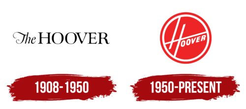
1908 – 1950
Until 1950, Hoover household appliances were marked with a word mark, which also appeared in advertising. It contained the brand name followed by the article “The.” For the first half of the inscription, a thin and elegant font was used, stylized as handwritten. The second part was done by contrasting antiqua with long serifs.
1950 – today
The iconic Hoover logo is similar to a no-go sign in that it’s also red and round. And inside it, there is a white ring, which is divided into two parts by a diagonal strip of the same white color. It intersects with two other lines and forms a stylized “H.” Below the long diagonal are the remaining letters: “O,” “O,” “V,” “E,” and “R.” They are built from the bottom up with a ladder. All glyphs are capitalized, bold, and slightly tilted to the right.
The graphic Hoover sign – white lettering in a red circle – has a long history. It is known that he was presented in the early 1950 in Life magazine. And the first products to feature the logo were the Hoover 638 and 1224 vacuum cleaners. It continues to be used on the brand’s home appliances and promotional materials. At the same time, an important rule is observed: the word necessarily forms an angle of approximately 55 degrees.
Font and Colors
To avoid loading the logo with unnecessary details, the designers decided not to use a serif font. Instead, they limited themselves to bold grotesque, capitalizing all the letters and adding a slight slope to them for symmetry. And only the first “H” became an exception to the rule.
The Hoover emblem is painted bright red because it was introduced in the 1950s – just at the moment when the company began to replace the gloomy and restrained palette with bright colors. At that moment, the red Hoover 29 vacuum cleaner was released, replacing the brown and black models.
Hoover color codes
| Pigment Red | Hex color: | #ec2426 |
|---|---|---|
| RGB: | 236 36 38 | |
| CMYK: | 0 85 84 7 | |
| Pantone: | PMS Bright Red C |


