A selection of hotels offers the Hotels.com logo. A complete and convenient catalog containing important information for the traveler is viewed in the symbols. Included in the logo is the promise of timely data updates.
Hotels.com: Brand overview
| Founded: | 1991 |
| Founder: | David Litman, Robert Diener |
| Headquarters: | Dallas, Texas, U.S. |
| Website: | hotels.com |
Meaning and History
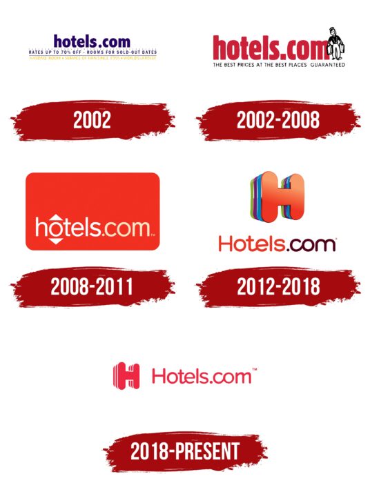
For more than 30 years of functioning in the tourism market, the company has changed its logo five times. Despite this, conciseness and minimalism in details allow it to remain recognizable to the target audience. This is exactly what the online booking service needs.
What is Hotels.com?
First of all, this is a site that contains information about hotels from more than 100 countries of the world. The user can get data on available rooms, prices, and living conditions in a few clicks.
2002
The first version of the web resource logo was introduced in 2002. Its main element was the platform’s name, made in a classic bold font using lowercase sans-serif letters. The purple color was not chosen by chance because it immediately catches the eye of potential customers.
Phrases directly related to tourism have been added in two lines in purple and orange under the site’s name. There was a horizontal purple line between these lines. With the help of additional verbal inscriptions, the company pointed out to users the services it provides.
2002 – 2008
Almost immediately after the first version of the logo, an update was introduced. The main element was also the site’s name, made in a classic bold font using lowercase dark red letters. Also, the platform’s slogan was presented at the bottom of the name, namely “The best prices at the best places. Guaranteed”. This inscription was made in black, using a classic sans-serif font.
To the right of the name was an image of a porter with two suitcases. The emblem was made in black and white and had to be associated with potential customers with hotels.
2008 – 2011
In 2008, the results of another logo redesign appeared. The platform’s name has been placed inside a red rectangle with rounded corners. The title is in lower case bold letters using a white gradient. An interesting solution is related to using the letter “o.” Two arrows go out of it in the title – one up and the second down. Thus, there are associations with the elevator as an indispensable attribute of a modern hotel.
2012 – 2018
In 2011, the unique logo in the history of Hotels.com was introduced. It only shows the first letter “H” in a classic bold font with rounded sans serifs. At the same time, to create the volume of this symbol, a color palette consisting of many shades was used. Each color in a new layer symbolizes a new place on the world map and opportunities that appear for “Hotels.com” customers.
2018 – today
After seven years of using the 3D letter as the logo of the online booking service, the decision was made to simplify it. The main element was again the name of the project, made in red on a white background. Special attention should be paid to the elongated edges in the letters “t” and “c,” which create the feeling that these characters are not written but drawn. All letters are lowercase except for “H.” This logo has a well-chosen color palette that allows the user to easily read the resource’s name and motivate him to go to the main page.
Font and Colors
The verbal name of the brand is made in a classic sans-serif font. After the first drafts, the simplification of the logo, including the removal of slogans, made it more concise and friendly to the client.
The current version of the logo uses red. The company used a more diverse color palette in previous variations, thereby creating associations with different parts of the world, attracting the target audience to travel and get to know something new.
Hotels.com color codes
| Red | Hex color: | #ee2843 |
|---|---|---|
| RGB: | 238 40 67 | |
| CMYK: | 0 83 72 7 | |
| Pantone: | PMS 1788 C |


