Although the Houzz logo does not contain many elements, it is a reminder that this site is dedicated to designing rooms and homesteads. The symbol is done in a geometric style, as it is a trendy trend in contemporary landscape architecture.
Houzz: Brand overview
| Founded: | February 2009 |
| Founder: | Adi Tatarko, Alon Cohen |
| Headquarters: | California, U.S. |
| Website: | houzz.com |
Meaning and History
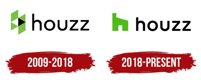
The visual recognition of the site logo is high among users who are fond of the relevant topics. Two versions of the logo were presented for the entire period of the platform’s functioning in the global network of the target audience. In general, they practically did not differ from each other.
What is Houzz?
It is an authoritative web resource in the field of landscape design and interior design.
2009 – 2018
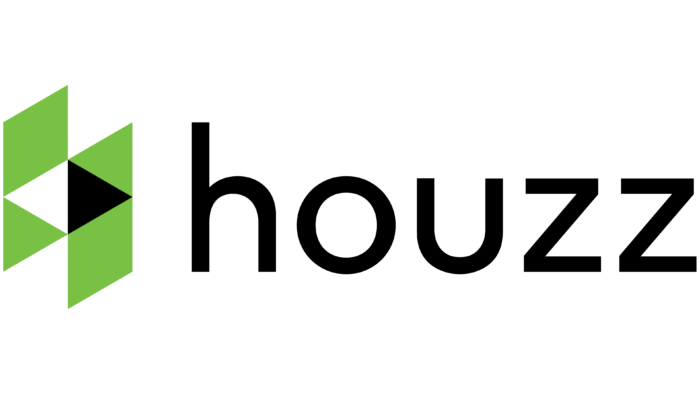
The original version of the logo consisted of a word inscription and an emblem located on the left. The emblem consists of six geometric shapes: four triangles and two rhombuses. The central two triangles are white and black, while the remaining elements are green. It looks abstract but at the same time progressive and interesting.
The brand name is in lowercase, using a classic sans-serif typeface with rounded corners and thin lines. The verbal inscription looks simpler against the background of the emblem but, at the same time, successfully complements it.
2018 – today
The only redesign at the moment somewhat simplified the first version of the logo. We are talking about the emblem from which the geometric shapes familiar to many were removed. Instead, a stylized image of a greenhouse appeared.
In turn, a traditional black sans-serif inscription was used for the word inscription. The lines became bolder and more confident, which added strength and confidence to the logo. There was a large space between the characters in the title. Thus, the logo has become more airy and confident.
The color palette remained identical and combined black and lemon green.
The brand made a rather interesting decision regarding the use of the logo. If the emblem and logo are used together, they must be located on the same horizontal line. At the same time, the logo can be used regardless of the company name, for example, for a site icon. The verbal inscription “Houzz” cannot be used without a symbol.
The conciseness and minimalism of the elements of the logo allow you to place the logo on any surface. As a rule, black or white is used as the background, but other options can be considered. In addition, three-dimensional versions of the logo are sometimes used, which are realized through shadows.
Font and Colors
The logo is based on a classic simple sans-serif typeface. Thin lines in symbols and a large distance between them make reading the word inscription on any surface easy. Moreover, the name effectively complements the emblem.
As a color palette, the company uses two shades of green and black and white. Some variations also use multiple shades of gray. The background can be black or white. The contrast between colors attracts the attention of potential readers, so the logo is popular among the target audience.
Houzz color codes
| Kelly Green | Hex color: | #4dbc14 |
|---|---|---|
| RGB: | 77 188 20 | |
| CMYK: | 59 0 89 26 | |
| Pantone: | PMS 802 C |
| Black | Hex color: | #000000 |
|---|---|---|
| RGB: | 0 0 0 | |
| CMYK: | 0 0 0 100 | |
| Pantone: | PMS Process Black C |
