Designers created the Huggies logo based on the concept of this brand. So it turned out to be serious, like parental care, but with playful elements, which every child’s life is not without. The logo is a combination of opposites: softness and austerity, orderliness, and chaos.
Huggies: Brand overview
| Founded: | 1968 |
| Founder: | Kimberly-Clark |
| Headquarters: | United States |
| Website: | huggies.com |
Meaning and History
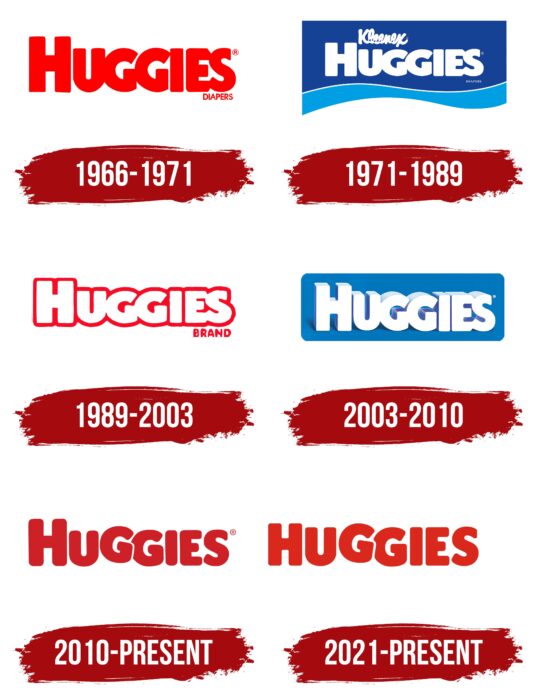
Throughout the brand’s existence, six logo variants have been presented to potential buyers of Huggies. Each new redesign brought a new style to the wordmark and made it more attractive. Visual recognition of the brand is at a high level. Billions of people worldwide have heard of this company’s existence.
What is Huggies?
It is the most famous diaper company in the world. Almost every parent has heard of this brand and bought products for their baby.
1966 – 1971
The first version of the logo was introduced in 1966. It lasted five years. It was a red word inscription consisting of capital letters. However, the first “H” was slightly larger than the rest of the characters. A classic bold font with thick lines and rounded corners were used. The letters had practically no space between them. Each letter had a barely visible black outline. In general, the inscription looked harmoniously on different backgrounds.
1971 – 1989
The first redesign, which came in 1971, changed the logo’s color palette to blue and white. The brand name was written in white on a dark blue background. The font used was identical to the original version but with wider lines in the letters. Also, a blue wavy line has been added to the bottom.
1989 – 2003
Another change was aimed at making the logo more modern and progressive. At this stage, two variants of the color palette were used: red-white and blue-white. In turn, the letters have become smoother and thicker. The blue outline and blue shadows give the image a three-dimensional feel. Also, in the logo’s white and red variation, the word “brand” is located in the lower right corner. It is in a classic sans-serif typeface.
2003 – 2010
In the new redesign, the volume of the image is even more noticeable. It is created by bold letters executed in a double outline using blue and sky blue. As a rule, the verbal inscription was located on a blue background. Even though all the letters are located on the same line, it may seem that they are written diagonally.
2010 – today
Two color palettes were used at all stages of the company’s existence: red and blue. At the same time, the next redesign led to the fact that the red version became the main one. The bold, non-standard font with rounded lines in the letters was again used as a font. At the same time, the space between the characters has become more tangible. In turn, in the letters “GG,” you can see a jumping effect. Thus, a reference is made to children’s products and a more lively logo.
The verbal inscription, as a rule, is located on a white rectangle. However, it may change color depending on the type of packaging. The most common packaging used is a heart-shaped emblem with a thick white outline and white lettering. The logo looks welcoming and friendly, evoking care and warmth.
2021 – today
The latest redesign has seen the company revert to the format it came up within 2010. However, the color has become brighter and lighter. Also, each letter has a white outline, especially in the “G” letters.
Font and Colors
Throughout the company’s existence, many font variations have been used for the Huggies brand. A common feature was clear and wide lines in the letters. In some versions, the effect of “jumping” letters was used. This is a direct reference to the fact that the company specializes in children’s products.
As in the case of the font, various color palette options are used. In most cases, we are talking about white-blue and white-red colors. However, in some embodiments, a cyan or black outline is used to add three-dimensionality to the image.
Huggies color codes
| Maximum Red | Hex color: | #da281c |
|---|---|---|
| RGB: | 218 40 28 | |
| CMYK: | 0 82 87 15 | |
| Pantone: | PMS Bright Red C |
