


![]() Hunger Games Logo PNG
Hunger Games Logo PNG
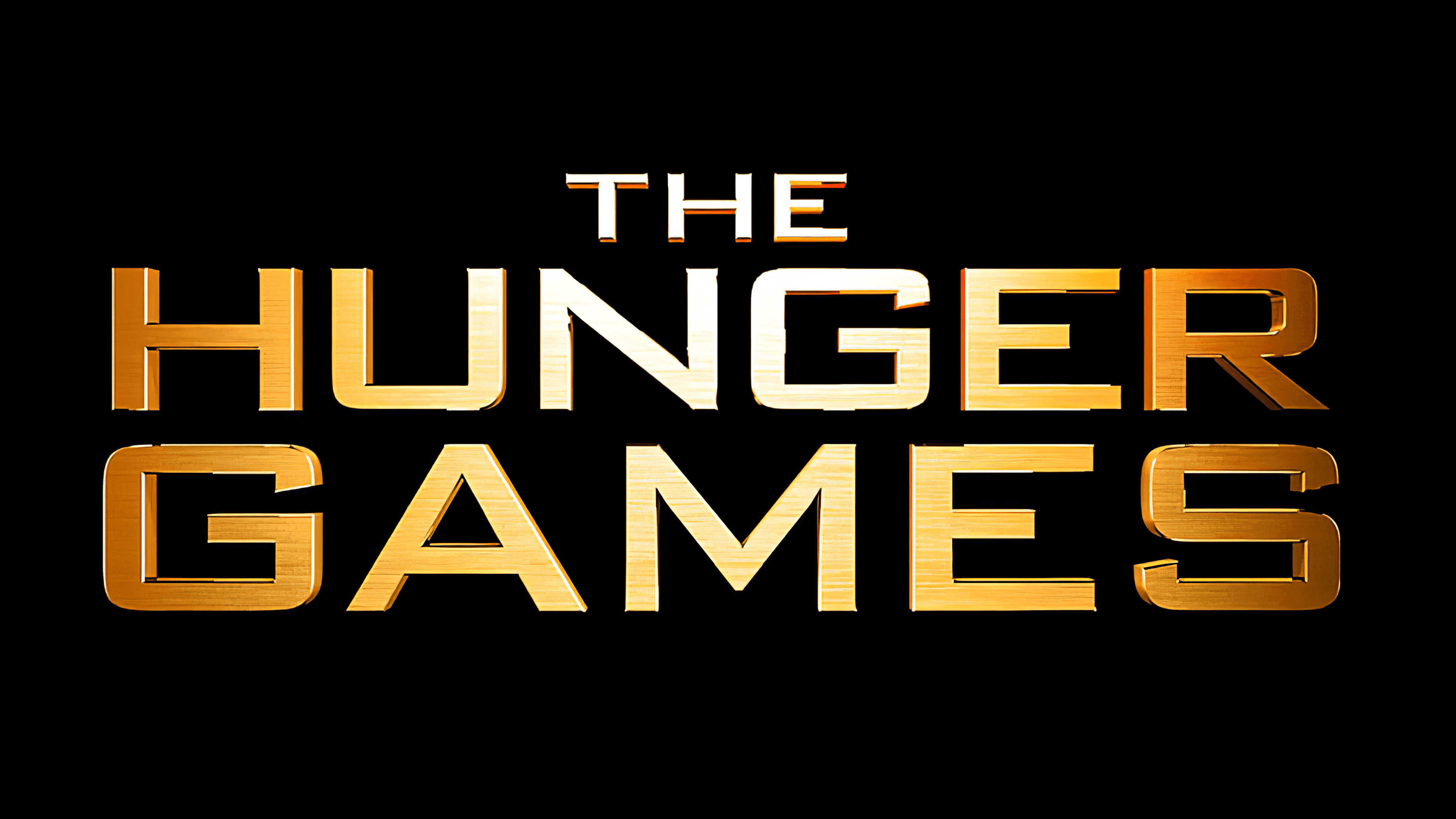
The Hunger Games logo is filled with grandeur, strength, and struggle. The unyielding metal of the emblem reflects the will to win that fills the story’s heroine. The shine of gold indicates the main resource at stake in the games.
The Hunger Games was written by Suzanne Collins, a writer who had worked for Nickelodeon and Cartoon Network before moving into novels. In 2005, the idea came from switching between reality television and news coverage of the war in the Middle East. She connected that image with the myth of the Minotaur and Roman gladiator games, shaping a story about violence turned into public entertainment.
Scholastic published The Hunger Games on September 14, 2008, with an initial print run of about 50,000 copies. The book spread among teenage readers through libraries and in online discussions, reaching the New York Times children’s bestseller list in early 2009. At the time, young adult fiction was still influenced by Twilight’s success. Still, Collins’ novel used dystopia, state control, and survival rather than romantic fantasy.
Catching Fire was released on September 1, 2009, and sold about 250,000 copies in its first week. Mockingjay appeared on August 24, 2010, with more than 450,000 U.S. copies sold on the first day. By 2012, the trilogy had sold over 65 million copies in more than 50 countries. Lionsgate bought the film rights, hired Gary Ross for the first movie, and cast Jennifer Lawrence as Katniss Everdeen with Collins’ public support.
The first film opened on March 23, 2012, earning about $152 million in its U.S. debut weekend and around $694 million worldwide. The studio split Mockingjay into two films, following the model used for Harry Potter and Twilight. The four movies made more than $2.9 billion worldwide. In 2020, Collins released The Ballad of Songbirds and Snakes, which Francis Lawrence adapted into a film in 2023.
Meaning and History
![]()
The trilogy’s logos are filled with images that evoke associations with the story’s main events and characters. The symbols represent freedom, uprising, wealth, and domination. The images tell the story of the difficult path to freeing the entire country from the slavery of a despotic capital that has hoarded all resources. Panem won its happy future like a bird gradually spreading its wings on the emblem.
What is Hunger Games?
A series of films and novels by Suzanne Collins in which teenagers from 12 districts of a fictional world must participate in deadly combats. The first part of the book was published in 2008. Filming began in 2011, and the first movie was released in 2012. After that, there were three more books and four films. In terms of popularity, the series ranked second after Harry Potter.
2012
![]()
The emblem is the logo of the first film, based on Suzanne Collins’s trilogy. The film began production in 2011, and the first logo was designed.
The sign consists of voluminous golden letters that, like a monument, rise above the viewer. The emblem represents the grandeur of the Capitol, a technologically advanced and wealthy capital.
The emblem was designed to showcase the spectacle of the games broadcast in all districts. The sign is a prototype of a grand show.
The gold in the logo indicates the theme of wealth. The main problem was that the districts remained poor due to the Capitol’s dominance. Victory in the games promised a reward of food, supplies, and money.
2013
![]()
The second emblem is associated with the trilogy’s second film, The Hunger Games: Catching Fire, released in 2013. Unlike the book’s fiery title, the inscription that became the logo uses white letters. The golden name of the trilogy, The Hunger Games, is placed at the top in its previous format. The choice of white letters for the Catching Fire inscription indicates:
- The first confrontation with the president of the Capitol was with Snow.
- The heroine’s disappearance from the authorities’ view is going underground.
- The ashes were left after the destruction of District 12, where Katniss Everdeen used to live.
- The Mockingjay partner’s memory loss.
- Winter, as the events took place in the cold season.
The capital letters demonstrate the grandeur of the drama’s events. The film decides the fate of an entire generation.
2014
![]()
The sign corresponds to the first film based on the third novel in Collins’s trilogy, The Hunger Games: Mockingjay Part 1. The logo returns to its saturated gold color. The word “Mockingjay” is especially highlighted in the emblem, as the main heroine had to embody the ideological image of the uprising.
2015
![]()
The logo represents The Hunger Games’s fourth and final installment: Mockingjay Part 2. It completely replicates the imagery of the first part.
After all the films in the series, a prequel, The Hunger Games: The Ballad of Songbirds & Snakes, was made, which tells the story that led to the rise of the ruthless ruler Coriolanus Snow.
The Hunger Games (novel series)
2008, 2013
![]()
The emblem of the first book features a symbol that became the prototype for the entire series. It is used in any reference to The Hunger Games, whether in film adaptations or print. The image is of a Mockingjay in a circle, holding an arrow in its beak.
The bird is a fictional animal resulting from the crossbreeding of jabber jays and mockingbirds. In the book, it is associated with District 13’s uprising against the Capitol. This event is central to the origin of the games. Originally, jabberjays were mutated by the leaders of the Capitol to assist them in their struggle for power. They were trained to memorize speeches and spy on the rebels. However, the rebels managed to reprogram the jabberjays and send false information to the Capitol. Consequently, the rulers abandoned the mutants, thinking they would die out since they were all male. But the talking jays mated with the mockingbirds, symbolizing resistance to the Capitol.
The bird is associated with the main character, Katniss Everdeen, after she voluntarily takes her younger sister’s place in the games. Like these birds, she was never meant to exist there.
The logo image was a badge Katniss wore on her clothing, a reminder of her beloved sister. Throughout the book, this amulet is a constant focus. The Mockingjay symbolizes resistance. They are unconventional, like all of the heroine’s decisions.
Mockingjays loved to listen to and mimic human songs, which Katniss used to communicate with friends. No matter how much the Capitol tried to discredit her, she grew stronger. The arrow corresponds to the weapon Everdeen uses.
2009
![]()
The second emblem represents the book Catching Fire. The previous sign is used but engulfed in flames. Katniss’s defiance during the games sparks the uprising against the Capitol, and the leader threatening her loved ones forces Everdeen to go on a tour to calm the residents. Then, she is forced to participate in new games. The fire symbolizes the rising rebellion and the danger threatening the heroine’s life.
2010
![]()
The logo for the third book, Mockingjay. The symbol of a bird taking flight, seemingly breaking free from the closed circle of the arena. The author was inspired by the story of Theseus and the Minotaur, who entered the circle of victims doomed to slaughter, helped kill the Minotaur, and led the prisoners through the labyrinth to freedom. The emblem represents victory over the Capitol and freedom for all districts.
Font and Colors
The golden color used throughout the emblems symbolizes strength and prosperity, emphasizing the central themes of the stories: the struggle for resources, freedom, and a dignified life. This shade contrasts with dark background tones, heightening impact and evoking a sense of hope and defiance. The red color in the second part of the series represents resistance and the desire to change the existing order. The final story features light blue and white tones, symbolizing calm, freedom, and a new beginning.
The films share a unified design style and geometric typography without decorative elements. The letters are clean, with defined lines and sharp ends, creating a modern, slightly futuristic impression. Visually, the characters resemble well-known typefaces such as Morris Sans Std Medium and Bank Gothic Medium.
The book versions of the stories excluded textual titles, focusing instead on symbols and color schemes. This approach conveyed the narrative’s emotional core through visual elements rather than words.