


![]() Hyatt Logo PNG
Hyatt Logo PNG
From dusk to dawn, staying at the chain hotels will bring pleasure to the client, says the Hyatt logo. Every guest here is treated like a star. The emblem demonstrates a broad network of hotels and a superior position over competitors.
Hyatt began on September 27, 1957, when Jay Pritzker bought the Hyatt House motel near Los Angeles Airport for $2.2 million. The name came from its original owner, Hyatt von Dehn. Jay saw the airport hotel as a business travel opportunity during the rise of commercial aviation. Within four years, he and his brother Donald had turned one motel into a six-hotel chain.
By 1969, Hyatt operated 13 hotels. The breakthrough came earlier, in 1967, with the Hyatt Regency Atlanta, designed by John Portman with a 22-story atrium lobby. That open interior changed hotel architecture and pushed Hilton and Marriott to rethink their own large hotel projects. In 1969, Hyatt opened its first international hotel, the Hyatt Regency Hong Kong, and established Hyatt International Corporation to support overseas growth.
Donald Pritzker died in 1972, leaving Jay to lead the expansion. In 1979, the Pritzkers took Hyatt private. In 1981, the Hyatt Regency Kansas City walkway collapsed, killing 114 people and injuring 229, becoming one of the worst structural disasters in US history. Grand Hyatt opened in New York in 1980, while Park Hyatt introduced a smaller luxury format.
Hyatt unified its domestic and international companies in 2004 under the name Global Hyatt Corp. In 2009, Hyatt Hotels Corporation went public on the NYSE. Later deals included Two Roads Hospitality in 2018, Apple Leisure Group in 2021, Dream Hotel Group in 2023, and Standard International in 2024.
Meaning and History
![]()
The first Hyatt House was built in 1954 near the Los Angeles International Airport. The company’s founders, Hyatt Robert von Dehn and Jack Dyer Crouch, built the hotel. Therefore, the network was subsequently named after one of them. However, its official opening date was 1957, when the Pritzker brothers, Jay and Donald, bought the business. The deal cost them $2.2 million.
Realizing the growing demand for air travel, they actively expanded their hotel operations around airports in cities across America. This was a strategically correct decision. After Los Angeles, Hyatt motels have sprung up in San Francisco, Seattle-Tacoma, and several other major cities. This step made the corporate emblem universally recognizable.
Since 1969, the hotel chain has expanded internationally. She began construction, purchasing new buildings and acquiring competitors. Today, its assets include many hotels, resorts, boutique hotels, and hotels with a full range of services. Therefore, the logo is now known in more than 60 countries worldwide. There are three emblems in Hyatt’s career.
What is Hyatt?
Hyatt is a hotel company known worldwide as Hyatt Hotels & Resorts. It owns a large network of properties designed for travelers, with over 1,300 hotels in dozens of countries worldwide. They are categorized by guests’ budgets, so both affordable and luxurious rooms are available. Nonetheless, all guests receive quality service.
1957 – 1990
![]()
The corporation’s debut visual identity mark included the full name Hyatt Hotels & Resorts written in elegant, elongated type. Thin letters were located very close; sometimes, there was no intersymbol space, and some elements almost merged.
The phrase was monochrome and grotesque, with a circular icon between “Hyatt” and “Hotels”. It was a white flower with four petals on a black background. Inside, there was a semblance of a core with protruding semicircles. A thin line crossed it. The lettering highlighted an “R” with an unfinished middle line and an “H” with a low crossbar. The rest of the letters were close to the standard.
1990 – 2013
![]()
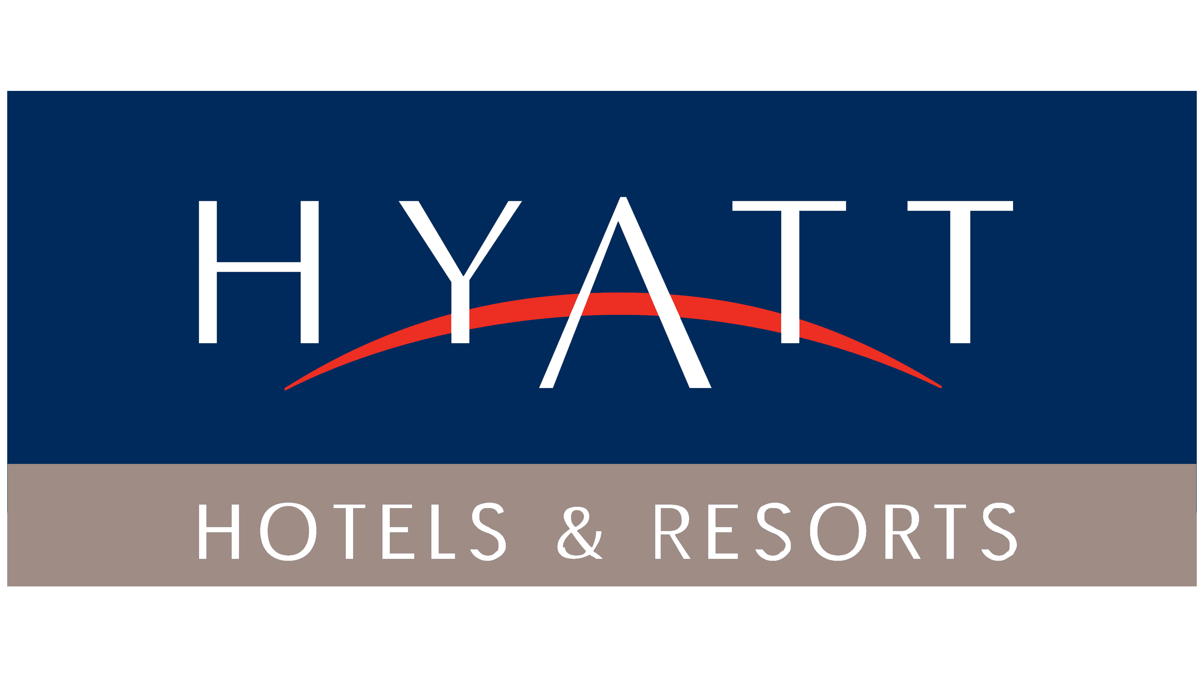
After a long application period for the old emblem, management approved the new one. It was a harmonious combination of graphics and text. That is, the letters were individual, hand-drawn, not printed. The updated version featured tall, sleek sans-serif characters. The center of the logo was “A.” It was in the middle and was very large, with a red curved line instead of the usual crossbar. To the right and left of it were the rest of the signs from the word “Hyatt.” Behind him was a red arc with pointed ends. It is a special element that symbolizes the close relationship between customers and the corporation, as well as between the past and the future.
2013 – today
![]()
The current emblem is almost a complete copy of the previous one. The difference between them is only in the color change: the early version was two-color (blue-red), and the latter was one-color (blue).
Font and Colors
In the course of evolution, the logo lost unnecessary elements and became simplified. Now, it looks as simple as possible, a monochrome sign consisting of one inscription and one arch. But in the initial stages, it was a multi-part inscription: a detailed name of a hotel chain, with a flower-shaped icon with four petals.
The debut emblem used a custom typeface with the characteristic round “O,” open “R,” and non-standard “H” with a lowered horizontal line. The rest of the letters are a typical flat grotesque. After the redesign, a font reminiscent of Optima appeared.

Previously, the corporate palette consisted of black (for letters and icons) and white (for the background). The logo changed dramatically, becoming much brighter: dark blue (#04214e) and red (#ef221b). They are now replaced with blue (# 4a78ab).