Hyster: Brand overview
Hyster, an American company founded in 1929, is known as a manufacturer of forklifts and a variety of material-handling equipment. The company has its roots in Portland, Oregon, but its central manufacturing facility was later relocated to Cleveland, Ohio.
The company’s lineup includes a variety of equipment, including electric and internal combustion forklifts, container handlers, reach stackers, and other specialized warehouse machines. These machines find applications in a variety of industries, including distribution, port operations, and construction.
Hyster is credited with several industry firsts. It introduced the first elevator truck and also pioneered the two-ton forklift.
Hyster has a global manufacturing presence with facilities in the United States, the Netherlands, Brazil, Mexico, Italy, and China. The company employs approximately 6,500 people and supplies products to more than 100 countries worldwide.
In 2013, Hyster became part of Nacco Materials Handling Group Inc. However, the company continues to operate as an autonomous subsidiary while maintaining its brand and business strategy.
In the material handling equipment market, Hyster is represented by serious competitors such as Toyota, Kion, Hangcha, and Crown Equipment. However, Hyster has maintained its position in the industry for over 90 years, solidifying its position as a leader in forklifts and warehouse equipment. In 2022, the company celebrated this long legacy of innovation and quality.
Meaning and History
What is Hyster?
Founded in 1929, Hyster has been a prominent presence in the American manufacturing sector for over nine decades. Originally formed as the Willamette-Ersted Company in Portland, Oregon, under the leadership of Ernest G. Swigert, the company has grown into a globally recognized brand specializing in forklifts and other material handling equipment.
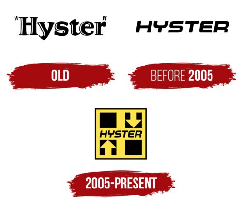
Old
before 2005
2005 – today
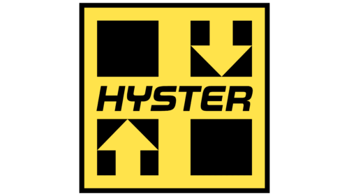
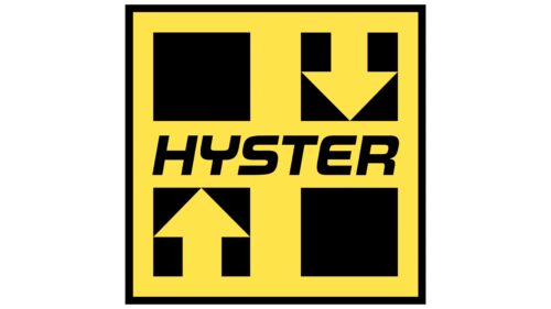
The two arrows symbolize upward and downward movement as Hyster manufactures material handling equipment. The squares located in different parts of the logo represent crates with cargo. The yellow and black color palette is reminiscent of the colors of special equipment, which should be bright for better visibility during the day and night. The company name takes center stage as the most significant element of the emblem. It is written in italic font with a rounded letter “E” and a modified letter “Y,” resembling an inverted bicycle fork.
The arrows resemble an elevator going up and down, showing that Hyster is a freight hauler. The squares resemble the boxes that can be stacked in a video game – simple but essential to the job. The yellow and black colors are reminiscent of warning signs; they shout, “Hey, look at me, I work here!”. The name in the center is the team captain in charge of that site. The whimsical “E” and inverted “Y” add a twist, bringing to mind a stunt on a bicycle or movement on a skateboard.
Hyster color codes
| Banana Yellow | Hex color: | #ffe34b |
|---|---|---|
| RGB: | 255 227 75 | |
| CMYK: | 0 11 71 0 | |
| Pantone: | PMS 115 C |
| Black | Hex color: | #000000 |
|---|---|---|
| RGB: | 0 0 0 | |
| CMYK: | 0 0 0 100 | |
| Pantone: | PMS Process Black C |
