The emblem’s futuristic style transports users to a future world. The Hyundai logo is a symbol of progress. The brand’s machines use the latest innovations the company’s designers and programmers created.
Hyundai: Brand overview
Meaning and History
Chung Ju-Yung first established the Hyundai Engineering and Construction Company and, after a certain period, acquired the Hyundai Motor Company. The difference between them is exactly twenty years, so the entrepreneur has accumulated a lot of experience to engage in serious production in the automobile industry.
When passenger car production became more active globally, South Korean companies also considered this business, inviting George Turnbull, a former manager from Austin Morris, to cooperate. He wished to adequately support the company’s prestige and cars and turned to the best British engineers for help.
As a result, in 1982, the Hyundai logo was already well-recognized abroad. Starting from the Canadian market, the company gradually expanded its sales, and in 1986, its cars entered the top 10 of the best products in the United States, according to the American magazine Fortune. This made the emblem of the South Korean corporation very prestigious.
What is Hyundai?
Hyundai is a South Korean conglomerate of dozens of enterprises that manufacture microchips, lighting products, plastics, petrochemicals, construction, information technology, defense technology, finance, and other fields of activity. The largest participant in the association is the car manufacturer Hyundai Motor Company.
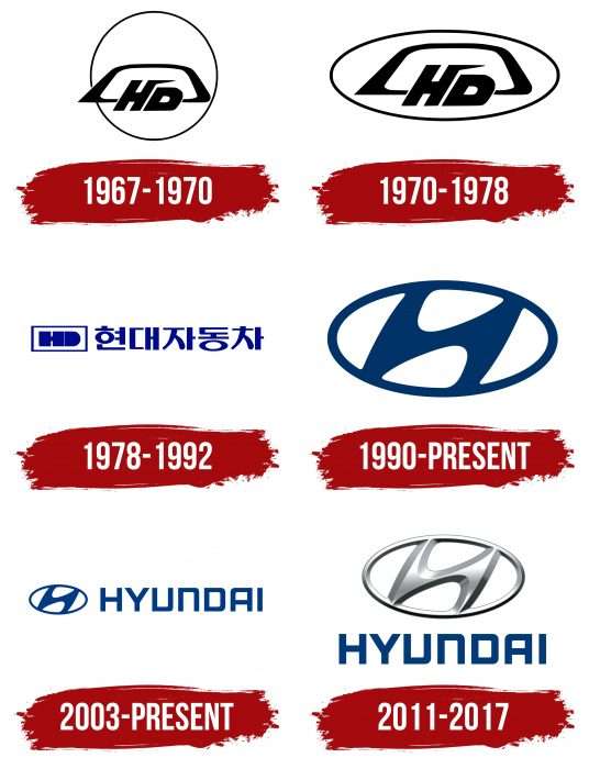
1967 – 1970
The debut logo features geometric shapes with an “H” and “D” in the background. They are taken from the name of the Hyundai company and are its abbreviation. The H has an elongated right leg, which resembles a miniature spike protruding above the second letter. The “D” has a rounded right side. A large bracket with an acute angle on the left serves as a background. She, in turn, is located against the background of a large, thin ring. The color of the emblem is monochrome – black and white.
1970 – 1978
In this version, the designers kept all the elements except the circle. They “flattened” it, turning it into an oval. As a result, the bracket located inside it began to look slightly biased back, as if in perspective – what is next to it looks larger and what is smaller.
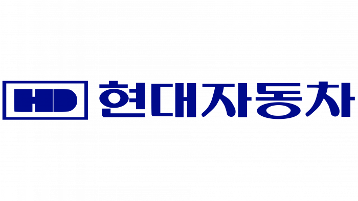
1978 – 1992
1978, the emblem received a completely different format—with a direct arrangement. The letters “HD” are even and legible, even though “D” has a solid color fill. Both signs are in a rectangular frame. On the right is an inscription in Korean characters.
1990 – today
The designers presented a radically different emblem: only an oval with a thin frame remained from the previous one. The graphic, stylized as the letter “H,” depicts a seller and a buyer shaking hands in honor of a successful deal.
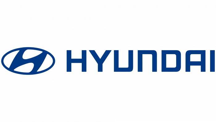
2003 – today
To ensure the emblem was well received in the foreign market, the company management removed the hieroglyphs and replaced them with the English version of the brand name. On the left side, there is a corporate badge in the form of an oval with figures exchanging handshakes, and on the right, the word “Hyundai” in capital letters. Now, this logo is actively used, being the main one.
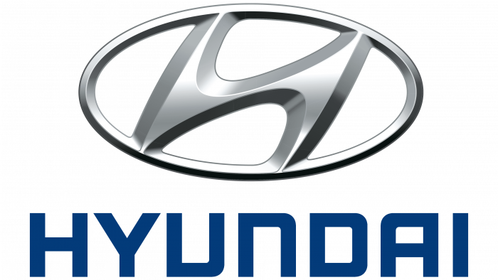
2011 – 2017
The designers temporarily moved the oval icon with the letter “H” above the brand name. They also repainted silver, adding shadows, highlights, and a cool metal feel. The brand name remains the same—even clear, sans serif.
Hyundai: Interesting Facts
Hyundai Motor Company was founded in South Korea and is now one of the world’s largest and most forward-thinking car makers.
- Early Days and Growth: Hyundai began in 1967, thanks to Chung Ju-Yung. It grew fast by focusing on efficiently making good, innovative cars.
- First Car: Hyundai’s first car was the Cortina, which was made by Ford in 1968. Then, in 1975, the Hyundai Pony was South Korea’s first car to be mass-produced and sold overseas.
- Worldwide Operations: Hyundai runs the biggest car plant in the world, Ulsan, South Korea. It can make 1.6 million cars a year. Hyundai cars are sold in 193 countries through about 5,000 dealerships.
- Innovation and Technology: Hyundai leads in-car technology. It was one of the first to offer a 10-year warranty, showing trust in its car quality. It’s also at the forefront of hydrogen fuel cell technology with its ix35 Fuel Cell vehicle.
- Genesis Luxury Brand: In 2015, Hyundai introduced Genesis, a luxury brand that has won many awards for its quality and design.
- Sustainability Efforts: Hyundai is working hard to be a leader in electric cars. It has several electric models, like the Ioniq Electric and Kona Electric, and plans to add more eco-friendly cars.
- Robotics and Future Mobility: Hyundai is looking beyond cars and investing in robotics and new ways of getting around. In 2020, it bought a large part of Boston Dynamics, a top robotics company.
- Sponsorships and Culture: Hyundai supports big events like the FIFA World Cup and invests in culture and education, showing it cares about more than just making cars.
- Design Philosophy: Hyundai’s design style, Fluidic Sculpture, started with the 2011 Sonata. It uses natural shapes and lines to make cars look like they’re moving, even when they’re not.
- Research and Development: Hyundai invests heavily in developing new car ideas. It has R&D centers in South Korea, the USA, Germany, and India, focusing on the future of cars.
Hyundai has come a long way from its start in South Korea to becoming a global car leader. It’s always looking to improve and innovate, aiming to lead the way to a greener and more connected future in driving.
Font and Colors
The logo’s modification mainly affected its spatial position: if the image was slightly thrown back in the earlier versions, now it is even. The shape of the letters was simplified, and they acquired the outlines of geometric shapes.
The logo’s typography is thought out in detail. The designers used the contrast principle to make the inscription look against the background of the round badge. They chose a large and geometric typeface called Hyundai Normal, created by Samuel Park. The proprietary palette is now represented by one of the shades of blue—cobalt color # 003685.
FAQ
What does the Hyundai emblem mean?
The emblem has a meaningful design. The letter “H” is slanted to the right, showing forward movement and focusing on the future. It looks like two people shaking hands, symbolizing a good relationship between the brand and its customers, emphasizing trust and cooperation. The handshake represents the transaction between the seller and the buyer, highlighting the importance of agreements and positive relationships.
What does the H symbol mean on a car?
The “H” symbol on the car has a meaningful design. It looks like the “H” in the brand name, but it features two people shaking hands. This symbolizes trust and cooperation between the brand and its customers, highlighting the importance of building strong relationships and positive interactions. The logo reflects the brand’s commitment to customer service, teamwork, and building strong connections.
What does the Hyundai logo symbolize?
The brand’s logo, a stylized “H,” symbolizes two people shaking hands, representing a mutually beneficial transaction between buyer and seller.
The letter “H” stands for the word “hanja,” which is the basis of the name. This shows the uniqueness of the brand in its cars. The logo reflects the company’s commitment to progress and providing reliable and advanced products to its customers.
Why did Hyundai change its logo?
The company changed its logo to better suit the international market. In the 1980s, the brand used a logo with hieroglyphs replaced with English letters to make it more recognizable worldwide.
The latest redesign gives the symbol a three-dimensional appearance similar to the Honda logo. This update aimed to modernize the logo and make it more dynamic and modern.
What is the Hyundai symbol supposed to be?
The symbol looks like a stylized “H” inside a vertical oval. The letter “H” is slanted, with rounded parts and no corners, connected to an oval frame at four points.
This design shows forward movement and progress. Smooth lines and rounded corners reflect modernity and innovation. The oval frame symbolizes the brand’s global reach. The letter “H” resembles a handshake between two people, symbolizing trust and partnership.
What’s the difference between a Honda and a Hyundai symbol?
Honda and Hyundai use the letter “H” in their symbols but differ.
The Honda symbol is a flat, vertically elongated letter “H” inside a rectangular frame with rounded edges. The color is usually silver or metallic, giving it a classic and sophisticated look.
The Hyundai symbol is a slanted “H” inside an ellipse. The letter “H” is tilted to the right. The color palette includes blue and silver, signaling modernity and innovation.
These differences in shape, slope, and color palette highlight each brand’s unique personality.
