IEK: Brand overview
IEK was founded in Moscow in 1999 and was initially engaged in the sale of electrical and lighting solutions. Favoring reliability and high-quality products, the company quickly gained a reputation for quality products under the IEK brand name. As demand grew and technology evolved, the company began producing telecommunications equipment, particularly along the lines of ITK and industrial automation systems known as ONI.
In 2014, recognizing the company’s expanding scope and growing international standing, it was transformed into IEK Group, and this pivotal year marked its transformation from a domestic manufacturer to an international enterprise in the field of electrical engineering. The transformation journey continued when IEK Group acquired the LEDEL brand in 2019, marking its entry into the LED lighting market.
Today, IEK Group is the leading company in Russia for the supply of various products, from electrical and lighting solutions to automation and IT offerings. The products are designed for various industrial, infrastructural, and residential facilities. Winning leadership in the Russian market, developing the LEDEL brand, and expanding its international presence – all testify to the company’s constant striving for perfection.
IEK group of companies owes its stable success to the relentless attention to research and development and quality assurance. Significant investments in these critical areas allow the company to maintain its position in a competitive market. Thus, the company, which began as a specialized supplier of electrical equipment, has become a diversified industrial conglomerate over two decades, a recognized brand both in Russia and abroad.
Meaning and History
1999 – today
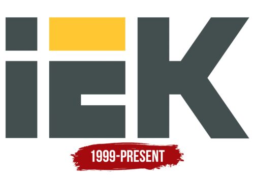
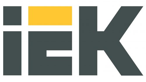
The logo is textual and includes only the abbreviation typed in a unique font that also serves as a graphic element. The top horizontal line of the letter “E” is separated from the main part of the glyph and is colored yellow. This is the only bright spot on the emblem, as everything else is dark gray, almost black. The dot above the “i” is replaced by a square, the width of which corresponds to the width of the symbols. Although the first character is lowercase, it matches the size of the capital letters.
The yellow color of the letter “E” makes the logo brighter, like a small sun in a dark sky. The square above the letter “i” gives the logo a modern twist, making it different but not too different. Even the lowercase and uppercase letters, which are well-matched in size, look balanced. The logo kind of strives to be cool without going overboard.
IEK color codes
| Charcoal | Hex color: | #434e4f |
|---|---|---|
| RGB: | 67 78 79 | |
| CMYK: | 15 1 0 69 | |
| Pantone: | PMS 446 C |
| Sunglow | Hex color: | #ffc732 |
|---|---|---|
| RGB: | 255 199 50 | |
| CMYK: | 60 0 23 0 | |
| Pantone: | PMS 7408 C |
