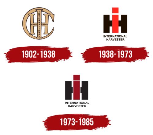
The IH logo allows you to look at the company’s equipment from above and appreciate the miracles that it can do on the field. In the sign of harmony, completeness, and compactness. The emblem tells about the ability to design and create new machines.
IH: Brand overview
| Founded: | March 22, 1902 – 1985 |
| Founder: | Cyrus Hall McCormick Jr., William Deering, J.P.Morgan |
| Headquarters: | Chicago, Illinois, U.S. |
IH is a major American manufacturer of agricultural and construction equipment, buses, and trucks. It was founded at the beginning of the 20th century by several entrepreneurs through the merger of companies. He was a pioneer in the field of mowers and tractors. The most famous models are Farmall, Mogul, Titan, Champion, Kemp, Plano, TD, John Deere, Hydro, Pro Ag, Electrall, and McCormick. The company owned several factories in Illinois, Kentucky, and Connecticut. Due to high competition, all divisions were gradually closed or sold from the bankruptcy of 1979 until 1985.
Meaning and History
The logo is filled with a game of spatial models, pointing to drawings, diagrams, and construction. The emblem shows the company’s ability to create compact, stable, productive models of equipment to offer the most thoughtful and multifunctional machines. The emblem shows the scale of the view and the assessment of problems to create effective proposals for solving them.
What is IH?
Mechanical engineering company specializing mainly in the production of tractors. During their existence, more than 5 million were produced. Trucks and tractors for construction and farms are also known. The headquarters was in Chicago.
1902 – 1938
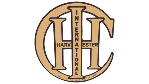
The logo is a fancifully arranged initial letter of the company name. Manufacturer’s first registered name: International Harvester Company.
- The largest letter, C, creates an unfinished circle around the sign. She represents openness to new ideas. It looks like a sickle that helps to harvest. The manufacturer’s first machine was the Reaper mower.
- Inside C, a wide H is inscribed, like a car chassis. Most models had four wide-spaced wheels.
- The largest letter I was in the center of the composition, representing the engines for the company’s equipment.
Three letters indicated the emergence of a firm from the merger of three parties:
- McCormick Harvesting Machine Company, which produced the Reaper harvester.
- Deering Harvester Company, which developed the first version of the tractor.
- Three small partners who produced tools, equipment, and mowers.
Directly on the glyphs of the letters is an inscription with the company’s full name. The word International is placed in the foreground, reporting on the large-scale claims of the manufacturer.
1938 – 1985
The company acquires a defense plant in Kentucky and sets it up to produce modern modifications of its A, B, and 340 series tractors. American industrial designer Raymond Loewy developed the appearance of the machines and the new logo.
The sign consisted of two letters H and I, superimposed on each other. The word Company was gradually removed from the company’s name, and the organization was increasingly called simply International Harvester.
According to the design of Loewy, the working part of the tractor had an elongated narrow shape in red. The wheels were large and black. Therefore, in the center, two black stripes, H, and a red stripe, I, resembled a view of the tractor from above.
Red is the color of progress and development that the conglomerate was striving for. The all-purpose tractor for farmers, Farmall became a bestseller for the next 50 years.
Below the abbreviation was the full name of the company.
1973 – 1985
In 1973, IH stopped producing its famous Farmall series, and a new stage began in the life of the enterprise. In most areas, new lines have appeared. The Pro Ag tractor model, the Axial-Flow rotary harvester, and the CO-4070/4090 tractor were presented.
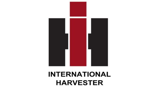
The logo has also been updated but has changed slightly. The red color became darker, and the letter H was divided into two halves, between which an I was inserted. In general, the general image and concept were preserved. Innovations showed:
- Several areas of work.
- Separation of past models and new ones.
- Extensive experience in their field.
The letter I was the prototype of trucks and tractors; when viewed from above, they looked like a rectangle with a dot-cab in front. The two halves of H looked like caterpillars.
In general, the sign demonstrated the company’s ability to integrate into new conditions to offer special equipment that stands out from other brands.
In 1985, all manufacturer divisions were sold, and the company ceased to exist. Trucks and buses continued to be produced by Navistar International Corporation under its brand, and Tenneco bought the rights to the name, turning it into the Case IH brand.
Font and Colors
The main colors of the logo are contrasting black and red. They convey style and innovation, which lies at the center of the company’s work. They talk about large equipment, its dimensions, and its strength. In shades, an indication of leadership and superiority over all competitors. In the 1930s and 50s, the company’s technology was second to none. Up to 12,000 dealers from all over the country came to the presentation of new models, and every 2-3rd farm had equipment from IH.
The font of the acronym is strict with rectangular shapes and sharp corners, which indicates machines capable of overcoming any obstacles. The title is done in Akhbar Bold.
IH color codes
| Lava | Hex color: | #cc2523 |
|---|---|---|
| RGB: | 204 37 35 | |
| CMYK: | 0 82 83 20 | |
| Pantone: | PMS 1795 C |
| Black | Hex color: | #000000 |
|---|---|---|
| RGB: | 0 0 0 | |
| CMYK: | 0 0 0 100 | |
| Pantone: | PMS Process Black C |


