


![]() iHeartRadio Logo PNG
iHeartRadio Logo PNG
iHeartRadio logo: we broadcast love. The emblem is filled with the idea of spreading favorite content and melodies to the beat of a beating heart. It is enough to press the button, and the music will flow like a river.
iHeartRadio began in 2008, when Clear Channel Communications, then the largest radio broadcaster in the United States, launched an internet radio streaming service under the name iheartmusic.com. It initially focused on online access to Clear Channel radio stations.
In 2010, the platform was renamed iHeartRadio and expanded beyond live radio to include personalized stations based on user preferences. In 2011, iOS and Android mobile apps expanded access, while the inaugural iHeartRadio Music Festival in Las Vegas gave the brand a public stage in the music industry.
By 2012, iHeartRadio had moved onto game consoles, smart TVs, and car entertainment systems. In 2013, it added talk shows and podcasts, expanding the service beyond music.
In 2014, the platform passed 50 million registered users and introduced playlist features tied to mood and interests. In 2015, it expanded into Australia and New Zealand and added personalized stations based on favorite songs. In 2016, iHeartRadio launched Plus and All Access subscriptions, allowing users to create playlists and listen offline. In 2017, it expanded its podcast catalog and added Artist Radio.
In 2018, the parent company, iHeartMedia, filed for bankruptcy, but the service continued operating and added Playlist Radio. After iHeartMedia exited bankruptcy in 2019, the platform improved AI recommendations and strengthened smart-speaker support through Google Home and Alexa. From 2020 to 2023, iHeartRadio invested further in podcasts, car partnerships, tools for podcasters and independent artists, while competing with major streaming services.
Meaning and History
![]()
The service was launched in 2008 and is now owned by iHeartMedia, Inc., which was renamed Clear Channel in 2014. Since 2019, it has been a massive podcast and streaming radio service and one of the world’s largest stations.
In the spring of 2008, a website was launched featuring music videos, on-demand singles, music albums, news, and other entertainment and radio content. In the fall of the same year, applications for the iPod Touch and the Apple iPhone appeared. It includes 12 radio stations in eight markets. The developers expanded the program in subsequent years, making it available for BlackBerry, Android, Sonos, Xbox 360, and iPad devices.
In parallel, the number of supported stations and services grew. So, in 2012, the format of online audio news, weather forecasts, and traffic streams appeared. Since 2013, the radio service has begun to feature foreign stations and to organize its platform for humorous performances.
Despite its rapid activity and expansion, iHeartRadio did not significantly alter the logo. She carried out only one redesign, a minor one that did not bring significant changes. Therefore, her image is distinctively stable.
What is iHeartRadio?
iHeartRadio is a free service that provides access to radio programs, music playlists, audiobooks, and podcasts. Essentially, it is an online radio that can be listened to on tablets, smartphones, laptops, smartwatches, and other devices with an internet connection. The platform was launched in 2008 and is owned by the American corporation iHeartMedia.
2008 – 2012
![]()
The corporate logo fully corresponds to the name iHeartRadio and consists of the indicated elements. It started with a big red heart, a classic one, as artists portray it allegorically. It emphasizes the company’s love for its listeners. A schematic translation tower is in the lower, narrow part of the symbol, an arched white projection. Above it is a solid point from which the brackets diverge to the right and left (three on each side). This is the designation of on-air waves broadcast by the station with great love for the audience.
Simultaneously, the elongated element with a dot is also the letter “i” because the platform’s name for listening to music begins with it. Under the heart, in one line, is the phrase “iheartradio,” continuously spelled in lowercase. Each word in it is highlighted in a specific color: “i” and “radio” in black, “heart” in red.
2012 – 2016
![]()
The iHeartRadio logo is recognizable and simple, yet it holds many meanings that reflect the essence of the brand and its history. The heart at the top of the emblem symbolizes the emotional connection and attachment between the radio station and its listeners. The heart shape emphasizes that the radio focuses on the soulful, human aspect of music and broadcasting, creating a warm and friendly atmosphere for its audience.
The waves radiating from the heart’s center represent radio broadcasting and the transmission of sound signals. Originally, the design featured more waves, but after a redesign, the number was reduced to two on each side, making the logo more concise and minimalist. This reflects the brand’s focus on simplicity and its commitment to the core aspect of radio communication. These waves serve as a reminder of the technical side of radio broadcasting and give the logo a more modern and sleek appearance.
The gradient, transitioning from burgundy to scarlet, highlights the passion and energy that the radio puts into its work. Initially, the heart’s color was pink, but after the redesign, it was darkened, adding depth and seriousness. The logo now appears more solid and professional, aligning with a more established, mature brand in the radio broadcasting and streaming platforms market.
The text is split into two parts. The first line features the word “iHeart” in black, symbolizing the brand’s individuality and uniqueness. The second part, the word “Radio,” is set in a silver font, adding a futuristic touch and linking the logo to modern technology and a drive for innovation. Splitting the text into two lines has made the emblem more balanced and easier to read.
This redesign wasn’t a radical change in style, as the brand had already secured its place and was recognizable to its audience. However, the changes made it more modern and simple, perfectly aligning with the spirit of the times.
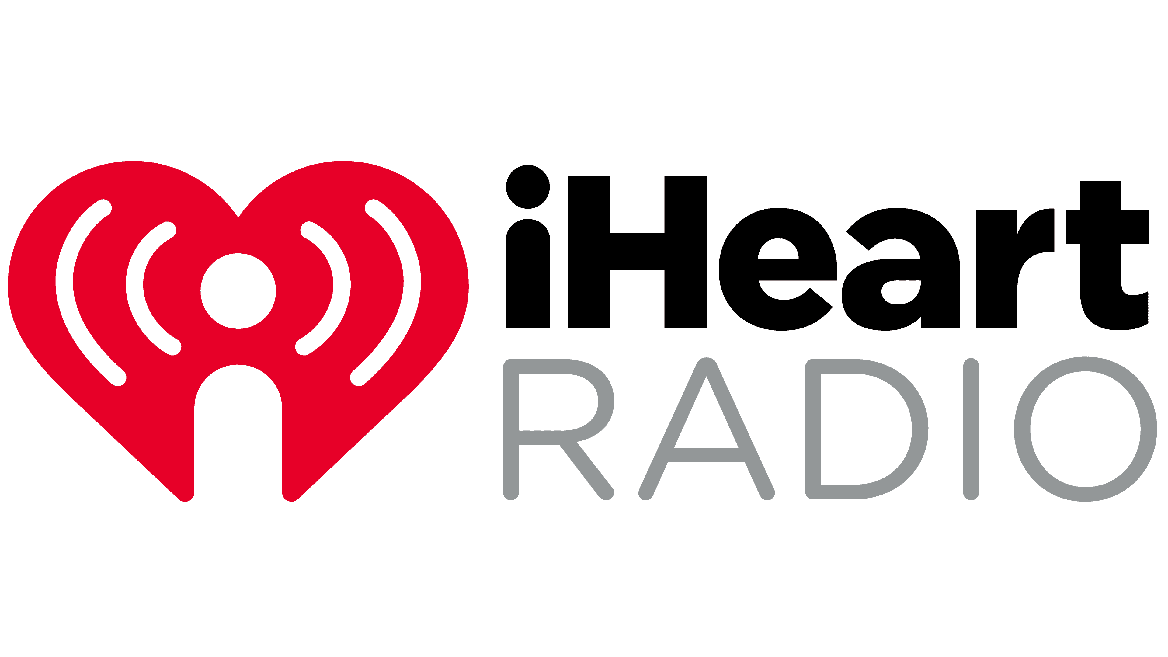
2016 – today
![]()
The iHeartRadio logo appears simple yet symbolic. At its center is a red heart, fitting for a brand that aims to convey a love for music and radio broadcasting. This symbol is easily memorable. The lines radiating from the circle within the heart resemble radio waves, signifying the connection to radio. However, the simple design captures the essence of broadcasting for everyone.
The color of the heart has changed, becoming slightly darker, now closer to burgundy. This shift makes it less bold and more refined. The classic bright red has been toned to make the logo more mature and restrained.
The letter “a” has undergone the most noticeable change; it now has a softer, rounder shape. These subtle details make the logo look more modern and visually “friendly.” The rounded edges make the overall “iHeart” text feel calmer.
The lower “RADIO” text remains unchanged and is rendered in gray, which balances the overall composition. The gray color adds neutrality without distracting from the main heart symbol.
If you look closely, the logo can be seen as more than just a heart. The center with the circle and lines can resemble a head with headphones, subtly hinting at a user listening to the radio. This adds a playful element to the design, making the visual mark open to interpretation.
Font and Colors
The logo evolved only in color and text, but not in shape. Its structure has remained unchanged, which means the radio station’s management and listeners who use this program like it. Traditional elements of the logo are a romantic heart, the letter “i,” stylized as a broadcast tower, and the company’s name. The rest is variable and subject to adjustment. The parts’ location depends on the country where the logo is applied, as it exists in several versions.
The emblem is dominated by two typefaces: a thin Helvetica Neue and a wide grotesque in bold writing. The word “Radio” is written in uppercase letters, and “iHeart” is a mixed word with a combination of uppercase and lowercase letters.
The designers settled on three colors: red, black, and white. Moreover, as the radio company emphasizes, red is basic and expresses its identity. There is also a gray one, which falls under the additional category.