


![]() iHerb Logo PNG
iHerb Logo PNG
The iHerb logo represents naturalness, freshness, safety, and health. This associative array is fully consistent with the concept of an American online store selling nutritional supplements, sports nutrition, cosmetics, and essential oils. After all, it offers only high-quality products made from natural ingredients.
iHerb’s background reaches back to the natural foods business that shaped part of the U.S. supplement market. In 1948, Paul Richard bought Fearn Soya Foods from the estate of Dr. Charles Fearn. By 1950, he was selling chocolate soy protein powder. In 1968, his son Elwood founded NOW Foods inside the family company’s facility. NOW Foods later became one of iHerb’s key suppliers.
iHerb itself was founded in 1996 by Ray Faraee in Moreno Valley, California, at the start of commercial e-commerce. The platform first focused on supplements for mood and nervous system support, then expanded into thousands of products. While rivals such as Puritan’s Pride and Vitacost were already in the market, iHerb pushed online sales, lower retail markups, and international delivery.
As demand grew, the company built a larger logistics network, with fulfillment centers in Moreno Valley, Perris, Hebron, Elgin, and Easton. It later opened an international warehouse in Incheon, South Korea, to shorten delivery times across the Asia-Pacific region, followed by a distribution hub in Hong Kong. Growth investment from General Atlantic helped fund international expansion and technology development.
In January 2025, iHerb launched digital storefronts through Albertsons Companies in the United States, Amazon UK, and Amazon Australia, expanding across more than 25 global marketplaces. In January 2026, it completed the acquisition of Vitacost from Kroger, gaining the brand, intellectual property, and inventory. By the end of 2024, iHerb had passed $2.4 billion in revenue, with seven logistics centers and average delivery times under five days.
Meaning and History
The store logo, iHerb, is permanent. It was invented when the very first iHerb supplements were sold online. This is a wordmark in green letters.
The combination “iHerb” can be translated as “I am a grass.” In a more literary version, “this is a herbal store.” Ray Faraee created a website to sell supplements for mood, depression, and calmness. They were developed from Hypericum’s green mass and flowers (St. John’s wort). The name could have been about this plant since St. John’s wort is a plant.
What is iHerb?
The world-famous site of dietary supplements and other natural products. Payment is accepted in 86 currencies. Products are delivered to 185 countries from 8 centers. The store has 4,000 employees.
The letter “i” is written in lowercase because the store is an inanimate object. In this case, the word “Herb” is capitalized. The owner wanted to focus on something other than the retail itself. Natural raw materials and medicinal herbs are of the greatest value. This is the main feature of the project. Hence the uppercase.
![]()
For writing, a green rounded font is used. Its lines resemble curving stems. The smoothness of the corners indicates the softness of the additive action and its safety for health.
The last “b” is larger than the capital “H.” She alludes to the following:
- Abbreviation BAD (biologically active dietary supplement). The store provides a wide selection of dietary supplements.
- The word best. iHerb products are the best option to take care of your health.
At the end of the logo is a registered trademark symbol.
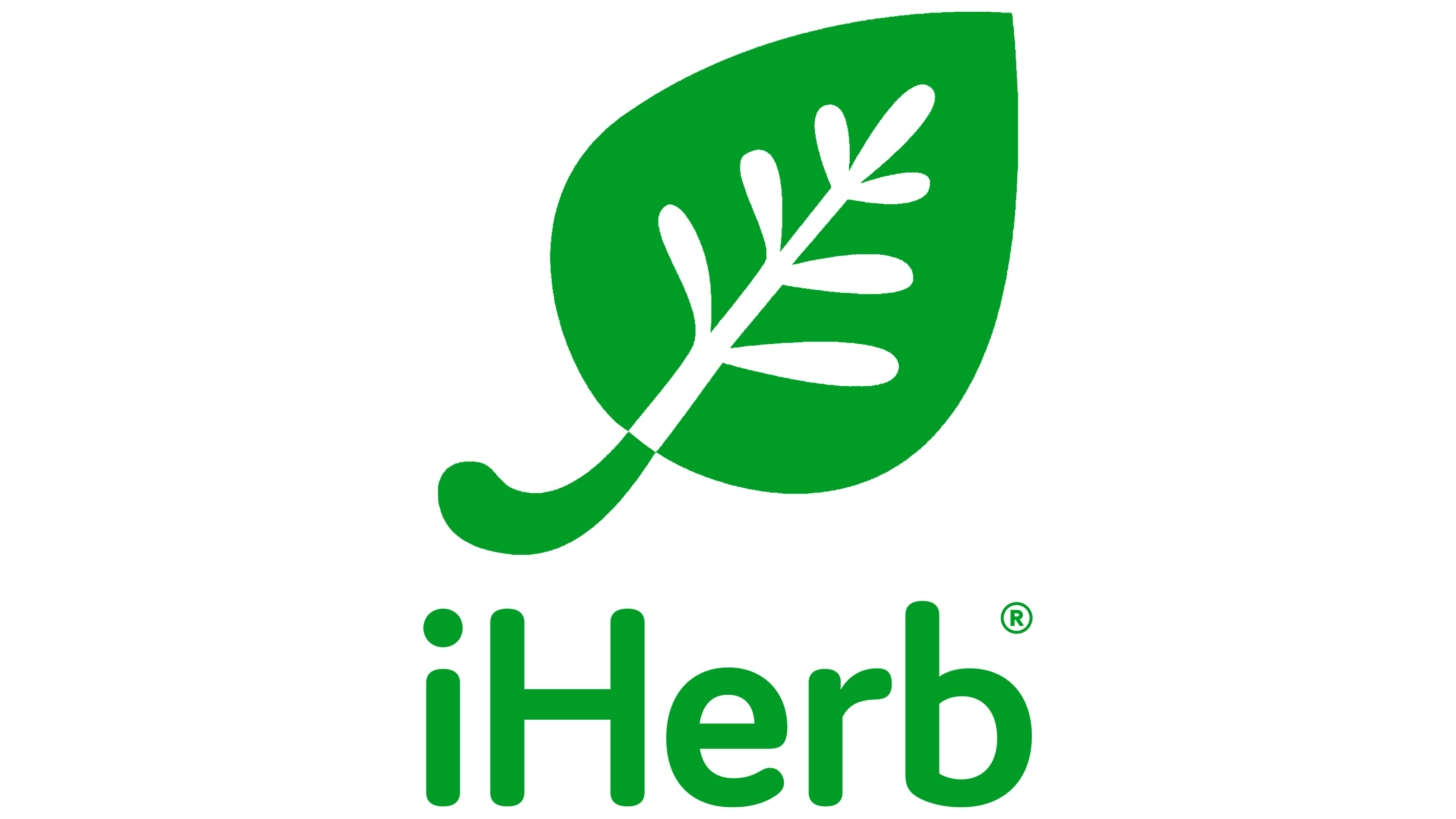
Among the visual identity elements, the iHerb website’s icon stands out. This is a green leaf on a white background. Inside the leaf, white veins turn into a green stalk on a white background. The leaf symbolizes:
- Human. The leg represents nutrition, the veins represent organs, and the green leaf represents the body. The intake of natural products through the “stalk” leads to recovery and cleansing of the organs. It gives life and health to the whole organism. Increases its unity with the surrounding nature, the earth.
- Raw materials. For the preparation of natural products, components from herbs, shrubs, trees, algae, and mushrooms are used.
- Naturalness. White veins within the leaf indicate vegetation grown in clean soil without chemical use.
All icon outlines are rounded and soft except for the pointed leaf tip. This is in perfect harmony with the logo’s streamlined lettering.
Font and Colors

The main colors of the company’s visual signs are white and green.
- White: purity of raw materials. Rejection of all chemical growth stimulants, pesticides, and herbicides. Cultivation on clean soils. Color is a symbol of medicine. Proper natural nutrition is the simplest and safest treatment that maintains harmony in the body.
- Green life, normal growth and development, good health. Symbolizes plants.
Lettering font: Torus Pro Semi Bold.