


 Illinois State Redbirds Logo PNG
The Illinois State Redbirds logo features athletes from the university’s 19 teams and a caricatured version of the mascot, rendered with an intimidating expression toward the opponent. The identity focuses on the state itself, the teams’ affiliation, and the name.
Illinois State University was founded in 1857 in Normal, Illinois, as a teacher training school. Football started in 1887, and the team was known as the Teachers before a 1923 rebrand to the Redbirds, proposed to avoid confusion with the St. Louis Cardinals. The red and white colors date back to the 1890s, while early logos gradually moved away from borrowed baseball imagery.
Basketball gained national attention through Doug Collins, who played from 1969 to 1973, later joined the Philadelphia 76ers, and appeared in the 1972 Olympic final against the USSR. The program reached the NCAA Tournament six times between 1983 and 1998 and remained active in the NIT.
Football success came later at the FCS level. Illinois State reached the playoffs ten times, winning the Missouri Valley Conference in 1998 and 1999 and advancing to the national semifinal in 1999. In 2014, the team reached the FCS Championship Game but lost to North Dakota State. A similar run followed in 2025, ending with a loss to Montana State.
The program also holds an NCAA FCS record with 66 ties and maintains a long rivalry with Eastern Illinois, dating back to 1901. Since 1980, Illinois State has competed in the Missouri Valley Conference, while women’s gymnastics competes in the Mid-American Conference.
A tragic event in 2015 reshaped the program’s recent history when a plane crash near Central Illinois Regional Airport claimed the lives of staff and supporters, later honored with a permanent memorial.
Meaning and History
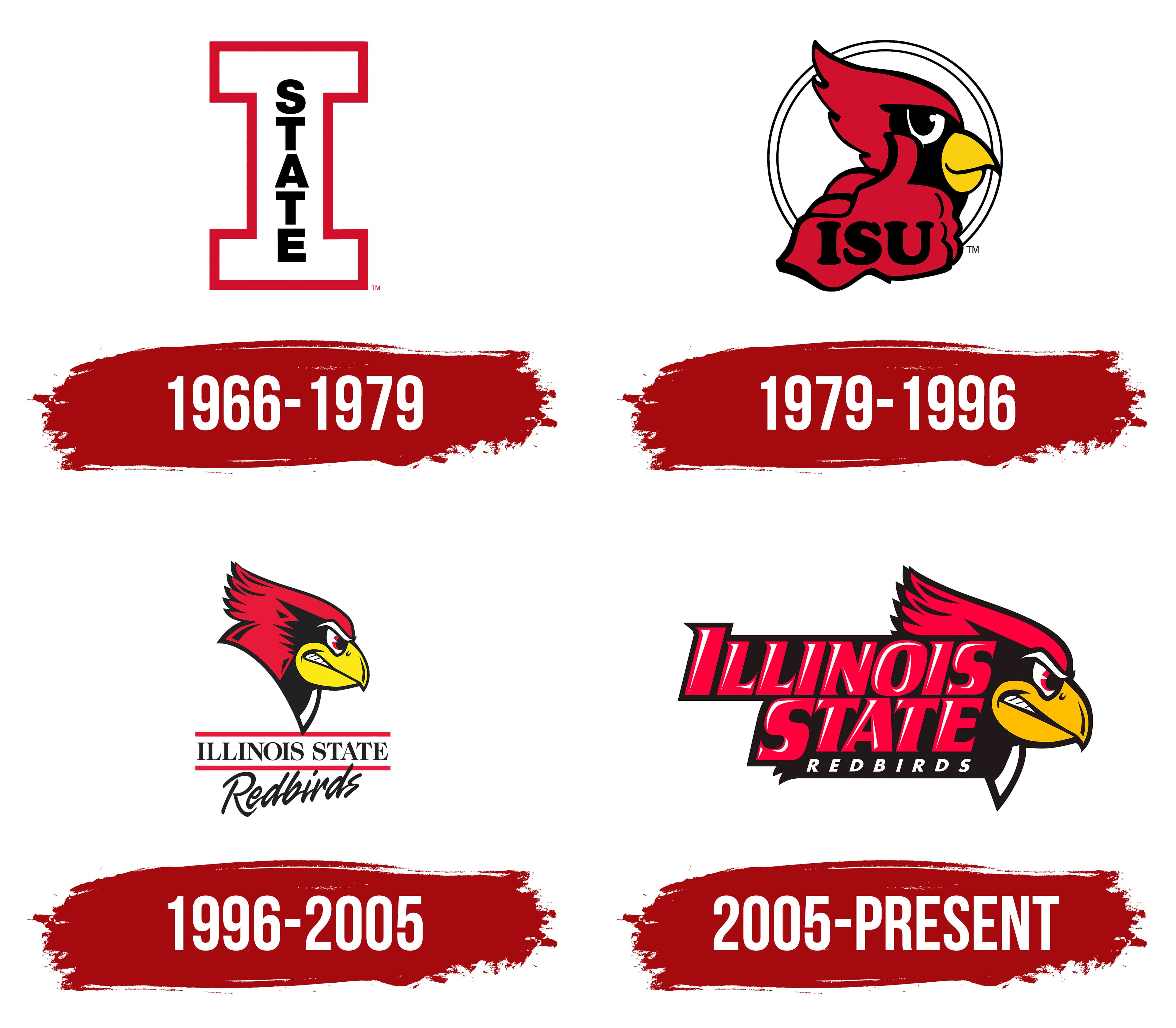
The Illinois State Redbirds logo depicts that same mysterious “red bird” mentioned in the name. Early versions of the red bird appeared in the 1930s. However, these prototypes hardly resembled what is used now: they either replicated the St. Louis Cardinals’ emblem exactly or depicted a realistic illustration of a cardinal sitting on a branch. In the 1980s, the sports department approved a permanent logo, which has since been modernized several times.
What is Illinois State Redbirds?
The Illinois State Redbirds include 19 teams that compete in intercollegiate programs and represent Illinois State University. They compete in NCAA Division I and are members of the Missouri Valley Conference. The football team competes in the NCAA FCS and plays in the Missouri Valley Football Conference. Located in Normal, Illinois.
1966 – 1979

1979 – 1996

In the late 20th century, an anthropomorphic red bird took center stage, giving a thumbs-up. It was the team’s main symbol until the mid-1990s. To give the image meaning, designers added elements: a large white ring outlined in black and the inscription “ISU.”
1996 – 2005

A redesign conducted in 1996 brought several significant changes:
- Artists redrew the bird and removed the hand.
- Instead of abbreviations, the teams’ full names appeared.
- The words “ILLINOIS STATE” were printed in capital letters, positioned between two red stripes, and “Redbirds” was written in a calligraphic-style font at the bottom.
2005 – today

Experimenting with the emblem once again, designers left the red bird alone. They shifted it slightly to the right to fit the large red inscription “ILLINOIS STATE” on the left, with the small white inscription “REDBIRDS” on a black background.
Illinois State Redbirds Basketball Logo

The men’s basketball team is best known for becoming the regular-season conference champions 14 times, the conference tournament champions 4 times, and participating in the NCAA Tournament 6 times. The women’s team was no less active: debuting in 1971, it has participated in five NCAA tournaments and twelve WNITs, and has won the Missouri Valley Conference tournament four times.
Font and Colors

The evolution of the Illinois State Redbirds logo shows how the cardinal’s character has changed. Initially, the bird smiled amiably and gave an approving gesture: an upward-raised thumb. Then, it became menacing, even fierce, with a red fire igniting in its eyes. Artists also conveyed aggression with a low-tilted head and tightly clenched teeth. This was meant to express the spirit of competition, boost the university teams’ fighting spirit, and intimidate opponents.