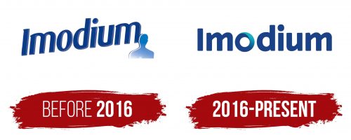
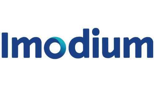
The Imodium logo exudes calm and safety. The color scheme and font reflect a commitment to health and consistent well-being. The emblem’s restrained design presents the company as professional and technologically advanced.
Imodium: Brand overview
In the 1960s, a remarkable journey began at Janssen Pharmaceutica, a Belgian pharmaceutical company founded by the renowned Dr. Paul Janssen. This endeavor led to the development of loperamide, the key ingredient in Imodium. Initially part of a program to discover new analgesics, loperamide’s powerful anti-diarrheal properties emerged without significant central opioid effects.
Synthesized in 1969 by a team led by Dr. Paul Janssen, loperamide quickly showcased its effectiveness. By 1973, the brand debuted in Belgium, soon succeeding in international markets. Johnson & Johnson’s acquisition of Janssen Pharmaceutica in 1974 provided resources and a distribution network essential for global expansion. Initially available by prescription, the drug’s safety and efficacy paved the way for its over-the-counter availability in many countries.
In 1988, the U.S. Food and Drug Administration (FDA) approved the product for over-the-counter sales in the United States, significantly increasing its accessibility. The 1990s and 2000s saw the expansion of the product line, introducing various forms such as chewable tablets and quick-dissolving capsules.
It became a highly recommended treatment for acute diarrhea by healthcare professionals. Research in the 2000s confirmed its safety and efficacy, reinforcing its role in managing acute diarrhea and symptoms in patients with irritable bowel syndrome with diarrhea predominance. In 2016, the FDA issued a warning about potential abuse risks associated with high doses, leading to stricter sales controls in some regions.
Meaning and History
What is Imodium?
It is a medication intended for treating diarrhea. The main active ingredient is loperamide, which reduces bowel movements and slows content passage through the intestines. This allows the body to absorb more water and electrolytes, decreasing the frequency and volume of loose stools. The product is available in tablet and capsule forms, making it easy to take. It is used for the short-term treatment of acute or chronic diarrhea in certain conditions.
Before 2016
The first emblem features a simple, strict font. The rounded glyphs convey harmony and balance of the body. The upward slant of the text emphasizes the improvement in well-being.
Blue signifies the calming of the intestines and the elimination of discomfort. This shade is used to highlight the consistency and control of the medication over the patient’s condition. The name of the medication seems to be composed of two parts: I and mod., which translates from Latin to represent the concept of moderation and reduction of excessive secretions.
The silhouette of a person at the end of the text indicates the medication’s consumer. Imodium is designed for people and fully meets the body’s needs.
The company aims to help every patient so that the patient’s image is anonymous. The medication is suitable for men and women of different ages. The silhouette also signifies confidentiality. The medication addresses a sensitive issue, so consumer information is securely protected.
2016 – today
Imodium was developed and introduced to the market as an effective remedy for diarrhea. The modern emblem reflects the brand’s evolution, adaptation to contemporary demands, and commitment to high-quality and reliable products. The logo emphasizes the company’s core values of stability and patient care.
The Imodium logo is designed in a modern style, giving it harmony and balance. The even alignment of the letters symbolizes stability, mirroring the effect of the tablets, which ensures the stable functioning of the body. Special attention is drawn to the letter “O,” which stands out as a symbol of openness and regulation, aligning with the action of the medication. The light-colored swirls inside the letter make it three-dimensional and lively, conveying a sense of comfort and relief.
The letter “O” in the emblem symbolizes regulating bodily processes, highlighting the medication’s primary function of normalizing bowel function. The swirling elements inside the letter add dynamism and liveliness, emphasizing the medicine’s effectiveness and rapid action.
The logo’s font is modern and smooth, without serifs, giving it relevance and professionalism. The rounded corners of the letters create a friendly and soothing impression, underscoring the company’s care for its patients.
The logo’s color scheme is in shades of blue, transitioning to turquoise inside the letter “O.” Blue is associated with trust, reliability, and calmness, which is important for a brand offering solutions to delicate health issues.


