The Imperial Brands logo shows the diversity of the tobacco company, as it owns several brands, the quality of whose products it is proud. At the same time, it’s a simple emblem where consumers clearly understand each image. It demonstrates reliability, customer orientation, and high professionalism.
Imperial: Brand overview
| Founded: | 1901 |
| Headquarters: | Bristol, England, UK |
| Website: | imperialbrandsplc.com |
Meaning and History
The history of this company began with the merging several tobacco firms into a large and competitive structure. The company has remained such throughout its activity, as its main strategic principle is absorption. Of course, difficulties with defining visual identity arose immediately, as large brands drew attention to themselves, suppressing small ones. However, the problem was solved radically: the new player in the tobacco market abandoned everything old and focused on individual identity.
As a result, a general emblem was created that represented all the trademarks at once. The fact is that the basis was two rectangles that resembled cigarettes, rolling papers, and cigars. After the renaming from Imperial Tobacco to Imperial Brands, the logo took a sharp turn: it acquired a radically different look since the manufacturer’s concept shifted slightly. The company decided to demonstrate its centripetal approach using the simplest signs.
What is Imperial?
Imperial is the shortened name of the British company Imperial Brands, formerly Imperial Tobacco. It combines several trademarks involved in the production of tobacco products and ranks fourth globally in cigarette production volumes. It owns 51 factories, and its products are sold in more than 160 countries. The headquarters is located in the city of Bristol. Its foundation time is 1901.
1901 – 2016
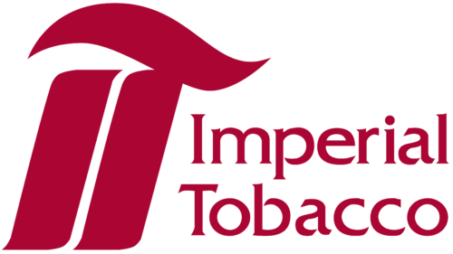
The Imperial logo has two vertical stripes with a slight tilt to the right. The bold lines have miniature points at the round ends and resemble cigars. The distance between them is narrow, so the white stripe seems incredibly thin. Above is another line – wavy, so it looks like cigarette smoke.
This “structure” is nothing more than an abbreviation for the tobacco company Imperial Tobacco: “I” is before “T,” which has a cap. Both letters look identical and are colored burgundy. To the right is a two-level text in a chiseled font aligned on the left edge.
2016 – today
The Imperial Brands emblem consists of simple geometric shapes, demonstrating two factors:
- customer orientation (the entire range of tobacco products meets the preferences of each buyer and is aimed at his requirements);
- multi-branding (the parent company owns many trademarks that produce cigarettes, cigars, rolling paper, snuff, and so on).
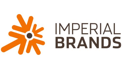
This concept is conveyed by orange arrows directed towards the center, composed of short lines. Moreover, no tip has a point – all ends are blunt and smooth. In the middle is a black circle, and to the right is the company’s new name. It is typed in a gray font of two shades: the upper line is thin and light, and the lower is bold and dark. The letters are chiseled, slightly rounded in shape.
Font and Colors
Each row in the Imperial Brands logo has its style of writing:
- The first part of the name (in the top line) is made in a font reminiscent of Halcom Book by The Northern Block or Yorkten Extended Light by Insigne Design Studio;
- The word in the bottom row is typed in a typeface resembling Akzentica 4F Bold from 4th February, Texta Narrow Heavy from Latinotype, or Prelo Bold from DSType agency.
The corporate palette contains several colors – burgundy, orange, black, and gray. White is used as a background.
