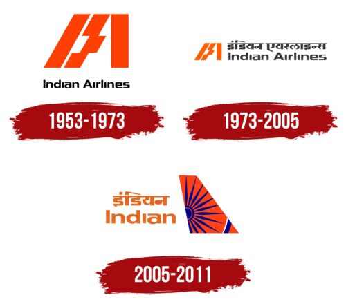
Before its merger with Air India, the Indian Airlines logo symbolized the company’s deep connection to Indian culture and its mission to bring together a vast and diverse country through air travel. The emblem represented its aim to serve the entire Indian subcontinent, playing a crucial role in expanding regional connections and fostering unity across different regions of India. The design incorporated elements quintessential to India, portraying the airline as a bearer of national heritage and values.
Indian Airlines: Brand overview
The history of Indian Airlines began with the passage of the Air Corporations Act of 1953 by the Government of India. This law nationalized the country’s aviation industry and established two state-owned airlines: Indian Airlines for domestic flights and Air India for international routes. The main goal of this decision was to strengthen and expand civil aviation in the newly independent India.
The company officially started its operations on August 1, 1953, by merging eight private airlines: Deccan Airways, Airways India, Bharat Airways, Himalayan Aviation, Kalinga Airlines, Indian National Airways, Air India, and Air Services of India. This merger created a robust national airline that could provide air connectivity nationwide.
During the 1950s and 1960s, it focused on expanding its domestic route network. The company utilized a variety of aircraft inherited from the merged airlines, such as the Douglas DC-3, Vickers Viking, and de Havilland Dove. Over time, the fleet was upgraded by introducing modern planes like the Vickers Viscount and Fokker F27 Friendship. The introduction of the Caravelle jet aircraft in 1964 marked a significant milestone, improving speed and comfort on the airline’s main routes. This event marked a new chapter in India’s civil aviation history.
In the 1970s, the company continued to modernize by acquiring its first Boeing 737-200 in 1970, which became the core of its fleet for several decades. These new aircraft allowed it to increase flight frequency and enhance passenger service. Despite facing competition from railways and private bus companies in the 1980s, the network expanded, and the fleet was upgraded. In 1989, it received its initial Airbus A320, which initiated a long-term partnership with the European aircraft manufacturer.
With the economic reforms of the 1990s in India, the company encountered new challenges as the government began to open up the aviation sector, leading to the emergence of private airlines. To adapt to the changing competitive environment, efforts were made to improve service quality and operational efficiency.
In 2005, the Government of India merged it with Air India, establishing the National Aviation Company of India Limited (NACIL) as the parent company for both airlines. The official merger with Air India took place in 2007, gradually phasing out the brand while continuing domestic flights under a unified brand. By 2011, the integration process was completed, with all operations fully transitioned under the Air India brand, marking the end of it as a distinct entity.
Meaning and History
What is Indian Airlines?
It was India’s state-owned airline based in New Delhi. It operated mainly domestic flights and served a few international routes to neighboring countries. It is known for its extensive network within India, connecting different regions. The airline merged with Air India, another state-owned carrier, to form National Aviation Company of India Limited (NACIL), which later became Air India Limited. The objective of the merger was to streamline operations and improve efficiency in the Indian aviation sector.
1953 – 1973
Indian Airlines, operating from 1953 to 1973, encapsulated the spirit of aviation and India’s cultural heritage in its emblem. The emblem of this period was immediately associated with aviation routes and deeply reflected the country’s cultural values.
The main element of the logo design is the company’s abbreviation, which is composed of straight orange lines. These lines suggest runways, symbolizing the start of a journey and expanding horizons for passengers. They extend into the distance, creating a sense of motion and progress. A notable design feature is a slight shift in part of the line to form the crossbar of the letter “A,” reminiscent of airplane flaps. This enhances associations with aviation and emphasizes the technical aspect of the brand.
The orange color of the logo embodies the warm and welcoming hospitality that passengers can expect on board Indian Airlines. This color is traditionally associated in Indian culture with the warmth of the home hearth and is considered auspicious and blessed. It is a common shade in the clothing of Indian monks, adding significance and recognition to the cultural references in the logo design.
The company name is presented in black lettering in English, indicating its international orientation despite its active participation in the domestic Indian market. Using English in the logo highlights Indian Airlines’ ambitions to expand its presence beyond India and attract passengers worldwide. This design element reflects the company’s aspiration to be competitive on the international stage and to serve a multinational audience.
1973 – 2005
Since 1973, Indian Airlines has increased its focus on India’s domestic market, reflected in changes to its corporate emblem. A Hindi inscription was added at the top of the logo, signifying stronger ties with local passengers and a deepened marketing strategy to serve domestic travelers.
The company’s abbreviation was stylized and reduced in size and moved to the left side of the logo, symbolically representing a shift in the company’s policy focus. This change highlights the airline’s stability, regular operations, and commitment to a more defined market positioning.
The brand’s English name at the bottom of the logo reminds us that despite the company’s focus on domestic passengers, it continues to welcome international guests. This bilingual presentation emphasizes the airline’s universality and hospitality, indicating its openness and accessibility to passengers worldwide.
The logo’s color scheme—combining orange and black—creates a lively and memorable contrast. Orange continues to symbolize warmth and hospitality, while black adds a sense of seriousness and professionalism, emphasizing high technical maintenance and service quality standards. This combination of colors speaks to the modern and premium service that Indian Airlines aims to provide its customers.
2005 – 2011
In 2005, the company introduced its most vibrant and colorful emblem, a significant symbol of its connection to India and international recognition. This logo highlighted the company’s roots and mirrored its global ambitions.
The emblem’s central element, a fiery orange color, was selected intentionally. It conveys the sun’s energy, symbolizing the company’s growth and flourishing. In the cultural context of India, orange holds deep spiritual significance, embodying spirituality and its association with Hinduism, making it particularly meaningful in the context of national symbolism.
Another element of the logo, a blue wheel on the background, is a crucial symbol taken directly from the national flag of India. Known as the Dharmachakra, or the wheel of law, it is an important symbol in Buddhism and represents the eternal laws of the cosmos. Its inclusion in the logo underscores respect for the country’s cultural and spiritual traditions, enhancing the brand’s perception within and beyond India.
The logo reflects India’s spirituality and cultural richness. Each element is crafted to evoke feelings of harmony, peace, and joy. This strengthens the brand’s connection to its cultural heritage, making it more appealing and memorable to passengers worldwide.
The logo includes inscriptions in Hindi and English, making it more accessible and understandable to an international audience and underscoring the company’s multilingual and multicultural approach. These inscriptions are integrated into the airplane’s keel design, enhancing it and creating a cohesive and expressive image.


