The Infinity Ward logo is associated with science. The designers purposely made it that way to equate the production of games with the process of the emergence of new life forms. The development team, in this case, acts as a deity that creates entire universes from scratch and fills them with different stories, images, and objects.
Infinity Ward: Brand overview
| Founded: | May 2002 |
| Founder: | Grant Collier, Jason West, Vince Zampella |
| Headquarters: | California, US |
| Website: | infinityward.com |
Meaning and History
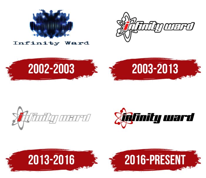
In total, four variants of the logo were presented to the target audience during the existence of the brand. It should be noted that they are all different from each other. Each redesign brought new elements, making the Infinity Ward logo more modern and attractive.
What is Infinity Ward?
This is one of the most famous video game development studios, which gave the world a cult series of military shooters called Call of Duty.
2002 – 2003
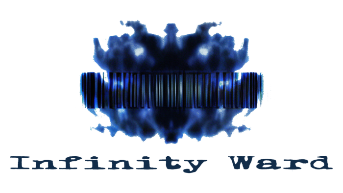
The original version of the logo was introduced in 2002 after the company’s founding. It is worth noting that they had two versions. In one of them, there was an emblem and a verbal inscription, while the second contained only the name. The emblem is an abstract image containing three figures. If we talk about the word inscription, then it is made in a classic font with thin lines and rounded corners in the letters. All characters are in lowercase, except for the initial letters in both words.
A black and white color palette was used for the logo.
2003 – 2013
The first redesign took place a year after the original version’s release. It also consisted of a word inscription and an emblem located on the left. All letters were lowercase. These are white characters with thin black outlines. It is worth noting that there is practically no free space between the letters. All of them are made in a modern and progressive style. The exception is the first letter “i.” It is colored red, unlike other symbols. It has an emblem on top. It is similar to the movement of orbits, and the letter in it plays the central part.
2013 – 2016
The 2013 redesign resulted in the logo becoming more concise and minimalist. The layout of the elements remained identical, but the letter “i” was superimposed on the emblem and not vice versa. All letters are slightly slanted to the right, and the “F” character seems to be in uppercase. The outlines in the letters are much less visible.
2016 – today
Again, the elements remained unchanged. At the same time, the verbal inscription was painted black, even the letter “i.” In turn, the emblem acquired a bright red hue and became more visible against the background of the inscription. Interestingly, in some cases, the logo is used separately. The lines in the letters continue to be bold, and italic sans-serif can also be seen. As a result, the logo looks powerful and modern and can be associated with computer games and science.
Font and Colors
After the first redesign, the same font was used for the word lettering. It was a classic bold sans-serif typeface with an italic style of lettering. When interacting with the emblem, the development company’s name looked more attractive.
Different color palettes were used at different stages. As a rule, it consisted of three colors: black, white, and red. The contrast between the colors made the logo even more attractive and progressive.
Infinity Ward color codes
| Blood Red | Hex color: | #670204 |
|---|---|---|
| RGB: | 103 2 4 | |
| CMYK: | 0 98 96 60 | |
| Pantone: | PMS 484 C |
| Black | Hex color: | #000000 |
|---|---|---|
| RGB: | 0 0 0 | |
| CMYK: | 0 0 0 100 | |
| Pantone: | PMS Process Black C |
