The Innocenti logo embodies a commitment to experience and a drive toward the future. The company has always maintained its individuality, even after changing ownership. This is why the brand’s emblem is highly recognizable.
Innocenti: Brand overview
Innocenti, born in 1933 in Milan, Italy, began its journey in mechanical engineering. Thanks to Ferdinando Innocenti’s idea, it entered the transportation market after World War II when the company began manufacturing Lambretta scooters. This step came just in time: it was made against the backdrop of the post-war boom in demand for personal transportation in Europe.
In the 60s of the last century, the company expanded its activities and entered the automotive arena, having concluded a license agreement with the British Motor Corporation, which later became British Leyland. Under the Innocenti brand, the popular British models Mini, Austin A40, and Austin-Healey Sprite received an Italianized look from local consumers. The zenith of the brand came in the 1970s when the Innocenti Mini debuted. This hatchback, which became a version of the famous Mini Cooper, was very popular in the market, and its sales exceeded half a million units.
However, financial problems loomed on the horizon, which led to the company being acquired by De Tomaso in 1976. Although De Tomaso continued to produce Italian versions of British Leyland cars, the endeavor was only a modest success. In 1990, the Fiat Group took ownership of Innocenti, which sparked a brief revival of the company by producing several updated but ultimately obsolete models. However, Fiat could not rejuvenate its brand or outdated production facilities. By 1993, car production was halted, and another three years later, the brand was officially discontinued.
Today, Innocenti’s legacy lives on mostly as a historical footnote. It is most remembered for uniquely combining British engineering with Italian styling during its heyday.
Meaning and History
1947 – 1963
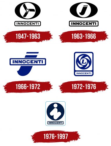
Even though the company was founded in the 1930s, the emblem has been preserved only from the post-war period. At the logo’s center is a circle resembling a moped wheel. Inside this circle are three blades representing the company’s three main production areas: equipment (pipes, machines, scaffolding fixtures), motorcycles, and cars.
These three blades are connected in the center by a triangle, emphasizing the number 3 and symbolizing the three key business areas. The design resembles a propeller or fan, representing forward movement and progress through successful development in all three areas.
Each blade is formed from “i,” the first letter in the brand’s name. This enhances visual identification and highlights the company’s innovation and dynamism.
The company name Innocenti is at the bottom of the logo, within an oval frame. This name comes from the founder, Ferdinando Innocenti, who laid the foundation for its diverse and successful development.
1963 – 1966
In the early 1960s, the emblem underwent slight changes. All elements became bolder to highlight the manufacturer’s achievements. The outer shape of the logo resembled an oval with a circle inside it. The three propeller blades were replaced by a single, clearly defined letter “i.” This hinted at the founder’s long-held dream of creating a Grand Tourer (GT) class car.
This project came to life with Ferrari, resulting in the Innocenti 186 GT (Dino). The company focused on car production, shifting other business areas to the background. Even though the Dino model never went into mass production, the brand created several other successful collaborations that strengthened its market position.
1966 – 1972
With the release of the company’s most popular car, the Mini, the brand updated its identity. The black color of the logo changed to blue to emphasize the brand’s technical and engineering focus. A large letter “i” appeared in the logo’s background, symbolizing the company’s innovation and progressiveness.
The removal of the restrictive background showed the brand’s readiness to expand and export its products worldwide. This move highlighted the company’s global ambitions and desire for international recognition.
The full company name remained on the front of the logo, written in a rectangular frame with rounded corners, consistent with previous logo styles. This decision ensured continuity and brand recognition, preserving its traditions while showcasing a readiness for new achievements.
1972 – 1976
In 1972, six years after the founder’s death, the company dissolved, and most of its assets were transferred to British Leyland. This happened during a period of joint car production. As a result, the updated logo featured the modern Leyland emblem with the letter “L” in the center.
To maintain continuity and respect for historical heritage, the full name “Innocenti” was added at the bottom in an unchanged rectangle. This decision symbolized the partnership between the two brands and highlighted their collaboration.
1976 – 1997
In 1976, De Tomaso created a memorable emblem for Innocenti. The logo features a clever design where the letter “i” is formed by three stripes, resembling a slanted “N.” This design is in white, set against a dark blue circle, creating a strong visual contrast. Below the circle, the company name is placed within a rectangular frame with rounded corners, adding structure to the design. The entire emblem is outlined with a thin, light blue line, adding a touch of sophistication.
Using white negative space against the dark blue circle makes the emblem stand out. This design choice highlights Innocenti’s innovative and forward-thinking nature. The thin, light blue outline adds elegance without distracting from the main design elements, drawing the viewer’s eye to the central motif and the company name.
The three stripes forming the slanted “N” suggest dynamic movement and modern innovation, aligning with the automotive industry’s themes of progress and speed. The dark blue circle provides a stable background, symbolizing reliability and professionalism, while the light blue outline frames the emblem, enhancing its visual coherence.
The rectangular frame with rounded corners at the bottom of the emblem balances the design and ensures the name “Innocenti” is prominently displayed and easily readable. This choice contributes to a harmonious and cohesive visual identity.
