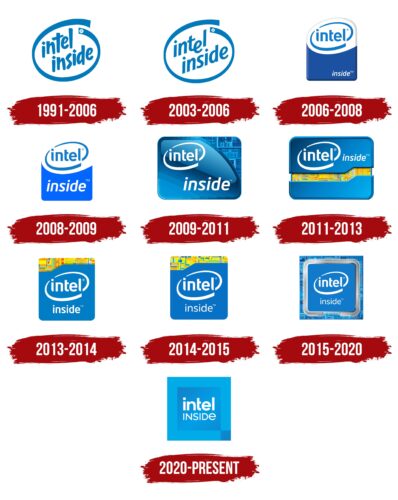
The Intel Inside logo represents modern technologies and capabilities that the company’s processors offer consumers. The emblem signifies continuous improvement and growth, ensuring optimal performance of devices.
Intel Inside: Brand overview
| Founded: | 1991 |
| Founder: | Intel Corporation |
| Headquarters: | California, U.S. |
| Website: | intel.com |
Before its iconic “Intel Inside” campaign took off in 1991, Intel Corporation, a prominent semiconductor manufacturer based in California, was hardly a name that rang a bell with the general public. The company’s main business interactions were with Original Equipment Manufacturers (OEMs), making it relatively obscure to the average consumer. Yet, the booming interest in personal computers during the late ’80s was a wake-up call for Intel, pushing it to establish a more direct connection with end-users.
The launch of the “Intel Inside” campaign became a groundbreaking moment in what’s known as “ingredient branding.” This marketing strategy aimed to elevate Intel from an anonymous tech entity to a brand as recognizable as any household name. It also allowed OEMs to advertise their products’ quality more implicitly by attaching Intel’s newly-famous label to them.
One of the brilliant tactics of this campaign was Intel’s decision to fund advertisements for computer manufacturers partially, contingent on those ads prominently featuring the “Intel Inside” tagline. This clever move accelerated the pace at which consumers became familiar with the Intel brand.
The outcomes were nothing short of transformative. The campaign catapulted Intel into domestic familiarity and made it synonymous with quality and innovation in the computing world. The “Intel Inside” campaign, therefore, stands as a monumental chapter in Intel’s corporate narrative, having successfully turned a once-indistinct tech supplier into a brand name that’s universally recognized.
Meaning and History
The Intel Inside campaign didn’t emerge overnight. Before its launch, there was a test version called Red X, which began in 1989. The market initially responded skeptically to attempts to advertise internal components and technologies. Intel, studying the experiences of Teflon and Dolby, eventually found the right levers. Thus 1990, the Intel slogan, The Computer Inside, was born and shortened to Intel Inside. Working closely with computer manufacturers, Intel gained press and television exposure. From then, consumers became aware of the brand and its advanced technologies. All logos feature images of Intel components with the printed slogan Intel Inside. Despite numerous rebrandings, the general form and inscription on the logo have remained constant for the last 30 years.
What is Intel Inside?
It’s an advertising campaign that introduced consumers to the processor brand of their computers. A device sticker ensures advanced technologies, high performance, smooth operation, and manufacturer support through available drivers and updates.
1991 – 2006
The first logo consisted of the inscription Intel Inside. The words were slanted and arranged on two levels. The slant indicated continuous development and improvement and advanced technologies.
The word Intel is an abbreviation of Integrated Electronics. The name replaced the original NM Electronics, named after company founders Noyce and Moore. Adding “Inside” indicated the processor’s location as a computer component—advertisements aimed to instill in consumers the understanding that having Intel indicates PC quality.
The inscription was encircled by an ellipse, symbolizing motion activity. It spoke to the processors’ speed, information exchange, and computational processes.
2003 – 2006
The font of the inscription changed to align with the company’s Intel logo, which had existed since 1969. The main feature was the lowered ‘E,’ dividing the word into two parts: Int (from Integrated) and el (from Electronics). The emphasis on the letter ‘e’ connected the logo with:
- Einstein’s formula,
- Mathematical constant – Euler’s number, the base of natural logarithms,
- Electrons.
The first two analogies discussed scientific data, calculations, and precise equations, emphasizing the capabilities and functioning of the processor. The connection with electrons highlighted the working principle of semiconductors, which is the foundation of transistor creation and, subsequently, processors.
Contrary to the original emblem, the Intel Inside inscription received smoother and more pleasant contours to emphasize the smooth operation of the brand’s processors.
2006 – 2008
In 2006, Intel underwent rebranding, dividing the company into departments based on consumer groups. The corporate logo also got updated, a project by the agency FutureBrand.
Intel Inside underwent emblem transformation following the main brand. Inside the ellipse was only the word Intel. Straight, even characters indicated reliability and stability. The font of the inscription changed to a transformed Neo Sans. The first and last letters had pointed ends.
The composition was placed on a white, elliptical base, combined with a blue rectangle representing a processor. The word Inside was written in small letters at the bottom of the blue part. For the first time, the brand name and the additional word were separated to focus consumer attention on the brand.
The white part of the image symbolizes the platform the company offers consumers. According to the new positioning, Intel is not just a processor but complete solutions, software, and hardware for a specific group of users.
2008 – 2009
In 2008, the color scheme and style of the emblem were slightly updated. Lightness and airiness appeared in the symbol. The word Inside increased in size and received a slight tilt, indicating technological advancement.
2009 – 2011
The 2009 emblem changed shape to rectangular, matching the design of some processors. The image was divided into two parts by a smooth line. In the further half, slightly revealed to the user, intricate internal components of the processor, silicon crystals, were visible, literally reflecting the Intel Inside expression.
The emblem was used for a range of the company’s dual-core processors. The logo focused on high technologies that are invisible to the consumer but should be known to them.
2011 – 2013
The 2011 changes made the emblem very stylish. A rectangular blue chip case, on which the Intel Inside slogan was written, slightly opened in the middle, revealing its yellow silicon crystal transistors’ interior. The blue-light blue gradient and the contrast between blue and yellow enlivened the image, giving it a friendly appearance. This composition was used for the new Sandy Bridge processors.
2013 – 2014
The campaign returned to the square, harmonic form of the emblem, which aligned with the appearance of most processors. The internal components of the chip shifted to the upper part of the image.
2014 – 2015
In 2014, minor changes were made to the logo. The word “Inside” became smaller and thinner, while the internal “filling” adopted a more yellow hue without red elements associated with overheating or malfunction. The agency Red Peak Branding worked on the font and overall design.
2015 – 2020
In 2015, the emblem’s image became even closer and more accurate, almost mirroring the look of a processor. The chip was placed over a square area that resembled silicon crystals or a motherboard. This visual approach emphasized the chip’s internal position and its construction. Expanding beyond the square boundary indicated an increase in the performance and power of the components. The steel outline gave a sense of reliability and protection.
2020 – today
The modern symbol transformed, featuring a more veiled and schematic version of the processor. Rounded corners were replaced with sharp ones to emphasize technological advancement. These changes were well suited to the name of the Tiger Lake processor series for which the logo was designed.
Font and Colors
Blue and light blue are the primary colors in Intel’s Inside emblems. The color is associated with high technology, manufacturing, engineering, and computers, fitting well into the logo concept.
The unique font used is Intel Clear. Developed for the company in 2014 by the Dalton Maag font studio and modified by Andrew Mirakian in 2020. The soft, rounded lines convey vitality and openness. The letters are easily readable on gadget screens, a primary objective during its creation.
Intel Inside color codes
| Ruddy Blue | Hex color: | #5fa9e4 |
|---|---|---|
| RGB: | 95 169 228 | |
| CMYK: | 58 26 0 11 | |
| Pantone: | PMS 299 C |
| Steel Blue | Hex color: | #4c83c6 |
|---|---|---|
| RGB: | 76 131 198 | |
| CMYK: | 62 34 0 22 | |
| Pantone: | PMS 279 C |

