


![]() Interflora Logo PNG
Interflora Logo PNG
The unique Interflora logo shows the company’s dedication. The company is in a hurry to deliver flowers on time to all recipients. The logo symbolizes love and inspiration because people give bouquets to express their feelings.
Interflora is an international flower delivery chain with roots going back to the early 20th century. Today, it is possible to buy flowers and order a bouquet design at more than 57,000 stores in more than 135 countries. Interflora is a subsidiary of Teleflora and of The Wonderful Company.
Interflora began in 1920 in Berlin, Germany, when florists decided to change how flowers were delivered over long distances. They started as Fleurop-Interflora and quickly became a collaboration that spread beauty across borders.
The network grew in the 1920s and 30s as florists from various European countries joined. After World War II, Interflora expanded even more, reaching North America, Australia, and New Zealand. In 1946, Interflora UK became independent, becoming a key player in the network.
In the 1950s and 1960s, Interflora was among the first to use computer systems for orders, improving how florists worked together. The 1970s and 1980s brought even more growth, adding new countries and products such as gift baskets and houseplants.
In the 1990s, Interflora went online, launching websites where customers could easily order. A significant merger in 2006 with the FTD Group expanded Interflora’s global presence.
Now, Interflora operates in over 140 countries with thousands of florists, offering a vast selection of floral gifts for any occasion. They continue to innovate, using new technologies to improve service.
For over a century, Interflora has led the flower delivery market, continually evolving to connect people worldwide through the power of flowers and gifts.
Meaning and History
![]()
Interflora’s emblems blend seamlessly with the brand’s rich history, serving as beacons of visual recognition that resonate deeply with people’s emotions and the timeless tradition of giving flowers. As a brand synonymous with the art of floral gifting, it embodies the universal gesture of connecting hearts and expressing feelings without words. Interflora’s presence in major cities worldwide reinforces its position as the go-to choice for those looking to make a meaningful gesture. Each emblem, infused with the essence of the brand’s journey, mirrors the elegance, care, and beauty that Interflora is known for, making it an unmistakable symbol of celebration for life’s most significant moments.
What is Interflora?
It is a leading flower-delivery network with extensive experience in the service-delivery market. Hundreds of millions of people worldwide are the company’s customers every year.
1953 – 2016
![]()
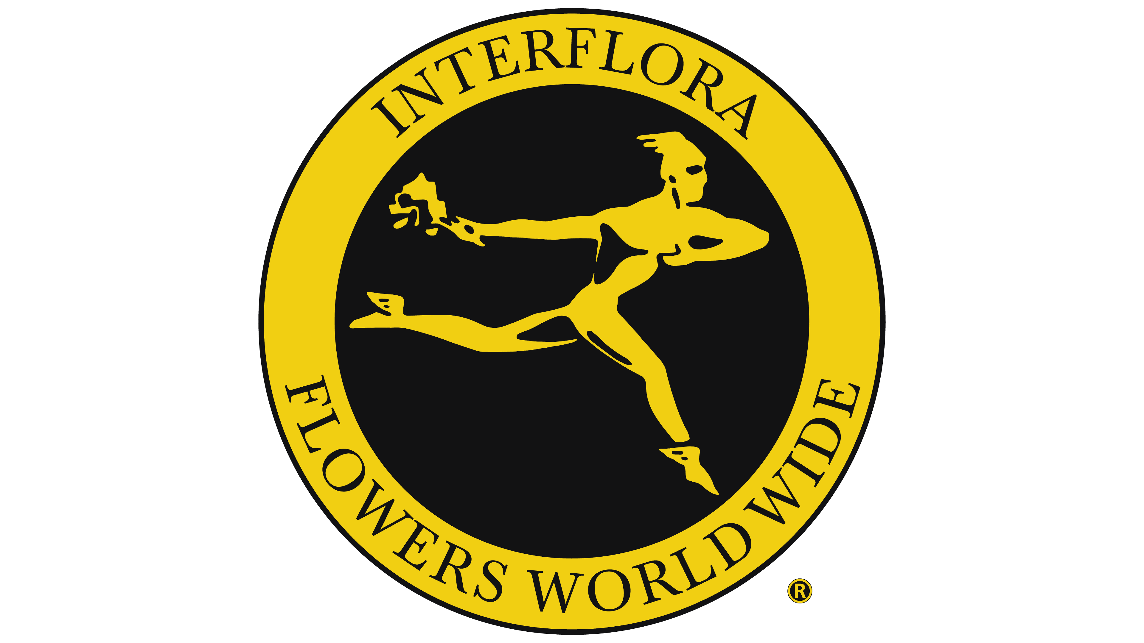
From 1953 to 2016, the Interflora logo has been a timeless symbol that marries tradition with the brand’s global reach. Encased within a circular black emblem framed by a thick yellow outline, the logo is striking for its bold contrast and simplicity.
Central to the design is the figure of Mercury, the ancient Roman messenger god, symbolizing swift delivery. Mercury emulates Interflora’s promise of quick and reliable flower delivery worldwide in motion and with wings on his heels. His right hand carries an abstract bouquet, representing the company’s core business: floral arrangements. The abstract nature of the bouquet speaks to the versatility of Interflora’s offerings, which can be tailored to the varied tastes and occasions of its clientele, adding an element of intrigue and sophistication to the emblem.
Around the circumference of the emblem, the brand name “Interflora Flowers Worldwide” is inscribed in bold, capital lettering, suggesting authority and presence. The font’s simplicity ensures legibility and timeless appeal, reinforcing the brand’s longstanding heritage. Using yellow in the logo stands for optimism and warmth, evoking the joy flowers are meant to bring. At the same time, the black background provides a strong visual impact, suggesting elegance and sophistication.
This logo mirrors the era’s shift towards global connectivity and Interflora’s expansion as an internationally recognized brand. In a time when communication and delivery were becoming increasingly instantaneous, Interflora’s logo symbolized its commitment to keeping pace with these changes, bridging distances by delivering emotions through flowers.
The logo’s aesthetic and Mercury’s imagery resonate with the era’s history, representing both the speed of delivery in a growing post-war global economy and the personal touch that Interflora maintained in its service values, which have enabled the brand to thrive over the decades.
2016 – today
![]()
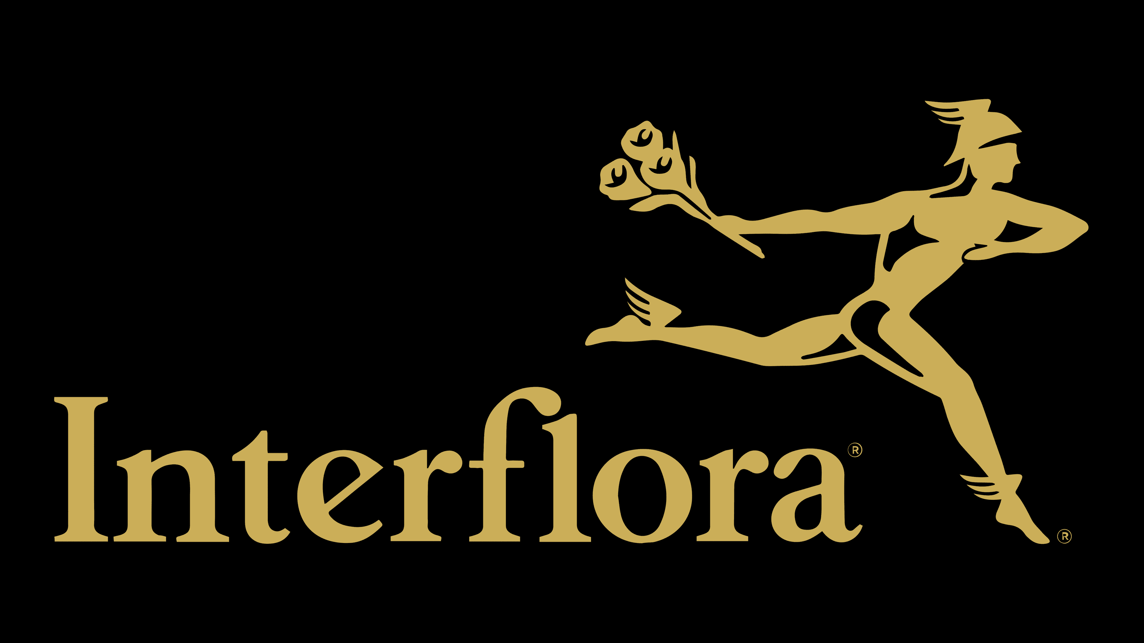
The new Interflora logo from 2016 to the present carries a modern elegance while honoring the brand’s storied past. The logo features the brand name in a classic, serif-free font with rounded edges and thin lines, conveying a sense of approachability and refinement. This font choice speaks to Interflora’s commitment to tradition and modernity, blending the timeless with contemporary aesthetic sensibilities.
The Mercury figure, still present and now more detailed, exudes a modern flair. He appears in motion, artfully leaping over the Interflora inscription, suggesting agility and the brand’s ability to transcend traditional barriers to flower delivery. The golden hue selected for the palette adds richness and warmth, symbolizing the brand’s longstanding heritage, with roots stretching back to the 1920s.
This color reflects the golden standard of service and excellence that Interflora has maintained throughout its history. The updated Mercury signifies the brand’s dynamic nature, representing a leap into the future while staying grounded in its rich heritage.
Interflora’s current logo represents a fusion of historical significance and forward-looking ambition. The company’s incorporation of historical elements signifies respect for its origins and a celebration of the journey to its current success.
Font and Colors
The word lettering uses a classic sans-serif font with rounded corners. It looks stylish and confident despite its historical details and can attract modern buyers’ attention. The brand name can be placed on any surface and will not be difficult for customers to read.
The logo is based on a golden-black color palette. It was not chosen by chance, as it conveys an air of aristocracy and extensive market experience. It is not for nothing that the ancient Roman God Mercury is depicted in golden robes.
FAQ
Who is on the Interflora logo?
The Interflora logo showcases Mercury, known in Roman mythology for his swift, winged feet. More than a messenger, Mercury symbolizes trade, connections, and the blending of different realms, mirroring the speed and freedom Interflora offers in sending flowers and gifts worldwide. This symbol closely reflects Interflora’s promise to provide fast, dependable service and its dedication to helping people share emotions like love, sympathy, and happiness through flowers.
Mercury fits Interflora’s logo because it captures the company’s essence: bridging physical and emotional distances to unite people. The logo isn’t just an image; it’s a pledge of Interflora’s commitment to quality, creativity, and the meaningful expression of feelings with flowers.
Who owns Interflora UK?
Teleflora, part of The Wonderful Company, owns Interflora UK. This setup connects Interflora UK to a vast network of resources and expertise in the floral and gift delivery industry. Teleflora has a wide reach and strong standing in the flower delivery market, which helps Interflora UK grow and improve its services.
The Wonderful Company, the top-level owner, is a major global business with interests across sectors such as farming, consumer products, and flowers. This support provides Interflora UK with significant benefits across its supply chains, marketing, and global reach. Being linked with Teleflora and The Wonderful Company boosts Interflora UK’s market presence and commitment to quality, customer happiness, and reliability.
This ownership structure allows Interflora UK to use its parent company’s advanced technology, logistics, and creativity. It also allows Interflora UK to maintain its high delivery and customer care standards, as well as Conti’s standards, by leveraging the brand’s longstanding values and traditions.
How did Interflora start?
Interflora was founded in 1910 in the United States by innovative florists. They invented the telegraph to find a better way to send flowers over long distances. This way, they could send flower orders across the country without delays in train transport.
Their idea wasn’t just about making deliveries faster. They wanted to change how people could send flowers, allowing emotions and messages to cross vast distances without the usual problems of time and freshness affecting the flowers. This new method created a large network of florists who could handle orders both within the country and abroad.
This network became a new kind of marketplace for florists, where an order placed in one location could be fulfilled elsewhere, making it easier and more convenient for everyone. This concept is how Interflora began, and it grew into a worldwide network that uses flowers to connect people. This was the start of what made Interflora a top name in flower delivery, known for its quality, dependability, and craftsmanship in arranging flowers.
What is the meaning of Interflora?
The name “Interflora” captures what the company is about: a worldwide network that links over 58,000 flower shops in more than 140 countries. This wide network lets Interflora help people share their feelings and messages with flowers, overcoming distance and cultural differences. “Inter-” means between or among, which fits how Interflora connects people everywhere with “flora,” meaning flowers. The name reflects Interflora’s goal of bringing people together through the beauty and meaning of flowers.
Being part of Teleflora and The Wonderful Company shows Interflora is strong and dependable in the flower business, with solid support from these larger companies. This enables Interflora to offer a wide range of flower arrangements and gifts, catering to all occasions with care and quality.
But Interflora is more than just a network of flower shops. It’s about using flowers to express feelings, celebrate important moments, and offer comfort during tough times. Interflora proves that flowers have a special power to send messages in ways words can’t, making them a key part of connecting with others and celebrating life around the globe.