


![]() International Paper Logo PNG
International Paper Logo PNG
The International Paper logo makes a double impression. On the one hand, it’s visually clean because it contains nothing superfluous. This is great for a pulp manufacturer. On the other hand, the logo combines elements of different shapes that symbolize the pursuit of advanced technology.
International Paper traces its roots to Hugh Joseph Chisholm, born in Canada in 1847. After moving to Maine, he built businesses in paper mills, railways, and power plants. On January 31, 1898, Chisholm and William Augustus Russell merged 17 paper mills in the northeastern United States, forming International Paper Company. At launch, the new company produced about 60% of the country’s newsprint.
Russell died in 1899, and Chisholm took over the company, leading it until 1907. Under early management, IP grew to about 30 mills and opened the first laboratory in the American pulp and paper industry in Glens Falls, New York. The company’s early base was tied to newsprint, mill operations, and the industrial use of water power.
In the 1940s and 1950s, International Paper moved deeper into packaging and containers. It acquired Agor Manufacturing Company in 1940, Southern Kraft Corporation in 1941, and Single Service Containers in 1947. In 1952, the company created the International Paper Company Foundation. Its Canadian division expanded through deals including Brown Corporation in 1954 and Hygrade Containers in 1955.
From the 1960s onward, IP sought to diversify into housing, nonwoven materials, diapers, and consumer paper goods. Still, many projects failed to pay off, so the company returned its focus to paper, pulp, and packaging. Major acquisitions followed, including Hammermill Paper Company in 1986, Masonite Corporation in 1988, Zanders Feinpapiere AG and Aussedat Rey in 1989, Federal Paper Board in 1995, Union Camp Corporation in 1999, and Champion International in 2000. Weyerhaeuser remained one of IP’s main competitors in the pulp and packaging sectors.
Meaning and History
![]()
Visual recognition of the brand is high because only two logo variants have been presented consistently.
What is International Paper?
It is the world’s leading paper manufacturer, offering its products to millions of people worldwide.
Old
![]()
The first version of the logo was an emblem and a verbal inscription with the company name beneath it. The emblem was a round frame with a spruce in the foreground and a forest in the background. Thus, the company indicated that it specializes in paper production. The frame itself had a wide outline on which flowers were depicted.
The International Paper Company brand name was located on the ribbons. Interestingly, the left ribbon contained the first word when “Paper Company” was written on the right. A classic sans-serif font was used for the word lettering, using capital letters and thin lines.
before 1960
![]()
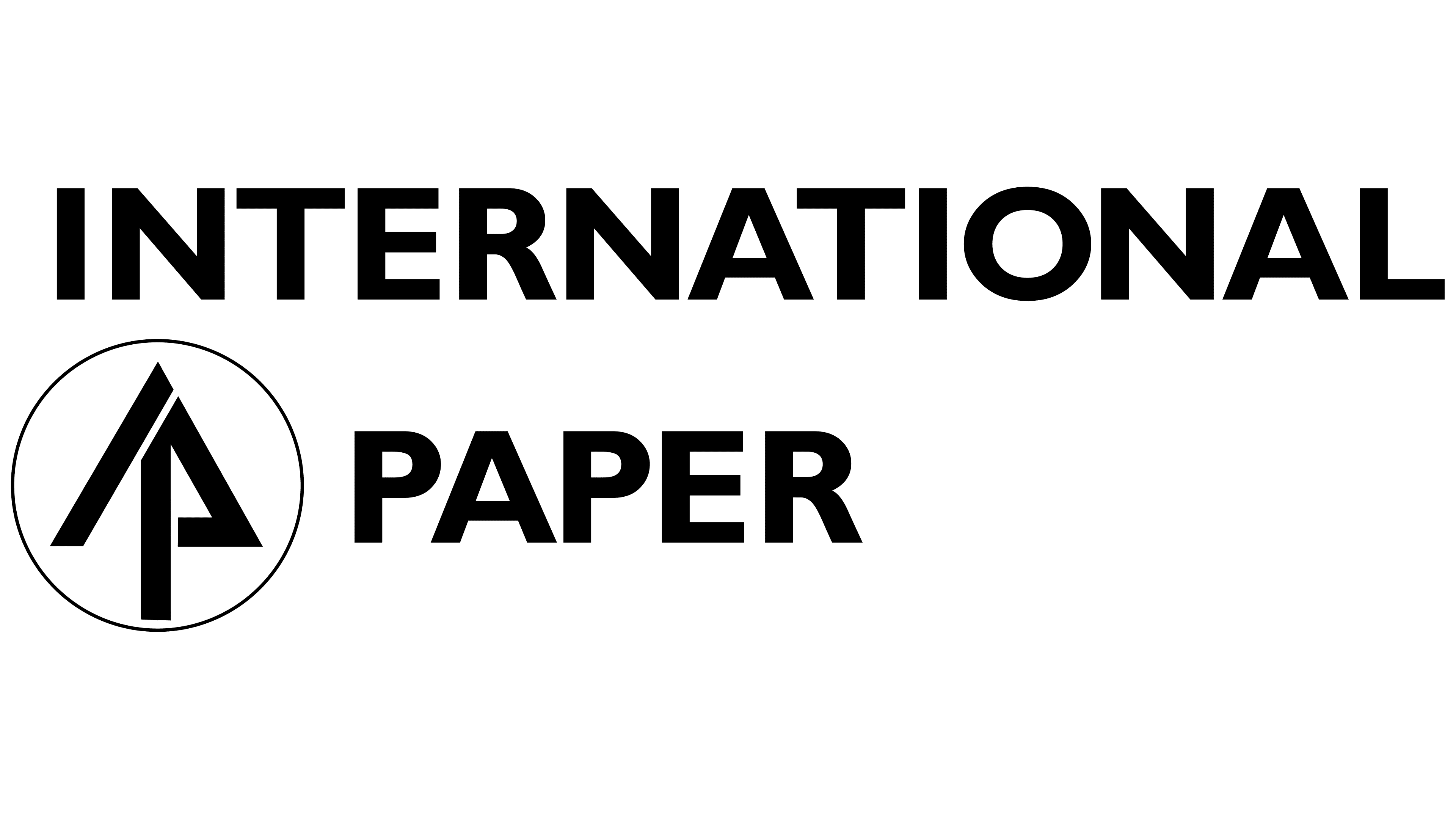
1960 – 2023
![]()
Many of the company’s clients do not remember the old logo because it did not change after the first redesign. The visual identification of International Paper Company at this stage is concise and minimalistic. These are two words, “International Paper,” between which an emblem appears.
The name is made using a geometric sans-serif typeface. It looks modern and confident. At the same time, the distance between the letters is serious, which makes the letters balanced and light.
The emblem is a black circle with a vertical line and a triangle inside. This symbol can be perceived as a stylized tree with an upward-pointing arrow. Thus, the company’s potential and ambitions are demonstrated.
The black-and-white color palette makes the logo look professional and confident. All logo elements are well-balanced and easy for potential buyers to remember. The line thickness and letter height are optimal. As a result, the logo can be placed absolutely anywhere.
2023 – today
![]()
The International Paper Logo, revealed after six decades without a redesign, features a unique graphic element composed of eight “leaflets,” as the company calls them. These leaflets are graphical representations of pine cone leaves, a significant symbol for International Paper because they signify the company’s origin and growth.
Color has played a crucial role in the redesign, with staff input helping choose a shade that reflects the company’s commitment to sustainability. This value is at the heart of the company’s ethos and is represented by the introduction of green hues into the emblem elements.
Adjacent to the symbol, the company’s full name is displayed in a straightforward, unambiguous typeface. The overall design of the logo beautifully symbolizes the company’s core values and origins, while also projecting its commitment to sustainable practices. It’s an elegant balance of honoring the past while looking towards a greener future.
Font and Colors
The word “inscription” in the current version of the logo is set in a modern geometric sans-serif typeface. It is visually similar to the Gill Sans Bold typeface but with a slight change in lettering style. Changes to the font after the only major redesign made the logo more confident and progressive.

The logo uses a monochrome color palette, conveying the company’s status and professionalism. The black-and-white color scheme suits International Paper’s industry well and helps it remain competitive in a highly competitive environment.